Before even getting into commenting on the design of the brochure, the first question that is begging to be asked, is ‘why the Pantone if they are not corporate colours?’. That will put production costs up considerably. If you can get away with breaking them down into CMYK, then it will make your client much happier.
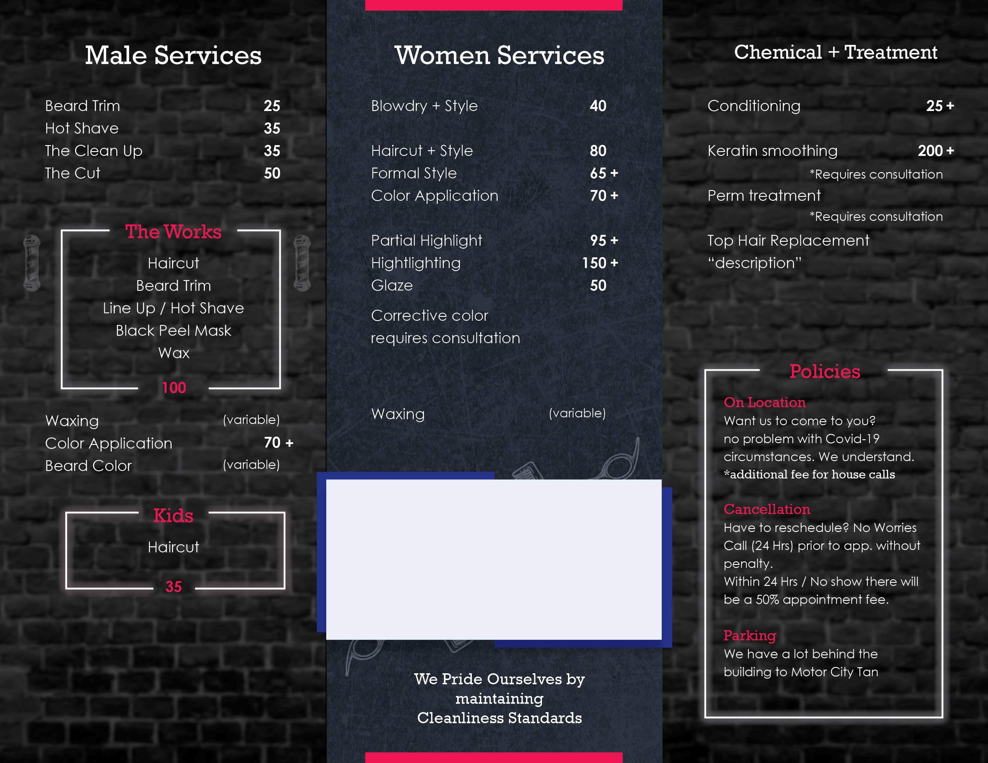
The text needs looking at. Why ‘Male Services’ and ‘Women Services’. Make them consistent. Either Male and Female (which, to me sounds too cold and clinical), or Men and Women. If the latter, it would need to be possessive, ie Men’s Services and Women’s Services.
There are commas missing, some odd sentence construction. Blowdry as one word? (Maybe it is in US English?). On the prices; why Is no currency indicated. Of course it is going to be $, but Is very odd not having the dollar sign in there. 25 what? If it is in there, you immediately know that figure is a price, not a quantity.
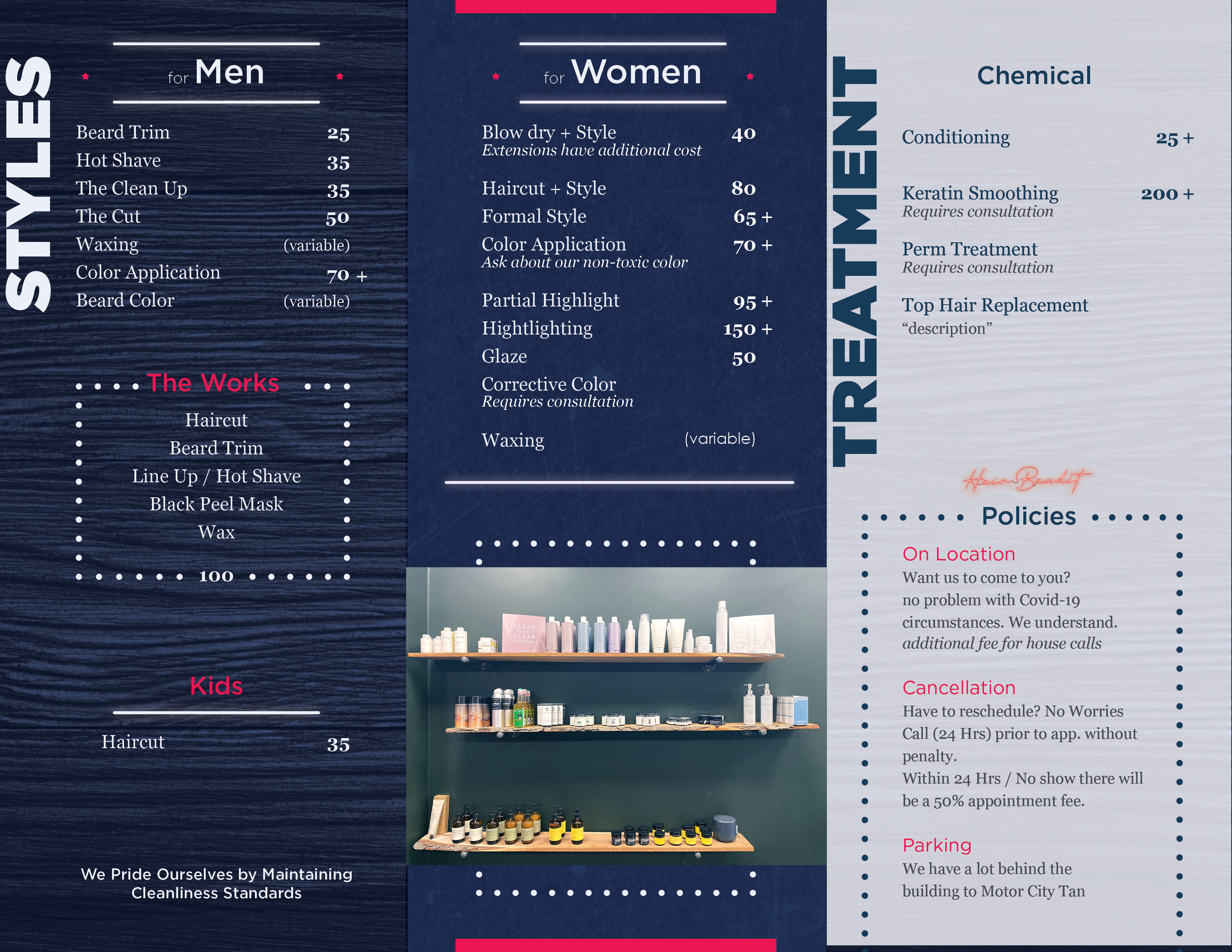
‘Non-toxic retail’ reads very badly. It implies that other products not on that list are harmful.
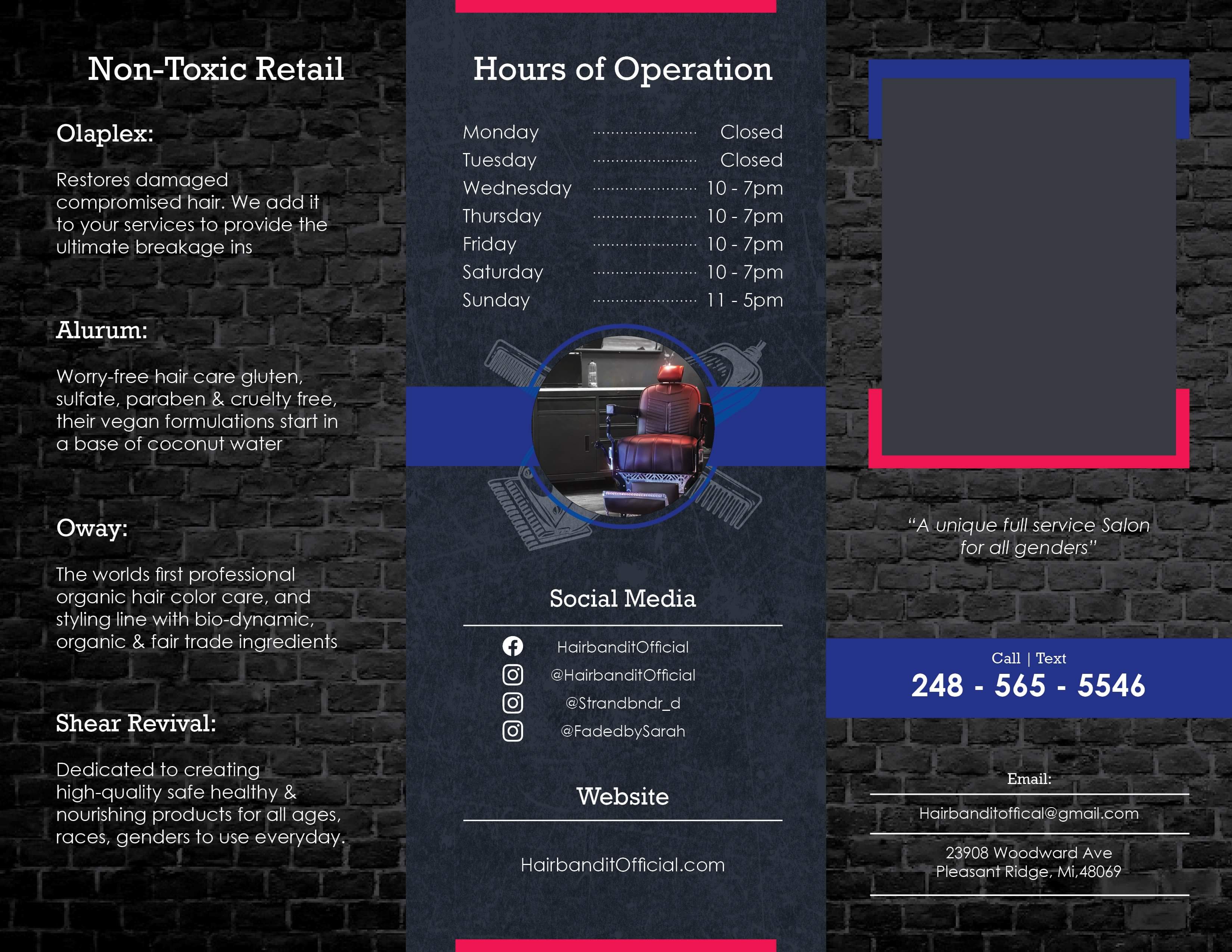
Why does ‘Requires consultation’ have an asterisk in two instances. The point of an asterisk it to reference a note at the end, if you want to use the text as it is (I wouldn’t, ranged right like that creates some ugly holes in the text), then drop the asterisk, or better just have and asterisk immediately after the title and then put ‘*Requires consultation.’ At the bottom of the page.
Aside from it being a terrible strapline, you can’t pride yourself by being clean, you can take pride in yourself by being clean, or you pride yourself on being clean
I could go on, but suffice it to say, the text needs a thorough proofing and in many instances, a re-write.
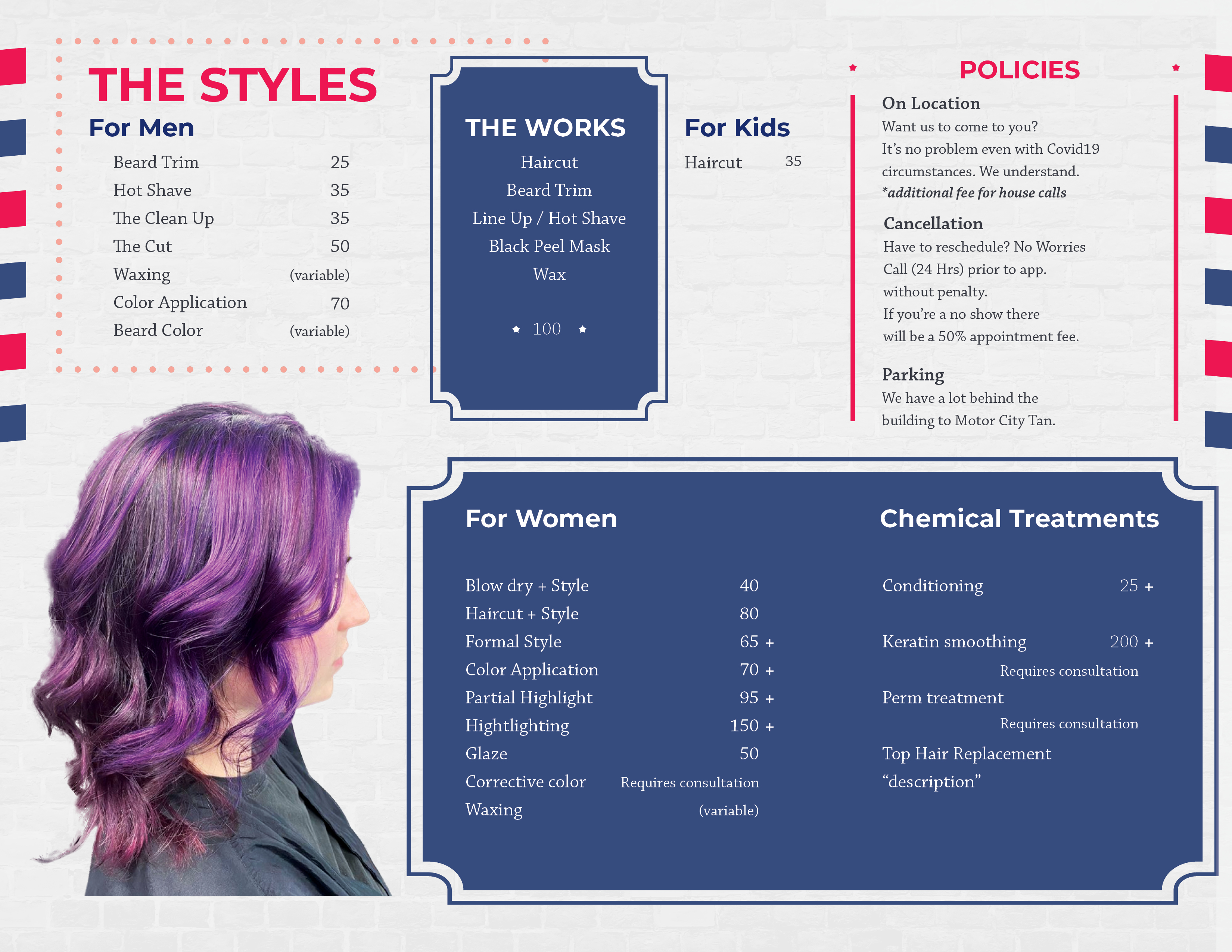
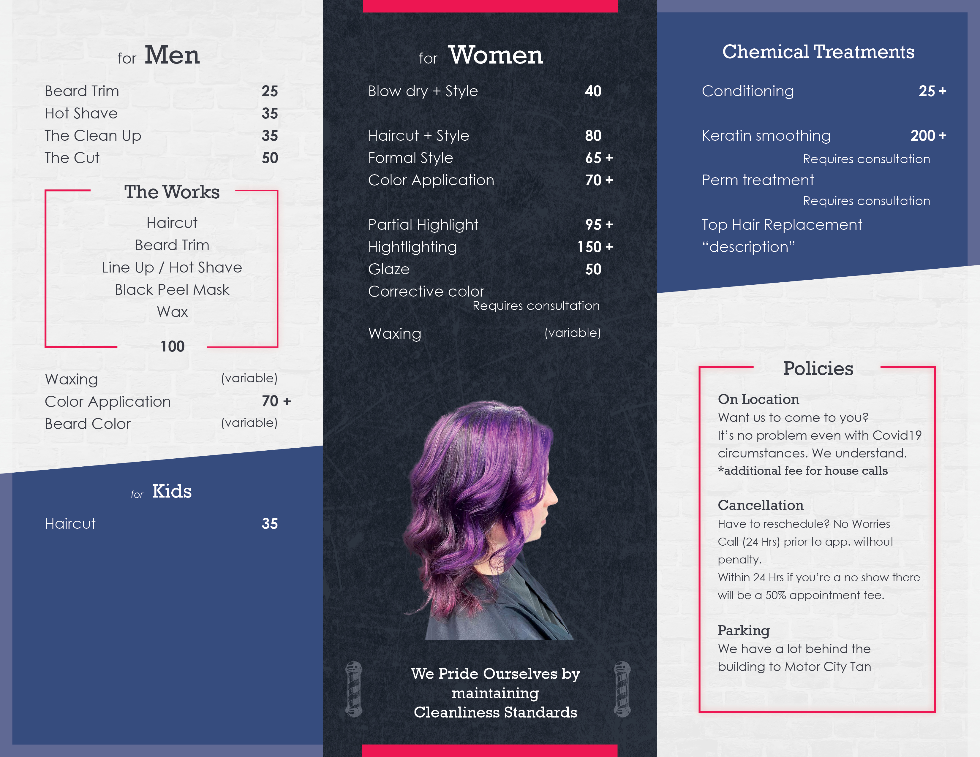
As to the design. It’s a bit lack-lustre I’m afraid. Very little hierarchy. The pic looks like an afterthought. If you are going to use it, then use it. You could drop the illustration behind (or use it instead). Both together with that blue slab just make for an ugly, confused shape on the page.
I’d definitely reduce the space between sub heads and text. They don’t really relate well to each other, as it stands.
The background makes the text hard to read in places. All black is a bit much too. Give I bit of pace by maybe varying the contrast across panel, ie some dark on light and some light on dark.
There are other details that need tightening up, but I really think hierarchy and pace need to be looked at first.
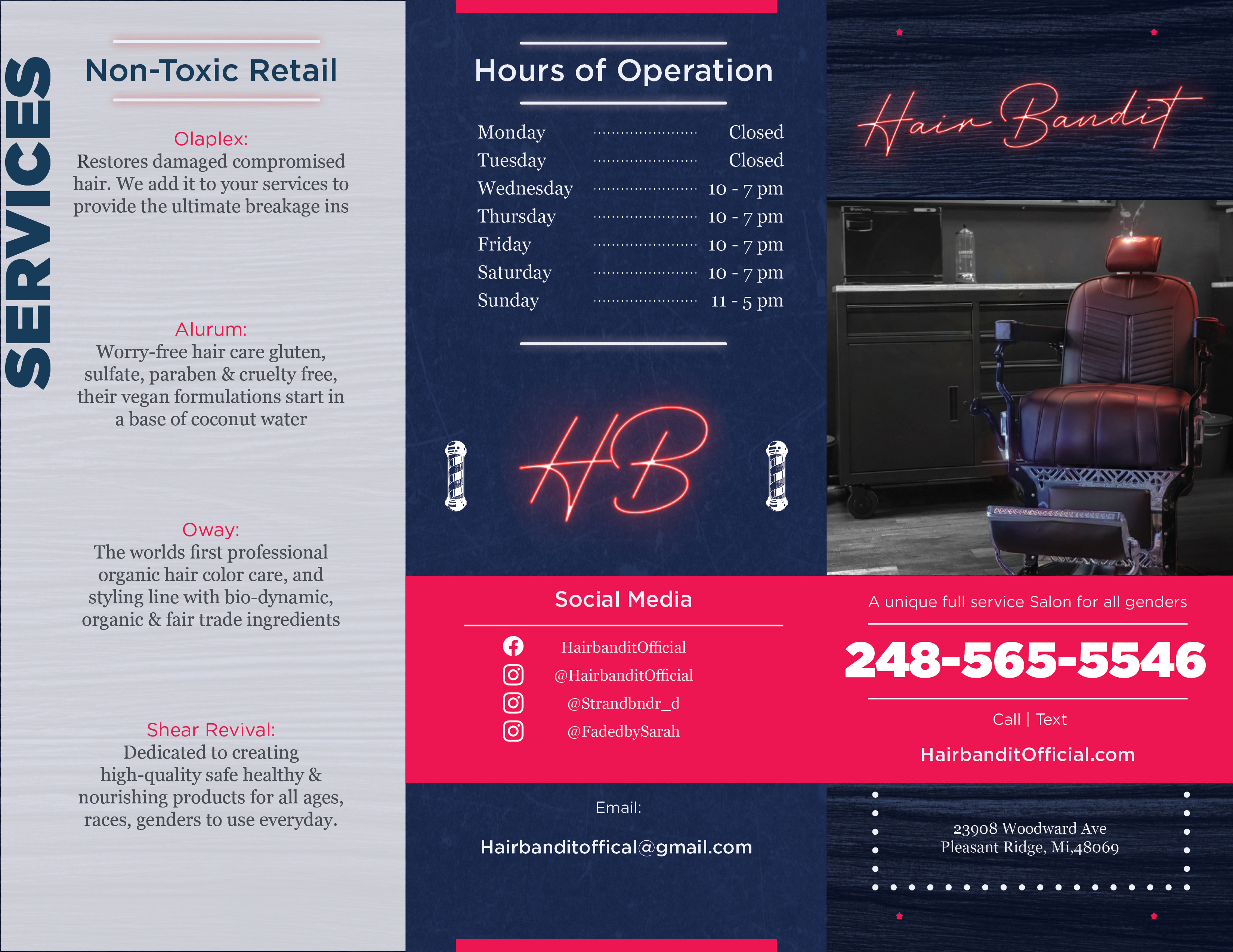
Finally, I’d suggest trying to persuade your client, he doesn’t need to replicate the neon sign. Even if you have to use that lettering (ideally not), it would be a lot better as a flat colour and thickened up a bit. If the neon sign has to be on there, take a photo of it lit at night. It will be much more dramatic.
Hope this helps, rather than disheartens.