For this student project I had to create a brochure.
I decided to do one for a Zara fashion show invitation. Any suggestions on how to improve this? I’m still messing with the layout…and figure out what additional content needs to be included.
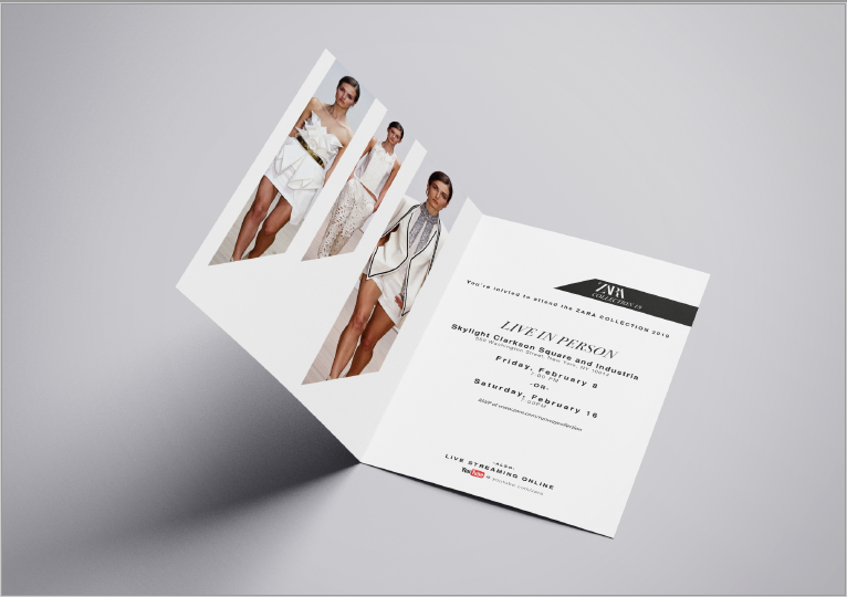
On the inside left, the trapped white space grabs my eye right away. You could have text in that space but I would also adjust the angles of the photos. Maybe the leftmost photo bleeds off the bottom of the page, the middle one comes down lower and the right one ends a little higher. This would have the angle of the photos going from the bottom left up toward the right.
The dates on the right hand side are spaced out too much, and that’s inconsistent with the other text that follows that style. I think this panel needs more work.
Maybe you do a die cut (cutout on the front cover and have it show through to an image on the inside right. Just an idea.
Here are a couple invitations I’ve done with die cuts like that, so you can see what I mean:
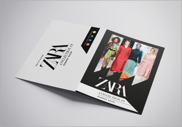
At first glance, it’s looks great. It’s dynamic and eye-catchng.
With a harder look, though, it starts to break down. There’s apparently no underlying grid structure holding things together. The typography seems random and a bit chaotic with different sizes, weights, italics, caps and degrees of tracking all thrown into the mix. Letterspacing lowercase, rarely (if ever) works.
The cover and images are angular, sharp and have a nice degree of tension. The centered typography on the inside, however, has an entirely different personality — busy, symmetrical and cluttered.
I don’t think the middle photo on the inside works well with the adjacent photos — two larger models on either side and a tiny little model in the middle. Are they all photos of the same model? All the models on the cover are different. Why the same one repeated three times on the inside?
If there are two shows wouldn’t it make sense to RSVP for the one you want to attend?
So, my teacher gave me the critique that the images are too “sharp”, and do not give off the feeling of fashion. He suggests coming up with a different shape to use. I don’t quite understand his feedback..(I know I need to go back and ask him) but does anyone else feel the shapes are too strong? I felt like they align with the ZARA logo.
I think those cutting, edgy angles are the basis for the personality you’ve developed for the brochure. And yes, I too think they match the logo (although I’m not a fan ZARA’s new logo). I might disagree with your instructor on this, but I’m not the one giving you the grade. In a sense, instructors are sort of like clients — you can make an argument, but in the end, it’s their call.
I like this look and feel a lot. I think it’s edgy, fashiony, and the consistent angle is unusual and striking. Some tweaks and rearranging, sure, but I think it’s a great start and will appeal to the target market.
I don’t understand your instructor’s feedback, because the sharpness is cutting edge.
I’m an ex Nordstrom market data analyst, and have seen a lot of fashion mail pieces that look like this one. But like B said, the instructor is the client, in this situation.
Love the look of it - the angles work for me but you will have to change it if the instructor isn’t happy with it. This happens all the time out here in the real world. We have all wanted to fire a client at one time or another. Having said that, I would make sure the instructor knows your reasons for the initial design and you may be able to talk him/her round. Try to explain why you chose the spikes and angles. Conceptual art is all about the meaning behind the work - without it Tracey Emin’s ‘Bed’ is just an unmade bed and Carl Andre’s piles of bricks are just piles of bricks.
The overall design is let down a bit by the typesetting. Don’t be afraid of space - you don’t have to fill it up. The text on the inside looks odd centred because of the black pointy shape at the top - it comes in from the right, so how about making your text right justified?
The sans typeface itself is OK but I would use a condensed face - right now its a bit too rounded and ‘friendly’.
I actually did a similar thing for a fashion show and the text was in English and French - for a show in London. This gave it a classy edge - French is the language of couture after all. It may not be necessary for a New York show but never underestimate the power of perceived ‘classiness’ to give your design an edge.
One last thing - ‘You are Invited’ is better than ‘You’re Invited’.
If your trying to promote elegance and high society/class, don’t do a folding card (think wedding invite but tailored to fashion). By going to this format (and I’d keep it single sided) you’ll reduce the number of images, and the amount of space available for text (you have way to much text). Remember your pushing people to the Zara website to RSVP, and you can put as much information on there as you want, as virtual space is unlimited. Also, Zara’s website is very reserved when it comes to text/images, your invite doesn’t match their look (not saying it has to completely).
On the front, besides the colour clash, you have a model wearing Versace. While on the inside the model is wearing all white outfits. Are all these ZARA models and are all these from “Collection 19”, or are there 2 different collections? There is an inconsistency there. As an aside, how are your showing images of models of a show that hasn’t happened yet?
I can see what your teacher is saying in terms of the “sharp” images on the cover. If you removed the models it could be construed as a promotion for a mach 4 razor. You’ve played around with size and rhythm for the inside “sharpies”, but for the cover they are all the same size. Which is fine, but inconsistent. Edgy is also fine, but ZARA isn’t hot topic (something to keep in mind).
If you’re going to use social media icons, make them white on black (its more elegant). And lastly, if you’re going to keep the folding card layout, make it all portrait or landscape, people don’t like flipping and rotating cards to read information.
Actually, I believe the goal is fashion, not elegance and high society. They are not the same thing at all. Especially since the main target audience for fashion is young single people.
So I don’t disagree with your comments on the text, etc., and I agree with Sparrow on the rotating orientation… but for this market, anything goes.
I think your post suggests I change literally everything
It does get confusing when navigating through different critique opinions. How do you guys do it when you get both ends of the spectrum between a design working vs a design not working? I know you should probably go with the client, but what if I see potential as a student project and don’t want to just drop and abandon what I have?
PS yes type is the hardest for me cause I haven’t taken any of my typography classes yet due to schedule conflicts
Fashion—“social standing or prominence especially as signalized by dress or conduct“
It doesn’t have to be elegance, or high society per say. But look at the culture of ZARA specifically. If you walk into a ZARA store, the atmosphere is different than if you walk into a Marshall’s, Hot Topic, or [insert clothing store]. All fashion is about communicating social hierarchy (or at least perceived). And ZARA definitely promotes affordable—albeit cheaply made “high fashion”. Which is who this invite is for.
You’ll notice there are differing opinions, because graphic design is not an exact science. Our opinions are colored by our individual experiences, education, environment and aptitude.
So take the suggestions that make sense to you, and don’t worry about the ones that don’t.
Although the one that is right on, is about the client. Clients sign the checks. Dealing with clients is probably the hardest part of being a designer, so may as well start learning about it now.
I respectfully disagree. In this context, fashion is about the latest. Cutting edge, up to the moment. She who wears the latest style, wins. (I personally think it’s shallow and silly, but it’s big business in retail.)
From Merriam:
“A popular or the latest style of clothing, hair, decoration, or behaviour.”
I don’t see a whole lot of fundamental disagreement in what’s been written. For that matter, I’ve read a general consensus that your idea is good, but the details aren’t working. It’s like seeing a house from a distance and thinking it’s great. Get closer, though, and the walls are a bit crooked, the windows don’t fit, the porch is sagging and the doorbell doesn’t work.
There are numerous ways to make a brochure like yours work, but you can eliminate the less-than-great options by carefully thinking through the problem. For example, if the brochure is meant to promote elegance and high society and class, Sparrow gave you some good advice. If that’s not what’s intended, DocPixel makes some good observations.
This is just a school project, but in real life, the biggest part of any design solution is carefully defining exactly what the problem is that needs to be solved. The debate Sparrow and DocPixel are having is a perfect example of the analysis that most experienced designers go through on so many projects before they decide on a direction.
Your scheduling conflicts are causing you to miss the most important classes that a prospective designer should take. Studying typography is about far more than learning how to use typefaces and letters. Typography contains the essence of nearly every aspect of design, so if you master how to work with type, you’re well on your way to mastering design.
To be honest I’d be curious to see the range of sketches/mockups you did for this—if you made any.
I think the biggest missed opportunity for students on this forum is that they ask for critiques during the final stages of their products as oppose to the beginning stages, when it’s easier to make changes.
I don’t suggest starting from scratch unless you have time to do so. I think others on this forum have given you good advice, that will be easy to incorporate. Incorporate what you can, and disregard what you can’t.
As for the teacher is your client bit. Understand that once you are out of school your clients will be your clients, and it’s much more difficult to be experimental and creative. Take advantage of that while your still in an environment that allows it.