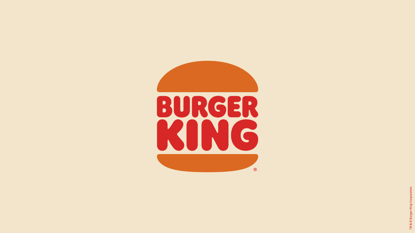
Burger King’s brand new logo is a revival of their old logo from 1969.
3 Likes
LOL, I love it!
2 Likes
Their new logo looks just like the one the abandoned 20-some years ago. I do sort of like it, though.
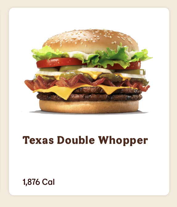
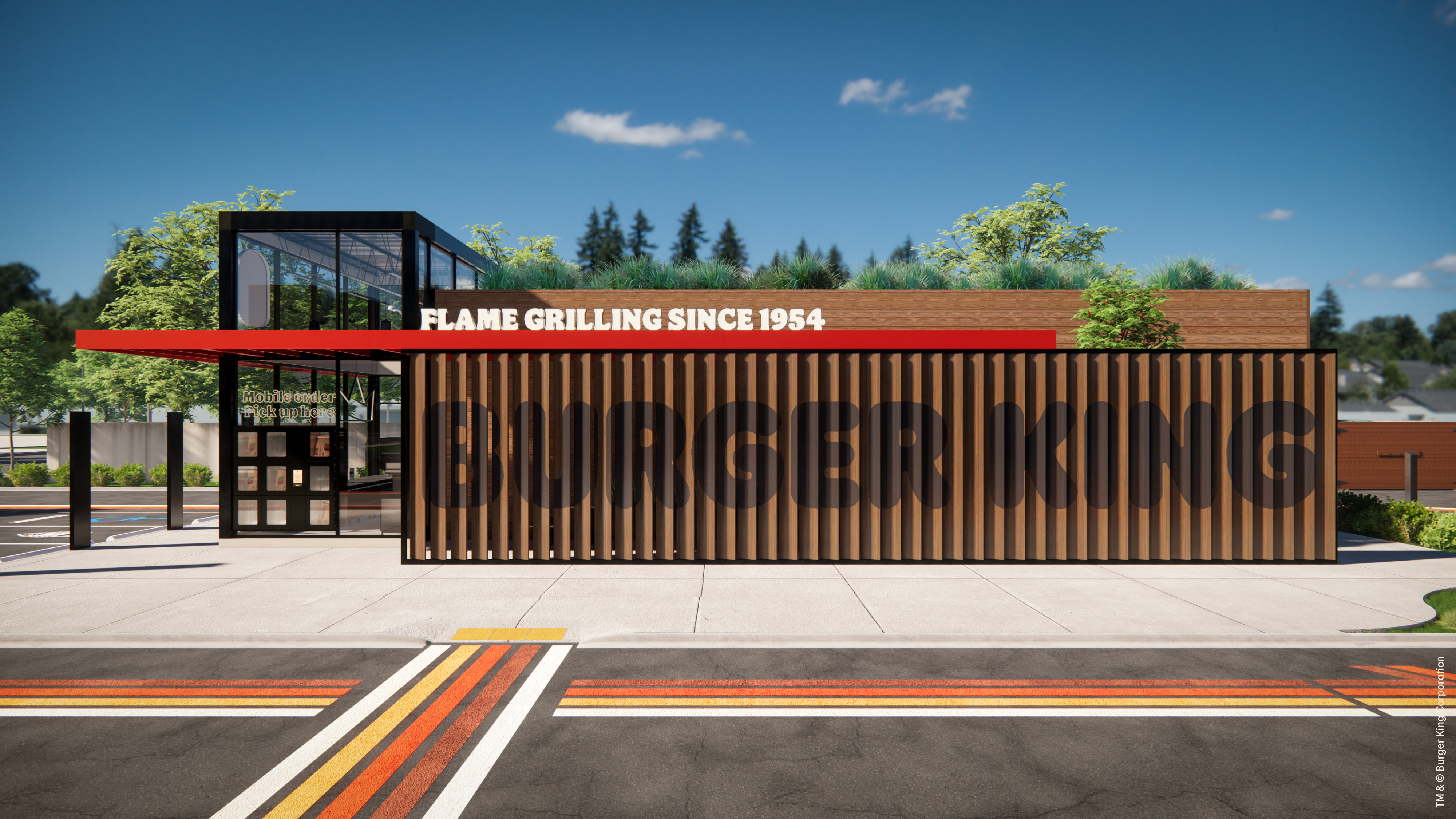
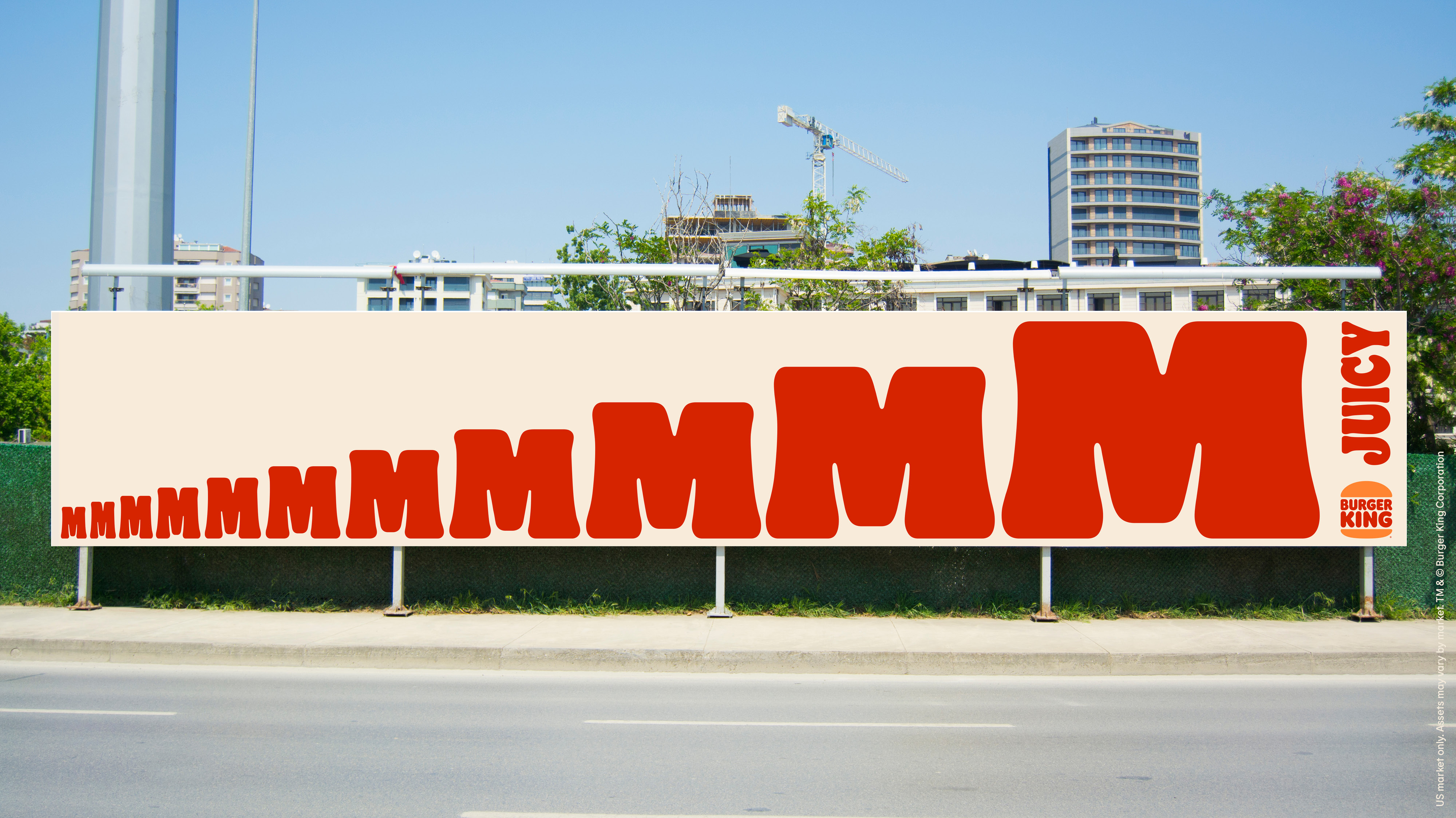
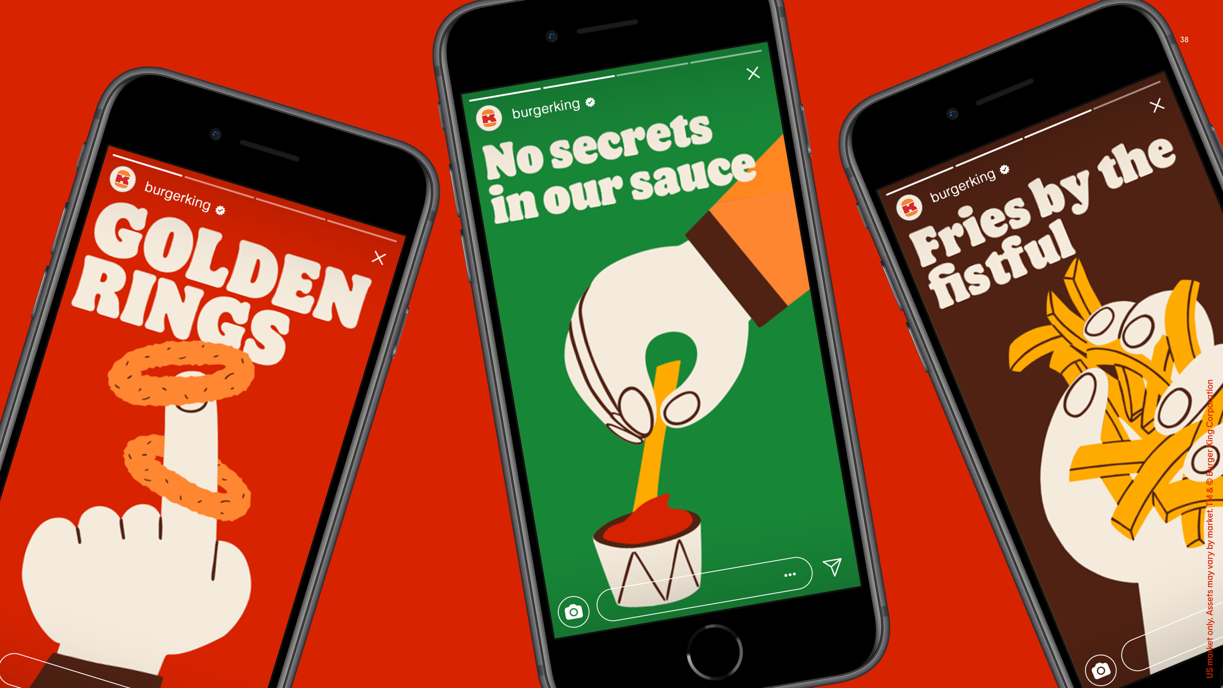
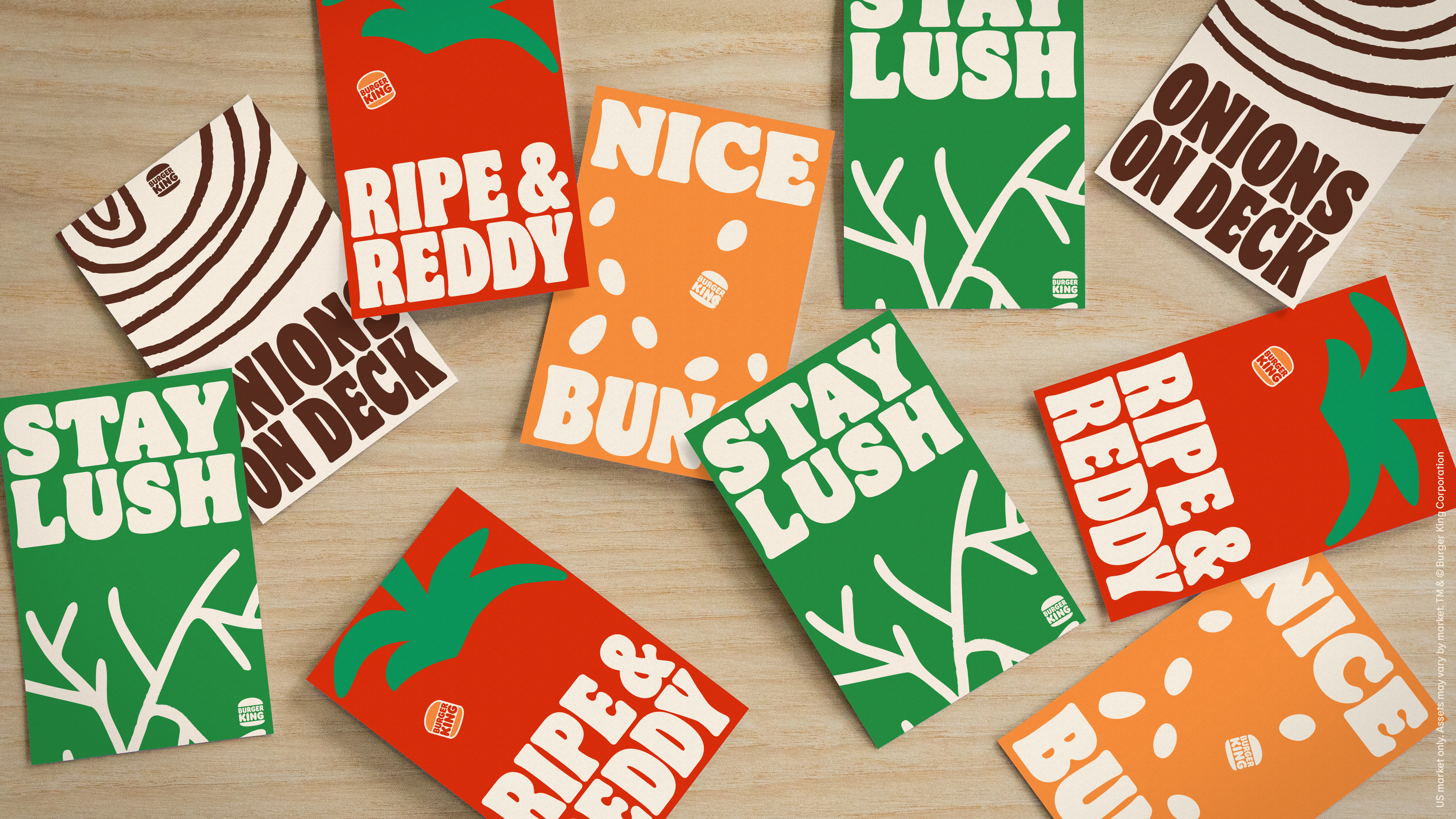
What I really like is their broader visual branding, which is just sort of playful and fun. I can’t say that I like eating at Burger King, but the broader branding really does play up what’s appealing about their food while minimizing what’s bad about it.
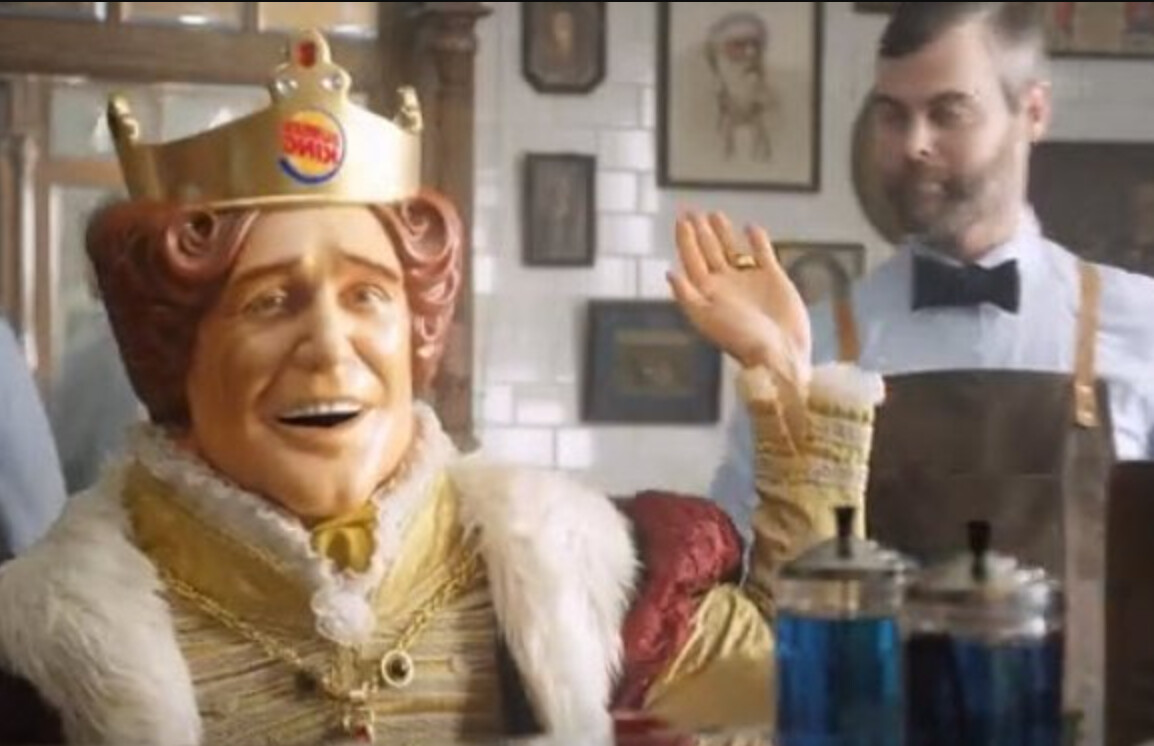
I’m also glad they got rid of their creepy mascot.
2 Likes
Yup, Iraszi said the new logo is a revival of their old logo from 1969. I love it.
3 Likes
I love the retro look back ![]()
1 Like
They had changed it? I looked at that and wondered what they had changed until I saw the little round hotwheel logo in the crown and like “oh,yeah.”
Shows how much I cared, LOL!
2 Likes
I’m glad I wasn’t the only one who thought that ![]()
2 Likes
I like how they looked back to move forward. Its a good logo. Proves its timeless and can accompany new branding
4 Likes
I like it a lot, but I’m a child of the 70s. It’s novel, but I don’t think it will have long term appeal to the younger demographic they need. I’ll wager they’ll be back within a few years with another redesign.
2 Likes
The plastic-faced king is still in the TV spots I’m seeing, new-retro logo on the crown and all.
2 Likes
Their most recent logo with it’s ‘dynamic’ angle and reflective elements on the buns (remember using reflection on everything in 2009?) is just not timeless. It looks like it should have stayed in the early 2000’s.
The blue swoosh around the burger always bothered me as well. The president at the approval board meeting must have been like “it’s missing something, how about a blue circle? Greg, add that.”
Pizza Hut had a similar issue which I’m guessing is why their new commercials use their old logo.
2 Likes
Yes, I remember the swoosh craze. When in doubt about what to do with a logo, just add a swoosh or a swoop to it. Problem solved. Toss in a reflection to give it a bit of 3d and it’s done.
This could even be looked at as an example of why designers shouldn’t blindly jump on trend bandwagons for things that need to outlast those trends. There’s no surer way for something to look outdated faster than to make it look trendy.
3 Likes
This should be memorized by all graphic design students right before their graduations, so that in later days they can differentiate themselves from all the bosses’ nephews/nieces.
4 Likes
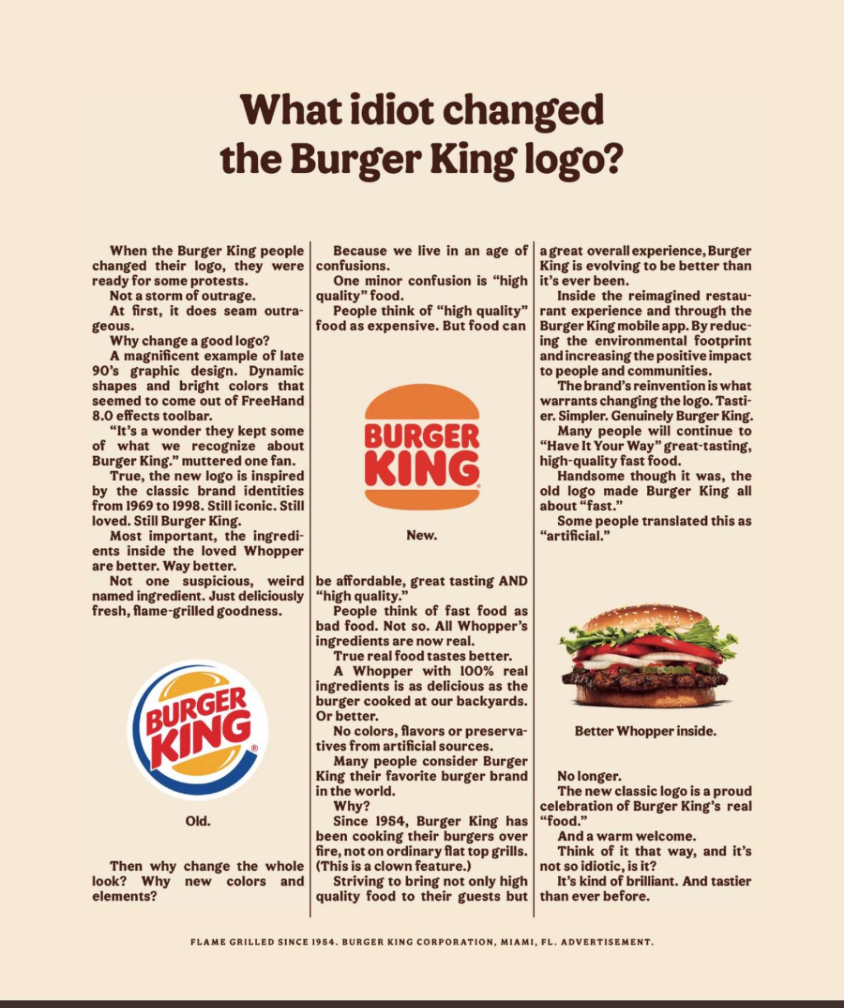
Did a 5th grader write that?
With a typo in the third sentence no less?
4 Likes
I agree it’s a horrid piece of writing (and typesetting) that self-assures a point has been made, but I don’t see one.
So many fragments set as sentences. (I count 18 of them, I think.)
![]()
Okay, what?
3 Likes
That exact wording is what made me wonder what juvenile wrote this.
A) you can better differentiate between flame grilled and fried on flat grill, and
B) the obvious, snide and derogatory reference to a competitor.
Very playground-esque
But that typo, from BK corporate? Really?
Or is this a parody, made to look like BK corporate?
1 Like
Is that a real Burger King ad?
It doesn’t match their new branding visuals, which I like a lot. The copy is full of mistakes. The writing is bad. The dense, crowded, text-heavy type is terrible. The whole layout and concept reeks of amateurism.
At first, I thought it was a schlocked-together parody, but the bottom line claims it’s a Burger King advertisement. Maybe the new branding was just the work of their ad agency, while this particular ad originated from their not-up-to-the-task in-house marketing people.
Whatever the case, I’d like to know how they can come up with a great new visual brand, then follow it up with something so atrociously awful.
1 Like
The first rule of shlock is to claim it’s real by saying so.
I’m voting for “not real.”
1 Like