
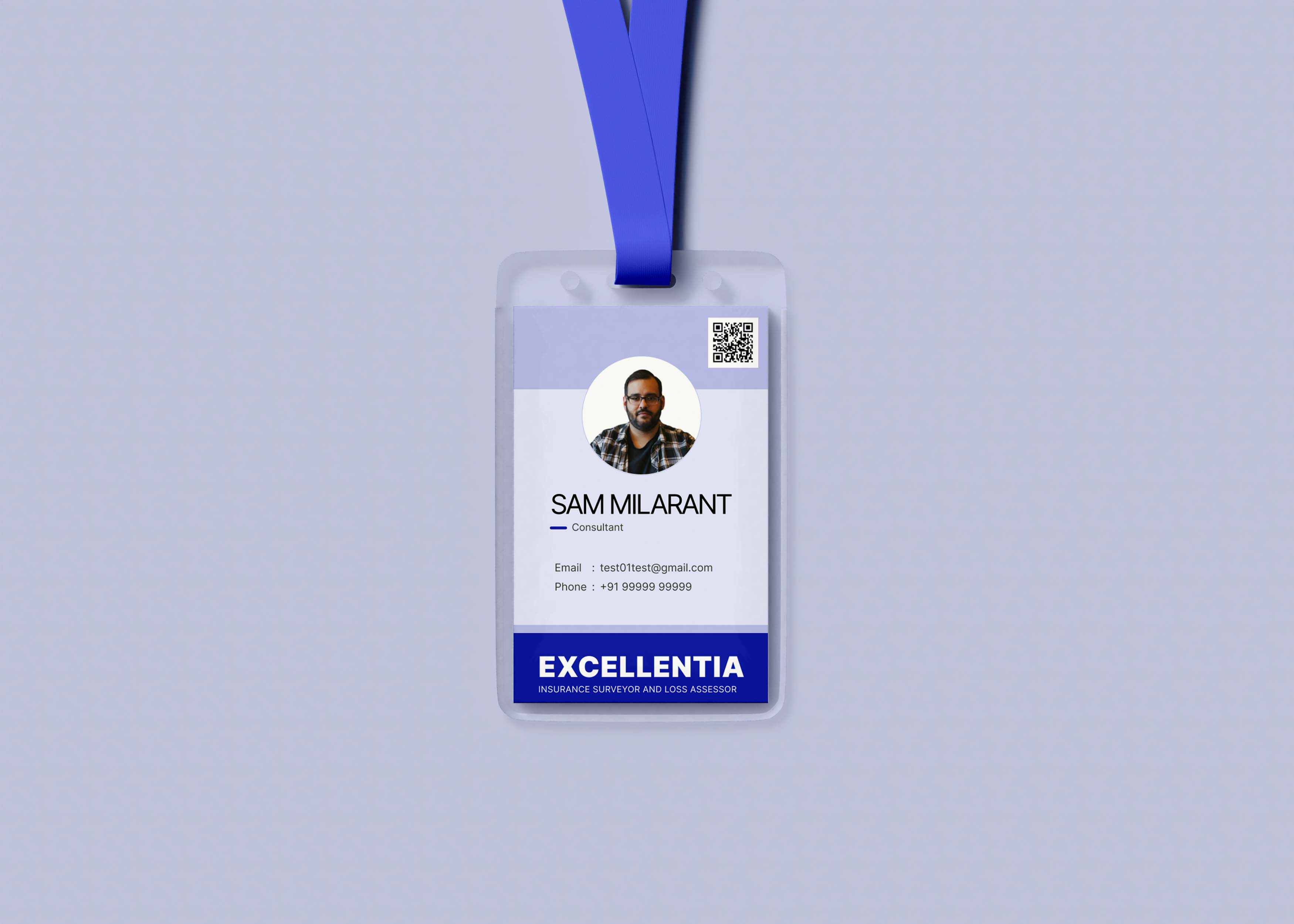
This business card is for EXCELLENTIA INSURANCE SURVEYOR AND LOSS ASSESSOR PVT LTD.
The primary aim is to show a trusted brand with a target audience of 50+.
You want your blood type on your business card? ![]()
2 Likes
I think it’s ok-ish for an older audience, but not sure. And when you are not sure about something, it means it isn’t the optimal solution.
I like that you have hierarchy in your design.
But you have an issue with the last shape from the top. It doesn’t fill the whole space and you have some white space there, remember to check the other shapes too to fill the bleed area. So you won’t have problems printing those.
At the bottom it says “Excellentia Insurance” and the design isn’t exactly communicating it. It actually looks like a business card for a start-up tech business. The shapes, color, and typefaces (I think there are at least 2?) don’t really fit the “excellence” theme, but without more information about the business in cause I may misunderstand this.
Even though this example simplifies a lot your idea I would draw inspiration from it. In my opinion it suits better the audience and it’s more relevant to the industry. Of course, it’s not the same idea (it doesn’t have an image), but it should be a good starting point.
Example here:
Hope you’ll take this well, sometimes I’m too incisive even if I don’t want to. Just want to help! ![]()
This is more like one of those hanging id cards and not a business card. My mistake.
Thanks brother and it sure did help. I am going to correct my mistakes.
Photo would look better without the circle frame. Make it large, cropped much, much tighter and placed in the lower right corner. If there is a logo for the company, use that as the secondary image. Choose better typeface for name. No more than 75% gray tone.
Is it necessary to have blood type on it though?
Seems weird.
It doesn’t have a company logo.
Why does it need their email address on it? It’s a hanging ID, who’s going to read it? Is it in case they lose it?
There’s not much to critique. The content is bizarre for a hanging ID.
1 Like
Hanging ID like a neck cord or Key card?
Or hanging ID like on a car mirror when car is parked for insurance adjustment visits?
There may be issues with putting an employee photo on a car mirror hanger. Creepy people out there, and not all employees are males in their 40s…
Where I live, they still have photos on the handicapped mirror hangers, but the give you a slider to cover the photo while parked.
Blood type? I’d need a really good reason why for that one…
Hanging card.
I think a blood group is necessary in case of any emergency such as an accident of sorts
- The company is an actual company of pretty old people they don’t have a logo or website and just needed a simple hanging id card
- After reading so many comments I too think that blood type was really not necessary but the idea was if an employee into an accident and if for some reason blood was need for that reason
- contact info is given so that people can contact in case of lost but I think I would also add some kind of qr code which will add the contacts automatically ( I think that would be better)
Thank you for the critique.

Your last post clears up some of the mystery while creating others.
What brand? Is their brand color blue, or is it purple (you’ve changed colors)? Did you use their brand typeface? Instead of a brand, perhaps you’re just saying you want the card to appear as though the company behind it is trustworthy.
A trusted brand without a logo or a website? An insurance-related company full of old people whose target audience is other old people? I’m a little skeptical of your perception of age. Who is this target audience: the company or its customers?
What relevance is age to whether a company has a logo or a website? For that matter, what relevance does their age have to do with anything you’ve shown us? Are you suggesting the card meets the needs of older people better than it would for other ages? You’ve mentioned age twice but have provided no rationale for how you’ve optimized the card for older people.
Even so, you’re suggesting this old-person company that is too old to have a logo or a website needs hanging neck cards with QR codes to enable clueless old people to scan with their smartphones. And why does your card mockup show a photo of a person who’s, what, 40? Is that your definition of an old person?
It’s not a business card, as the thread headline says. You’ve already agreed that it doesn’t need blood type information, but why does it need an email address and a phone number? Is there an expectation that people who meet employees wearing these cards will snap photos of the cards to get their contact information? Wouldn’t an employee ID number be appropriate? Wouldn’t the address and general company phone number be appropriate for the card?
Is the card’s purpose mainly to assuage its customers’ concerns by providing their employees with a company badge? Would these employees also carry business cards? Do they wear uniforms? If so, does the card/badge match? Does the card also serve as an internal access card into a building or secured areas? If so, does it need a magnetic stripe or a chip for access readers?
I could go on, but my main point is that judging from your first post, you seem to have assumed that the design problem you’re solving is an aesthetic one targeting unspecified older people for unknown reasons. Of course, the card must look professional and appropriate for the company. Still, more than important than anything, it needs to solve the problem that the card is meant to address, and it’s taken multiple posts from various people to drag that information out of you.
Feel free to disagree, but I suspect you don’t have a good grasp of the problem you’re attempting to solve. From what you’ve written about the company not having a website or a logo, I suspect you’re dealing with an iffy operation, and perhaps the company has provided you with insufficient information. Then again, I’m guessing that you haven’t asked and that we’re spending time critiquing a crowdsourcing problem.
Ok understand you are correct I’m kind of assuming the problems.
Let me explain a bit - my dad works at the insurance recovery company and he asked me if I could make them a hanging id card ( like the one mentioned in the mockup). It’s a very small company of 4-5 people with no need for any social presence so they never made any website or logo or have any brand identity. I mention old as I kind of indicated a bit of trust to some extent and for the same reason I used blue as for the phycology of color blur indicated trust.
So, I think my next plan of action would be to make a whole brand identity. What do you think?? but for that I think they would need to be convinced.
That may, or may not be required, but I would be very careful. It should be something tackled by an expert in the field. If you have an established business of many years standing, it already has a brand identity. The brand is not the cards, website and letterheads you produce. The brand exists. It is the way the company conducts business. It has an established ethos and way it deals with customers.
If you ride roughshod and just create something that looks attractive, you risk undermining years of established brand-building.
You need to establish why it needs a brand identity first.
A few years ago, my father asked me to do something similar. His company was even smaller. He was a clock and watch repairer. He had a business he had built up locally over 30 years, by word of mouth. There were others around, but it was just known that he was the go-to expert. He could fix any clock or watch, even ones that others couldn’t. He had a reputation for repairing old and precious pieces. His business, as I say, was all word of mouth. Customers and local jewellers.
The business was robust. It didn’t need to expand. It wasn’t changing position, or operation. It was all about him. Having looked at it and done a bit of research (of course I already know its operation pretty intimately), it became clear that to create a visual identity would have simply been a vanity project. Moreover, if it was done, it would have to be very exacting to communicate exactly what the business was about, which was personal relationships. He knew most of the old ladies in our town, as he’d fixed most of their clocks and in doing so built personal relationships with him (no; not like that!). We couldn’t go anywhere without him getting into some conversation or other.
If I had created some sleek brand to communicate this, I think it would have undermined this. It would have achieved absolutely nothing – or worse.
So, be careful when creating brands for long-established, word-of-mouth businesses. It is far more of an exacting and difficult science than building something for a new venture, where you need to establish a new market and speak to them.
Unless there is a reason to do it, you can do more harm than good – even with a professional brand designer. If you are doing it yourself and are not trained or experienced, then you can do a lot of damage.
Establish the why first. If it is not broken, I’d say, don’t fix it. If there is a valid reason to undertake it, ie a need to expand, a shift in markets, a change of strategy, etc, then tread very, very carefully and do a lot of research before you make any moves.
Your dad won’t thank you if his business takes a nose-dive because suddenly his tone of voice has changed.
Remember, design is not about prettifying.
1 Like
Do you mind me asking, what methods of research did you use?
I was in a fortunate position, that I knew half of his customers, so I just asked pertinent questions.
1 Like
I would use Icons instead of “Email” or “Phone”"
Hey @Centraal Glad you are enjoying helping, but watch your dates ![]()
Many, including this one are months and months old and the OPS are long gone. I’m sure they have solved their dilemmas and moved on ![]()
1 Like