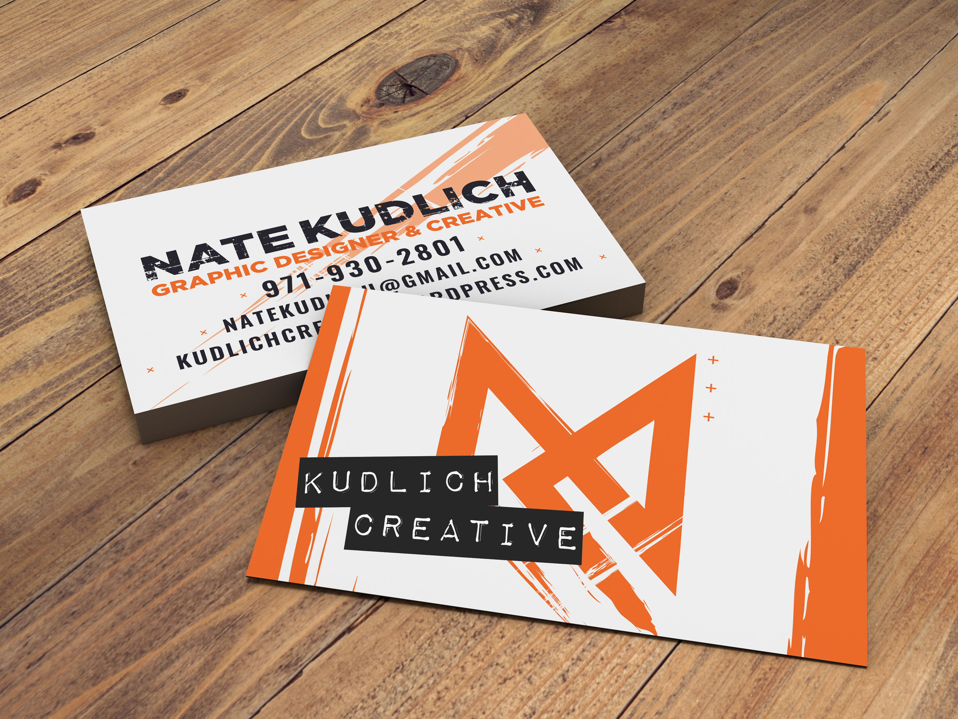
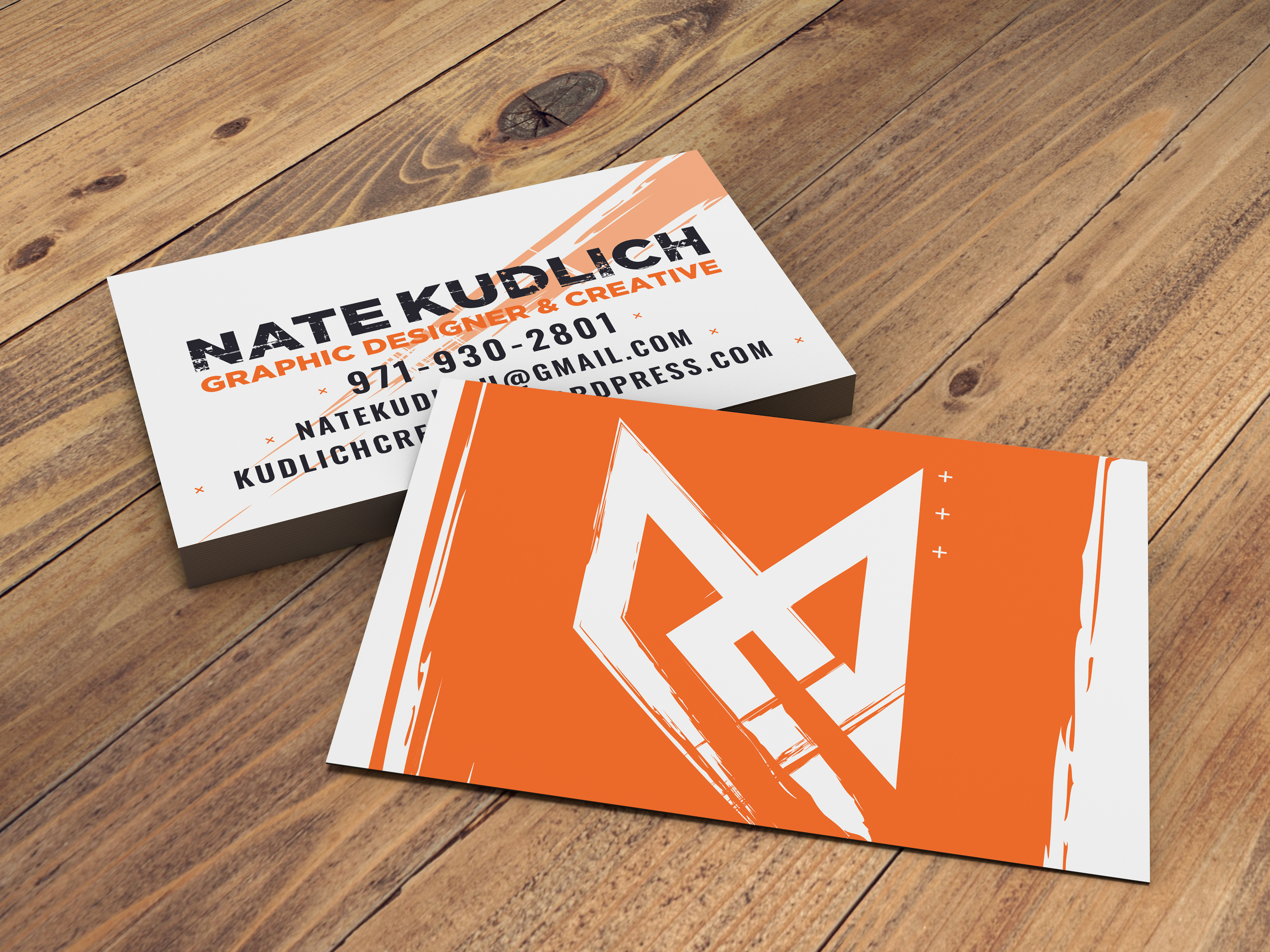
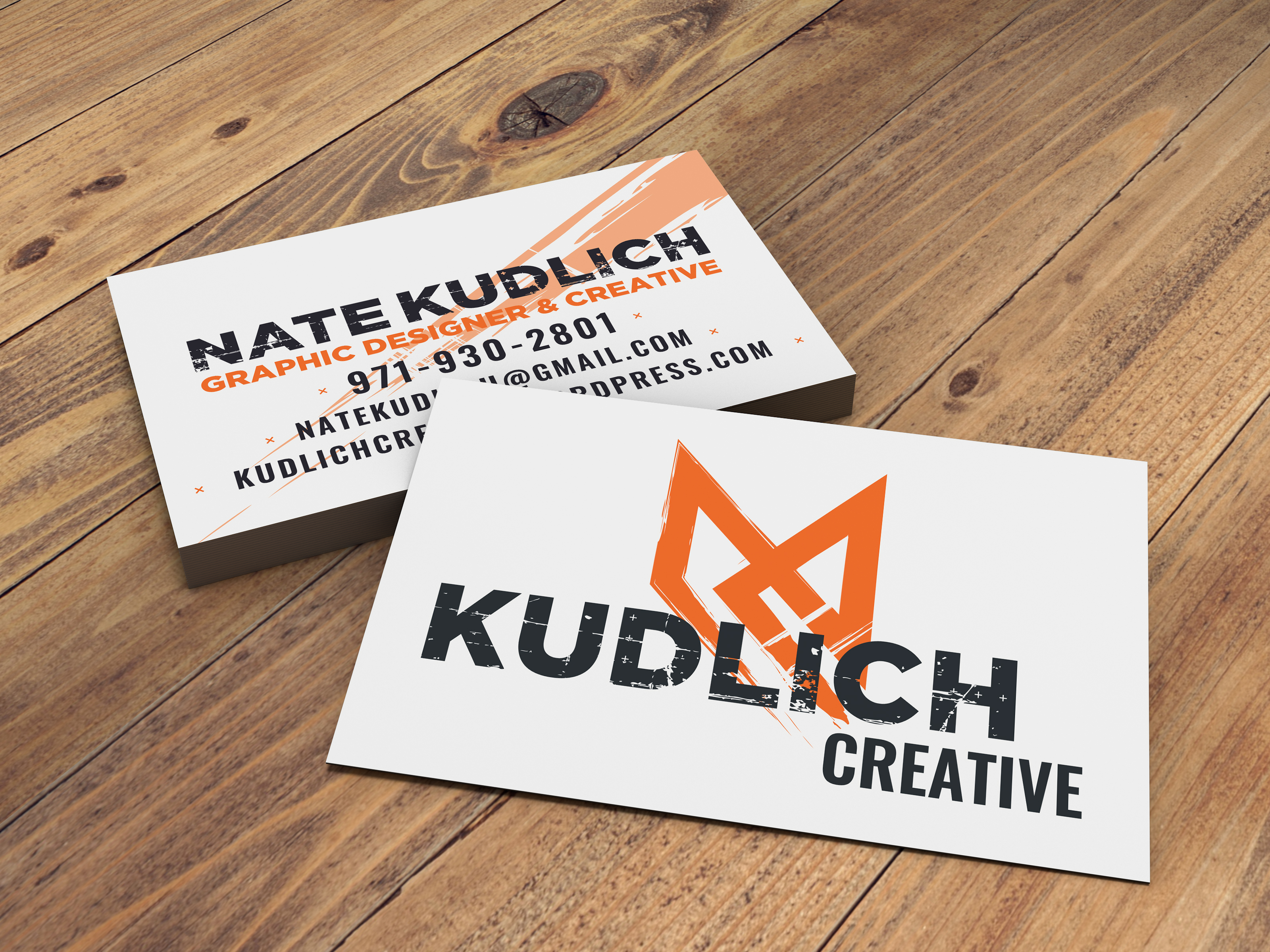
After many proofs, I’ve arrived at these three business card ideas. Please take a look and let me know what you think.
Thank you!
After many proofs, I’ve arrived at these three business card ideas. Please take a look and let me know what you think.
Thank you!
I like the design very creative and unique!
But somehow I get this feeling that the services
you do is house painting services.
I’d get rid of the Dynamoe and replace it with a Font already in use.
All I saw was an M. A very clever M, mind you.
I hope you meant Dymo. Yeah, I’m that old.
I meant this type: Identifont - FF Dynamoe
I used it at a client many years ago. I think it looks cheap ![]() But maybe I’m biased because the client was a discount supermarket chain.
But maybe I’m biased because the client was a discount supermarket chain.
Oh, I see. Never had a use for it, which explains my ignorance.
Thanks for the feedback, it’s actually the letters in my name connected. It also forms an abstract broken hourglass or eternity sign but it’s representative of order and chaos. One sides higher than the other but they look mirrored, the angles of the original along the bottom are all parallel, the ink stroke represents my drawing background from growing up with a professional painter for an grandfather but it’s still vector at some points.
As for using Dymo, I was contemplating using a label maker to achieve the same effect. Would you say the font a bad representative of the actual thing or just something to remove completely?
It’s weird and confusing that we must choose between thinking of you as “Nate Kudlich” or “Kublich Creative,” but the mark reads just as well either way, I suppose.
Yeah, I totally got all of that. [not really!]
Also, “Graphic Designer & Creative” is a bit odd, as though suggesting that graphic design isn’t necessarily creative or that the two are somehow separate, or worse, that you’re so unfamiliar with the profession that you don’t realize the two are used synonymously. I’d suggest using one or the other.
I’d lose it completely as I don’t see any reason for it in the design.
All in all I think you put too much brainwork into it. As you explained above there are so many things in the design only you understand. I don’t think clients will pay attention to that. IMO there are too many 'why?'s in this layout.
An abstract broken hourglass?
Or an abstract broken swastika?
People will see bad in all things innocent these days.
Thanks, that’s a great point of view I didn’t think of. I’ve just had some projects that were extremely boring or had no real creative work, just info layout so there’s been this sort of separation between the two.
If it’s on it’s side ![]() I’ve only had one or two people refer to that one. It looks like a bastardized rune than a swastika to me but I see more runes in my echo chamber of social media than swastikas. It’s ultimately very stylized initials. Everything else are just after thoughts and observations.
I’ve only had one or two people refer to that one. It looks like a bastardized rune than a swastika to me but I see more runes in my echo chamber of social media than swastikas. It’s ultimately very stylized initials. Everything else are just after thoughts and observations.
Yeah, it’s a real stretch. I’m not sure I’d want to work with anyone quite that triggered.
BTW, the armband insignia was on its side.
Me neither, that would make everything a lot more difficult. I was referencing the hourglass being on its side, not the design resembling an inverted rolling cross