Hello everyone
please let me know your opinions about this business card
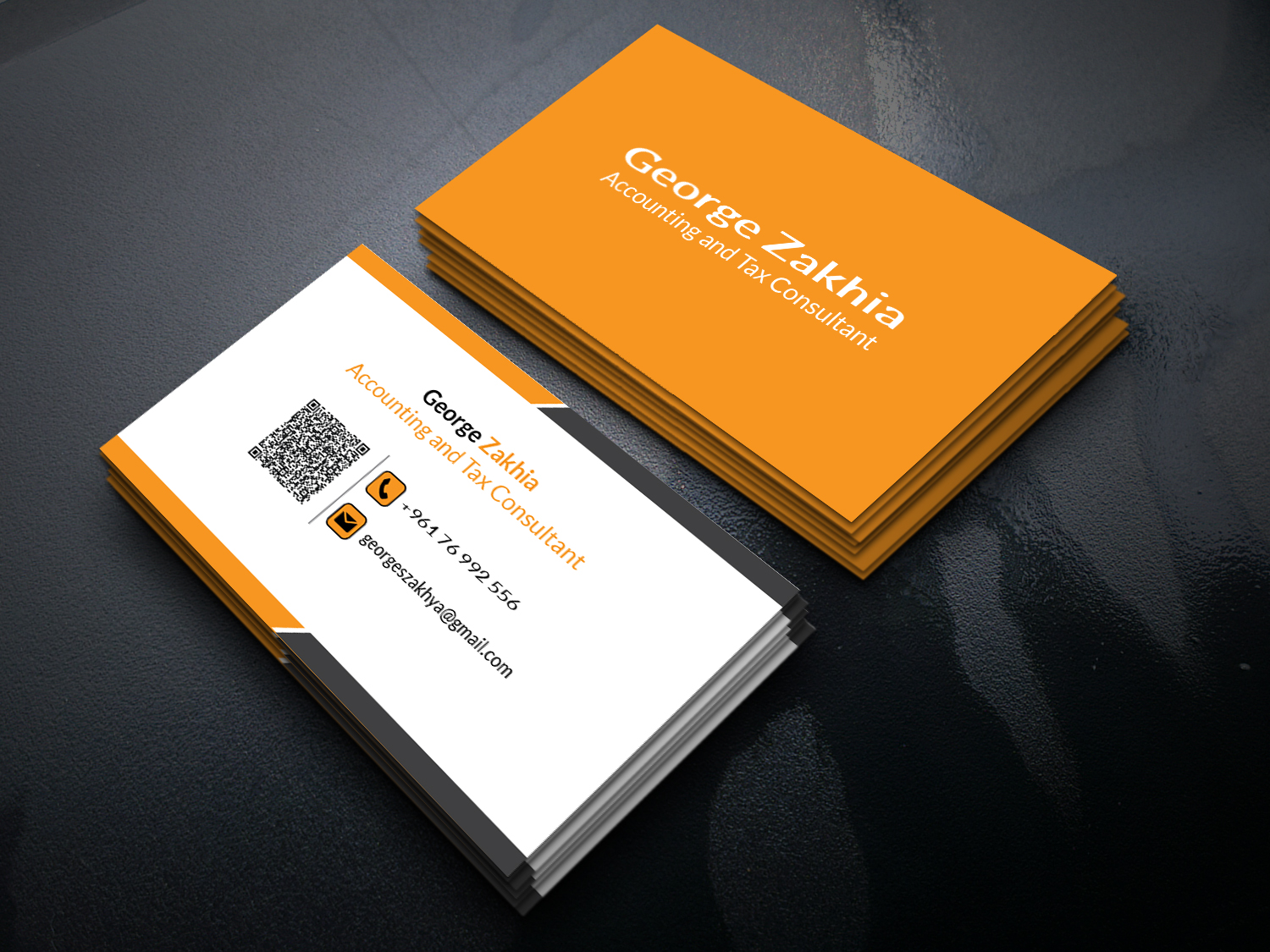
On the plus side, it’s bright, I like the color palette, and it’s easy to read.
On the negative side, I don’t like that the George Zakhia is stretched out on the orange side – the George Zakhia Accounting and Tax Consultant should have the same treatment on both sides. Overall, it feels a little generic to me.
1 Like
Its pretty generic, which is ok I suppose. Steve_O had some good comments, on top of that it bugs me that the orange to black angle on the front doesn’t “match” angles. As in, if you took a ruler and continued the angle form the top or bottom, they don’t intersect and are not on the same “line”. Its also odd that the phone and email icons are so close to the divider line, match the margins, IMO.
1 Like
Thanks so much for your feedback
1 Like
thanks so much for your feedback.
I agree with both Steve and Craig, but I also like the card. It’s clean, simple and striking. Anyway, I’m a sucker for orange.
I like the way you’ve integrated the QR code into the design rather than just sticking it in somewhere in an empty spot.
I’d likely be inclined to keep the first and last names the same color (probably black).
2 Likes
thanks so much for your feedback. I really do appreciate ![]()
+1 on that.
I agree with most of what’s been posted. I like the look, but there are details that need refining. Keep tuning it.
1 Like
thanks so much. I will of course
Loving the colour combination and the fact that the orange isn’t a generic orange but toned down. Works well with the grey.
Not wanting to be picky but I noticed that the accountants surname is: Zakhia but on the email address there is a ‘y’ instead of an ‘i’. Not sure if that means anything but I thought I would let you know just in case as it can’t hurt.
And I do like how everything is centered rather than justified left like so many. I would be happy if this was my business card. Job well done.
1 Like
Thanks so much for your feedback. I really do appreciate. glad that you like it. and of course with pleasure
for the name it happens that someone tries to check his name on the email address but it was taken so he tries to change something to be available. yes I meant it and I like your notice.
I already returned to my design to check the angles and took a ruler and continued the angle from the top and bottom and I have found that the are on the same line.
actually it was just copy past from the bottom line of the card so the angles are 100% match.
thanks for the notices
sorry I misunderstood you. I got your point of view now, but I did not want it to be such way.
it differs from someone to other but for me I prefer both colors are equal in length in each line. I do not want specific color to be too much greater than the other. anyway this is only my point of view.
I respect yours also and it differs from someone to other.
thanks for your notice
I like the color combination, the set up for QR code and its simplicity.
Just like what @Just-B says its Striking a must thing to do for business cards.
My only opinion is for the “Zakhia” in the white page, making it black is also cool.
because the message below it is already orange.
The icon for the contacts for me is too attracting, make changing it to a smaller one or with a minimalist effect will make it look elegant.