Business Card For A Cleaning Company

Hi there GDF’ers! How is it going?

So I came here again in search of your valuable critiques! This is one of my first “professional” jobs. A cleaning company of a friend, she just opened up her business and reached me out in need of a business card for the cleaning services company she will be running. Well let me know what are your thoughts on the versions, what would you have done different, what were my mistakes, what can I do to improve my skills for the future. Thanks a million in advance.

Briefing:

  • Cleaning company specialized in heavy duty cleaning (post-construction, offices, condos, etc.)

  • She wants to express reliability, efficiency, cleanliness, attract attention mainly from the construction field workers.

Concept: I tried to elaborate layouts that expressed modernity, through san serif fonts, and cleanliness through colors (blue, green, white).

I prepared four different versions:

That is it. I am prepared for all kinds of critique so try to be as frank as possible. Thanks again my dear forumers!

The first one is the weakest attempt. It looks very low-end.

These two give more of an impression of an high-end business and also convey the message of cleanliness quite well. I particularly like the second one with the waves integrating into the Kizzy wordmark.

The last one might work if the target audience is less literate. It’s less high-end looking than the two above, but still looks pretty professional.

One last note: I would not trust any business that does not carry the actual legal entity and address on their business card.

1 Like

Each of them present unique challenges in printing.

All of them would be rejected if submitted to me in prepress.

Details too small.
Light text might be a challenge
Compacted dots printed on a business card like that - iffy if you ask me.
Gradients - could be a challenge.
White text is too thin on the background

2 Likes

From a first glance type deal … I like this one. Clean and easy to read :slight_smile: (I would however darken up “CLEANING SERVICES”)

2 Likes

Easiest to clean up for print purposes - I’d also drop the gradients and go for solid colours.

It would be ok gradient from the blue K to the purple for the swoosh.
But the rest can go.

1 Like

Kerning – the kerning !!!

2 Likes

I think the one with the swirly lines is the strongest but could use work. Think and thin lines in the logo/swirls, perhaps translucent and overlapping, and the typography on the rest of the card needs work.

Cool concept the way the lines continue from front to back.

1 Like

The first option is pretty lazy.

The second option looks like you simply added your text to a layout from Shutterstock or iStock.

The third option seems forced and more like decoration than design.

I actually think the fourth option is quite clever. I like that on the front the cleaner is being applied, and the cleaner is being removed on the back side. Plus, you could do similar illustrations with a mop, broom or sponge. And I could see this color scheme and graphic style applied to a fleet, website, collateral, etc. That said, it needs some work. What will the Kizzy Cleaning Services type look like on its own? Is it distinctive enough to stand alone? I’d spend some time working to clean up the type, spacing, hierarchy, and layout. For example, the icons next to the phone and email aren’t needed. Everyone will understand that one is a phone number and the other is an email address. Overall, it’s not perfect, but this has a lot of potential in my opinion.

6 Likes

There’s a lot to unpack here, as there’s 4 No. design directions on top of the configurations of the business cards, so will do my best to be as concise as possible.

I actually think your first card is the most appropriate in terms of the typeface of the wordmark given the commercial nature of your mates business, although I don’t know how I feel about the italics and the lower case “cleaning services” :thinking:

The second option is very generic and could be any business.

I think the 3rd option is the weakest, I think this too delicate to be appropriate for something on a construction site, it looks more like a hair salon.

The 4th option is very appropriate in terms of the illustrations on the card, but am with @Steve_O on the concerns about the wordmarks ability to perform independently.

How are you selecting these typefaces?

Why does your client think they need a business card? What is the problem they’re encountering and why do they think a business card will fix it?

1 Like

Totally agree - the fourth option is fun and clever. Added to Steve_O’s comments - there are at least four (4) font options and the phone and email are far too big in relation to the owner’s name. The icons in the circles aren’t needed as it’s obvious one is a phone number and the other email. Bullets are too large in relation to all of the dots in the illustration. Use those dots and tighten the leading. Font selection is too thing for legibility and definitely would present printing issues.

1 Like

I lean towards your first and last attempts, at least in general design direction. You’ve got some room to improve on the execution in general, but I’ll explain why I like those two the best.

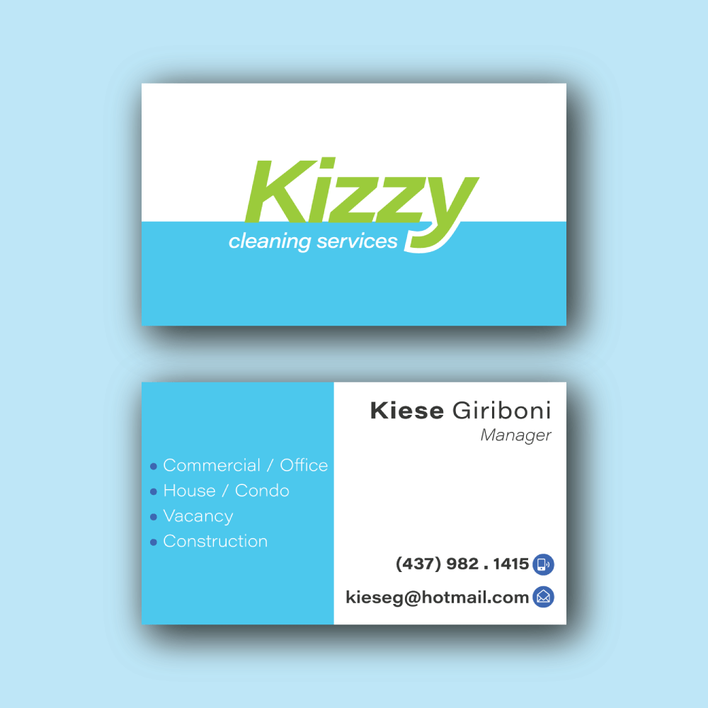
The first is very simple, minimalistic, and hits all of the goals you listed for aesthetic communication. It’s very efficient in that way - it doesn’t take a lot of fluff to tell you what’s going on, and it’s not saying anything other than what it’s there to say. I look at it and I hear “Clean” first, and that’s a solid starting point.

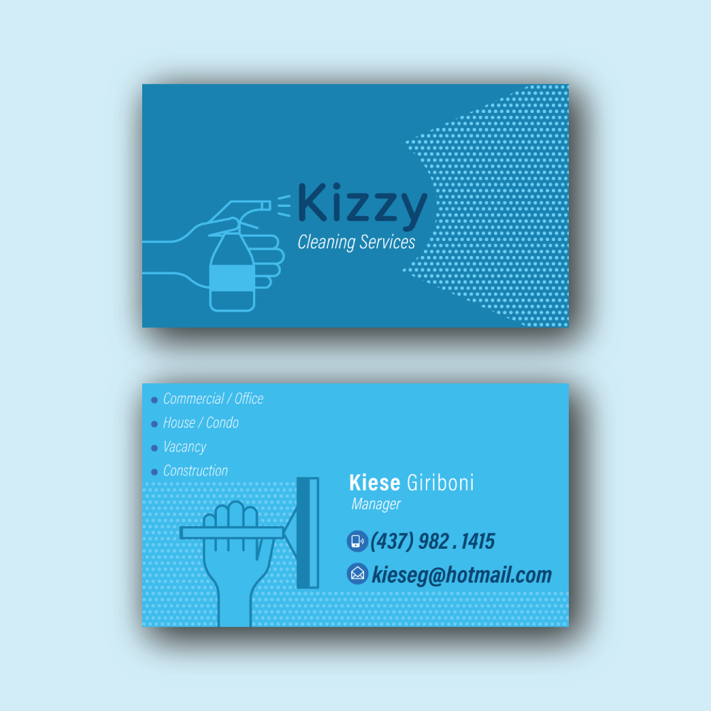
The fourth I like for a similar reason, in that it illustrates what it’s trying to convey clearly - but in this case directly with illustrations, rather than design language - but also in that it’s fun and visually interesting concept. The style is still fairly modern and simplistic, but the content itself gives you something to look at. With the audience you’ve listed, I think it’s simple enough to not over-stimulate and confuse a target, but interesting enough that they’ll remember it.

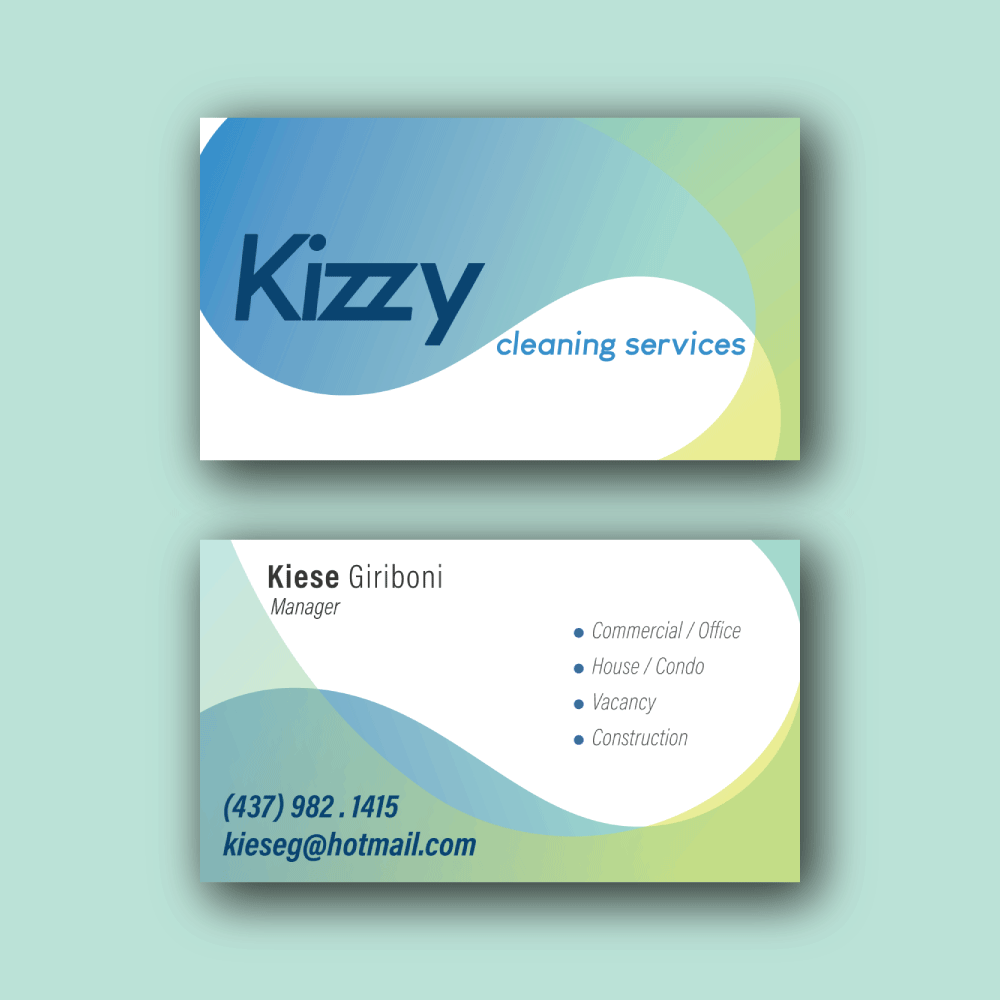
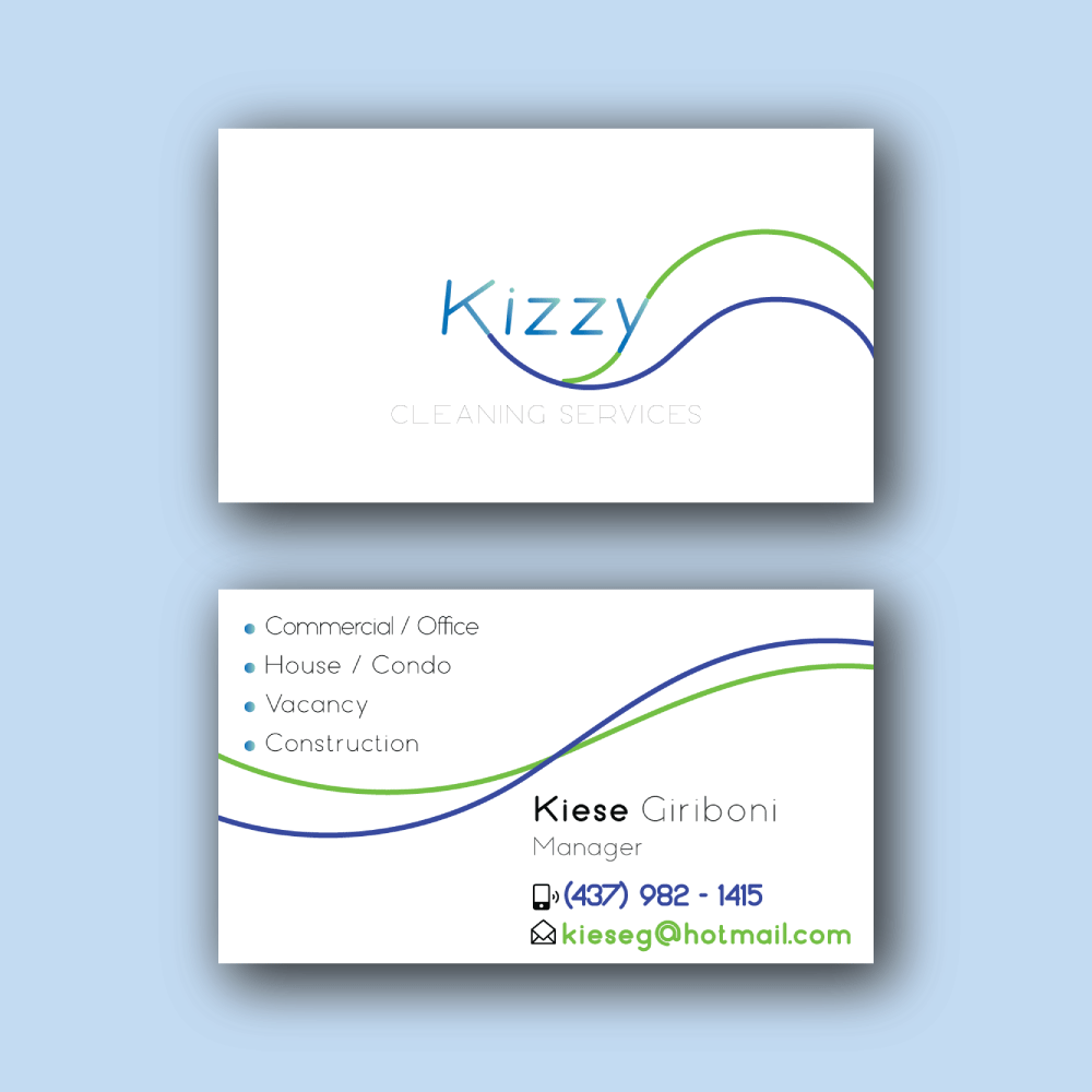
The other two, I think, have too much going on, on different fronts. The gradients on number two, while nice, kind of muddy the colors, which I think interferes with your message of cleanliness. I do like the waves, and the subsequent evocation of cleanliness through that, but I think the shape motion and color motion are too much, together. My take on the third is kind of the inverse, in that I like the cleanliness of the colors and overall simplicity, but I’m not as sold on the shape language. It’s hard to say how much of my unease is getting stuck on the seams on your line joins (I can see the rounded edges where the strokes meet, and that’s bothering me) or the unbalanced motion on the front, or something else that I can’t quite articulate. In summary, on #2 I’d pull back a little, and on #3 I’d go a little harder.

To put it another way, I think I like #1 because it’s the simplest, and I like number 4 because it’s the most interesting and approachable to a layman, while #2 & #3, while interesting, I think are more complicated than they need to be to do their job, and less clear than they could be in what they’re trying to say. Rephrasing again, I think I’d summarize 1 as Simple/Abstract, #2 & #3 as Busy/Abstract, and #4 as Busy/Direct. I think they’re all decent concepts, but if I were weeding them out, I’d drop or rework the two in the middle first. I hope that this helps, I notice there’s a lot of mixed opinions here.

2 Likes
  1. This is what I’ve seen before in stores for cleaning service business cards. Its simple but at least I definitely know what the card will be about. I would work more on it though. It’s almost too balanced between blue and white on both sides. Play around with placement and spacing.

  2. I’m instantly turned off by the colors. I just think about all the gross things I never want to think about. The patterns and style of this card could be almost any business.

  3. Initially I really like this one. I agree with a lot of the print issues you could encounter with this so tweaks may be necessary. I really can appreciate and feel good (clean) with all the white space. As @RedKittieKat pointed out - wow yes please make Cleaning Services visible. I nearly missed it! The more I keep coming back to it though, the more it feels off. I think it feels too crowded on the back with the design cutting through the info. You’ve already put flair on the front to get someone’s attention. If they turn it over then just give them easy to read info.

  4. I enjoy this one graphics a lot but similar to 3 I think you only need to lure someone in with a cute graphic in the front. The back graphic is a cute concept, especially paired with the front, but personally it’s taking up precious real estate. I would love to see this card in the color scheme of #1 or #3. Go high contrast with the front graphic and text to grab attention! Maybe for the back leave the graphic subtle, like an Easter egg.

Last thing for the card for any design. When I’m picking up business cards for cleaning services the last item I care to read is the card’s contact info. Of course it still needs to be on there (and I agree to add the address) but it doesn’t need to be the first thing my eye is drawn to on the back. I greatly recommend more prominently displaying the actually services. Investigating the services options is why I’m flipping the card over at all.

P.S. I also agree the icons and bullets are unnecessary.

1 Like

Welcome back to the forum Xico, it’s been awhile.

You’re getting some good thoughts from everyone, so I’ll throw in my thoughts as well.

The first example’s personality is that of an average, affordable cleaning service. It’s not particularly imaginative, but if your audience wants to save money, this might be the way to go. However, the thin white type reversed out of the blue background sets the stage for some printing problems. If you’re using solid spot colors for the printing, the problem will be limited to the ink spreading out a bit (dot gain) and making the thin type even thinner looking than it is. If this is printed using 4-color process, in addition to the dot gain, you’ll have a registration problem with that reversed type, which could make it nearly illegible.

The second example has much the same affordable look to it, but seems more fun and inviting. It would obviously be printed 4-color process (or it’s digital equivalent), and there’s no problem with the reversed type. So if the target audience is affordable-minded consumers and it comes down to a choice between the first and second examples, I’d definitely choose the second.

The third example has more of a high-end look that subtly suggests a service that might be a bit more expensive. However, the thin, gray “CLEANING SERVICES” type will be all but impossible to print in 4-color process (which will be used since there are too many total colors for spot color printing). It will be nearly impossible because the width of the line doesn’t appear much wider than the individual halftone or inkjet dots making up the line. It’ll degrade during printing into illegibility. Even if that type did print perfectly, it would still be too light, difficult to read and too faint to serve the purpose for which it was meant. In addition, the letter spacing (tracking) of the words on the card is all over the place. The letters in some words are way too loose, while other words are way too tight? Make them consistent.

The fourth example, has more of an industrial look to it, like that of a commercial service that specializes in office buildings, which is great if that is the target market. Again, you’re using an extra-light typeface reversed out of the color and, once again, that risks printing badly for all the same reasons I’ve already mentioned. That said, I’m sort of liking the overall look, but you really should design with the limitations of the printing process in mind.

2 Likes

Thank you so much for the detailed feedback!!

Smurf, thank you so much, I definitely got the idea of designing keeping in mind the printing limitations.

Glad to know you liked this version! Kittie, thank you so much for your feedback!

I had absolutely no idea about kerning (now you know how beginner I am). I learned something new today, thanks Erizzz!!!

Praxis, thank you so much for your feedback!

Steve, I can’t find words to describe how grateful I am for your critique! Thank you so much! It helped me so much!

Pluto, thank you so much for pointing out some important details to be fixed, I so appreciate!