Hello guys i’m new here. Can you please vote which logo design you like better, thanks
2 Likes
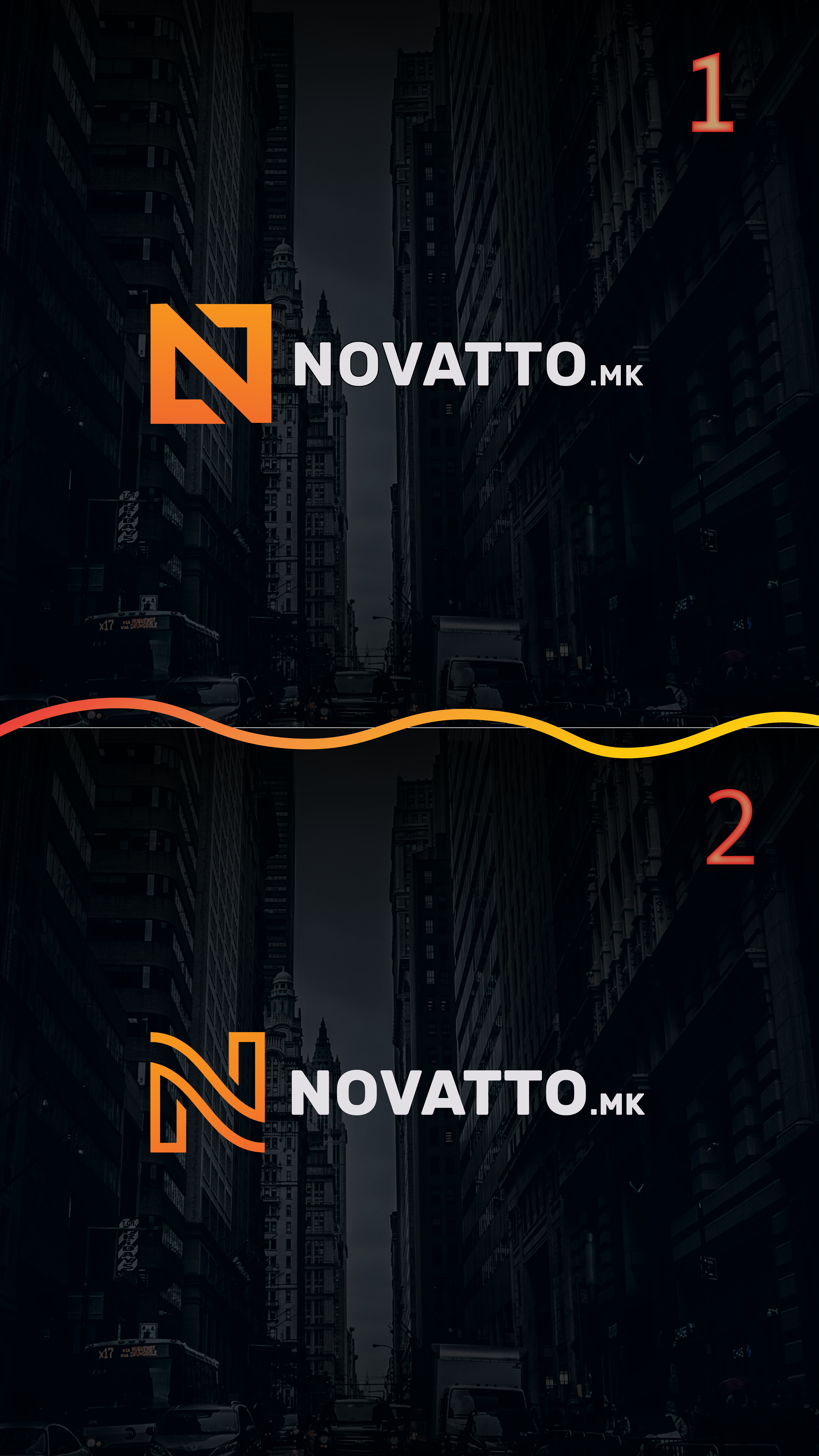
I like the first one because the straight edges match the buildings behind it.
1 Like
well background i just for aesthetics, the logo will be used on dark single color background
Without knowing anything about it — what the client does, who the target audience is, etc. — I like the second one best. For that matter I very much like the fluidity of the mark. I also like the typeface you’ve chosen for the logotype, but it does seem to overpower the N just a bit. Maybe if it were a light gray or a lighter weight, it might work better. I don’t like the little .mk, but I’m assuming it needs to be there since most people outside Macedonia would likely not guess it.
1 Like
Thank you for your reply i appreciate your response. We are mainly focused on website development and yes, .mk is our domain sufix.
I like the first one better. Cleaner lines.
2 Likes
Second one.
1 Like
Every time I said that it came back and took a chunk of my backside off. I hope it doesn’t do that to you.
Is that a logo or a domain name? I don’t see Nike put a .com on its logo.
1 Like
2nd one for me.
1 Like
Let me follow up a little more on why I like the second mark better — especially given that we now know its for a design agency. My reasons are entirely associated with my own emotional responses, which, of course, might differ from others’.
They’re both nice, but the first one is sturdy, rigid, angular, no-nonsense and solid. It might be more appropriate for a company involved in engineering, mining, machinery or construction.
The second is a nice combination of solidity and flexibility, which suggests imagination, purposeful creativity, stability and quality. In other words, the qualities I would associate with a good design studio.
I also agree with @Eriskay in that you cannot always be sure it will be used on a dark background. Luckily, though, it’s the kind of mark that can easily be made to work on a light background.
1 Like
Thank you, yes i tried with different background colors, it works nice aswell. I personally like the most simple designs but all are saying the second is better and i think i will go with the second. I really like those in-depth reviews. I love this forum.

Well yeah i understand that about the .mk but we are visible only on the Web and don’t (yet) have physical appearance (physical studio or something) so i think it’s nice that people know that is a domain and can access us online to find out more information about us.
I like the latest iterations — very nice!
I like both for different reasons. Choice depends on what fits the brand more.
The second one immediately made me think of Nespresso, so Id go with the first one for more originality.
I love the first one.
I prefer the first, the second remind me to Coffe Nespresso.
Good luck
Prefer option 2, option 1 looks like a Z on it’s side more than an N. It’s not a bad mark, but clarity is crucial.
first one is better, i like the straight lines
(personal opinion)
I prefer the first