Hi everyone,
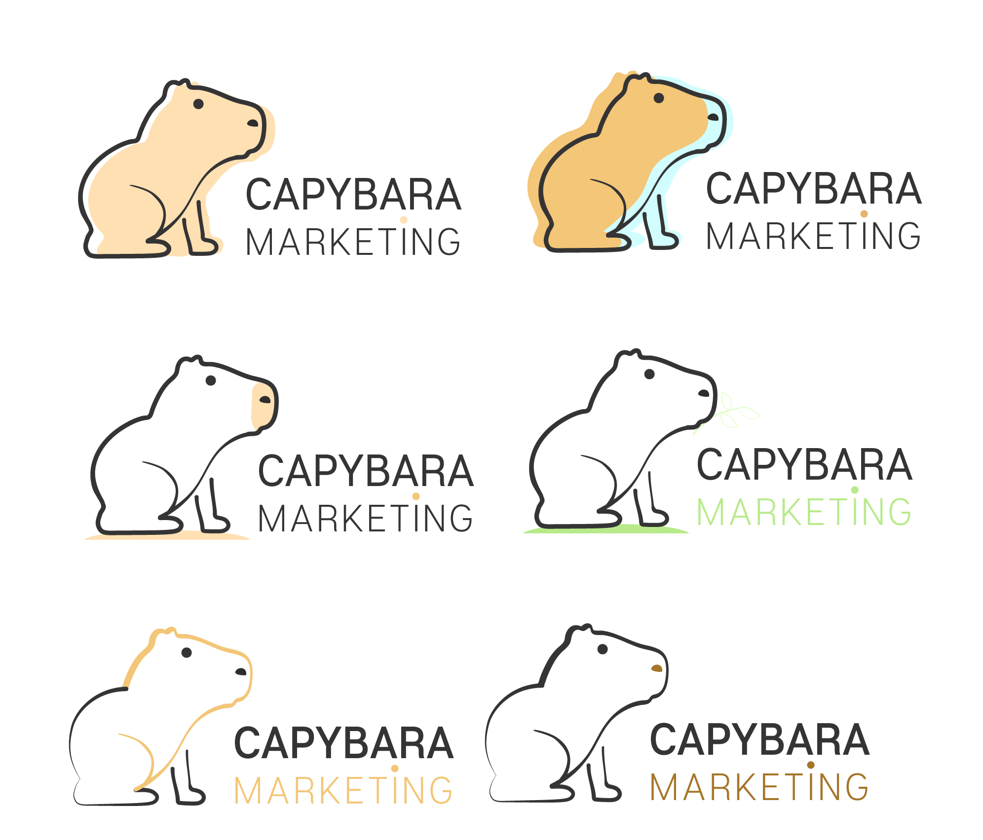
I have worn my heaviest sweater and decided to post my most recent logo attempts for the first time. It’s the first time I do so, and I’m here to learn how to improve.
I am not good at drawing but I did try to do my best.
A lil bit about the business:
My boyfriend and I created a small local marketing business and chose Capybara as our mascot since it’s considered to be one of the friendliest and the most social animals out there (plus we have a small personal connection to that animal). I do graphic designing and build websites while he does content writing, social media and etc.
We aren’t sure about the marketing addition (we actually preferred studio) but I wanted something that will balance the Capybara title.
We are up for any suggestions, including typography or colors. We are not strict about anything.
The idea was that we “complete” each other, since my boyfriend provides content writing services and I do graphic designing (I don’t draw often don’t worry ).
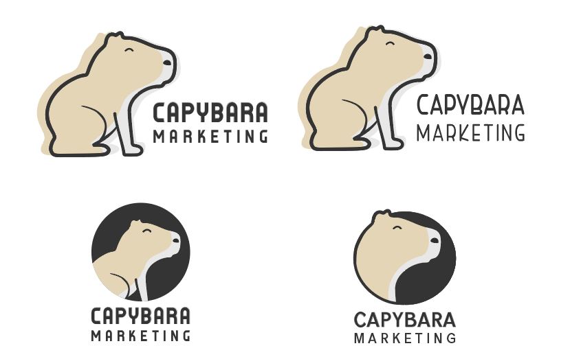
I like the top logos, but I agree the front leg(s) looks a bit like you didn’t know quite what to do with it. The leg appears to be on the far side of the capybara’s body, which leave me wondering where the leg on the near side is.
The top, left version seems best to me. I like how things are out of register and enough so that it looks intentional.
I would remove the dot from above the uppercase I. It just draws attention to itself as an inexplicable oddity. There’s a letter in the Turkish alphabet that looks like that, but I’m assuming you’re not from Turkey.
And speaking of typography, it’s awfully plain and generic. It’s also rather overshadowed by the capybara, which might not be bad except that the peculiarity of the animal really draws attention to itself. If it were me, I might try a different typeface and play around a bit with the compositional relationship between the typography and the illustration.
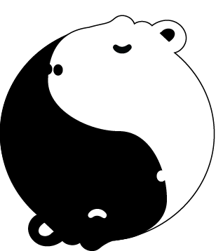
I’m not caring as much for the ying and yang logo. It’s a nice shape, but mixing Chinese symbolism with large South American rodents is, well, sort of odd.
For me it will look cool if you combine the shadow style to the upper logo. about the 2 color combination instead of light blue maybe a light brown or dirty white will do.
Also the typography is really plain maybe change the capybara into a frontpage types of font will do.
About the yin & yang I find it cute but its not my style of logo, because it would take almost 5 seconds for people to recognize the 2 capybara sleeping. Maybe adding two ears for each capybara and adding 1 more details will do.
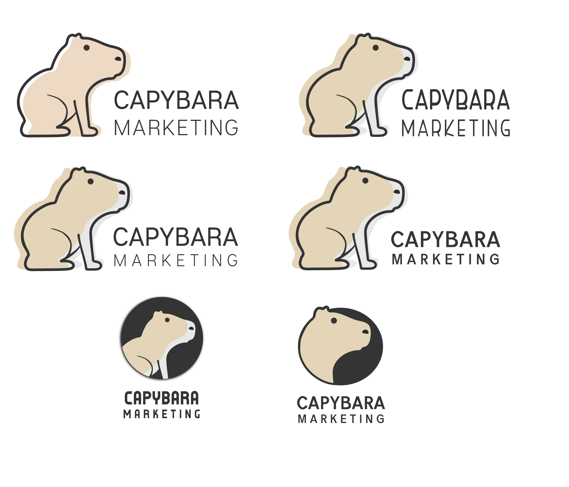
So I took the suggestions you guys came up with and made several more attempts. Wondering which version you prefer, and if you have any more suggestions. Thank you!
Yay! Thank you
I tried several typefaces there, anything else that might work better? Or may I ask for a font suggestion (just for a reference so I understand what kind of font would be the best in this case)?
Also, in the case of the top right capybara I have the urge to add some color to the text itself. I don’t how but it feels like plain text isn’t enough. I tried to color the holes in the letters with the dirty white, but it didn’t look good.
Hi there! Thank you for your helpful feedback! I tried to make the M and the C start at the same vertical point I can see it needs some accuracy work. As for the leg thickness, the foot itself is pretty much the same thickness, just the part that connects the body gets thinner the closer it is to the body itself. but I’ll check it out once again and try to accurate it.
What would you change about the bottom left typeface?
It’s really nice to see your progression and how you’ve implemented @Just-B’s advice. The second set of drafts of the capybara with the revised front leg is much better but for some reason I really like the bottom right logo. I guess it’s because it looks more like a logo rather than an illustration of a capybara.
For the typography, you have two words, set in slightly different ways. I would try more contrast between the two. Try for example, large bold CAPYBARA and small light/thin MARKETING.
I love capybara too and one thing about them is they always look very chilled out. The round eye you have used makes him look a bit startled. Have you tried a half closed eye?
Hi!
Thank you I have been “avoiding” making my own logo because I kept criticizing myself, and for years the phrase “the shoemaker’s son always goes barefoot’” defined me. The suggestions here really helped me progress.
I have been thinking whether or not I want to keep the marketing there. In the beginning I wanted it to be studio and not marketing but I changed it because it felt too short and I wanted to balance the typeface. For some reason I have felt like both top and bottom text have to be the same width. Don’t they?
As for the eye, well in one of the earlier versions I did try to play around with the eye I’ll give it some more attempts though.
Like @Just-B said: …speaking of typography, it’s awfully plain and generic. If it were me, I might try a different typeface and play around a bit with the compositional relationship between the typography and the illustration.
So… to answer your question: I’d search a typography somewhat more fitting with the capybara illustration. A bit playful with a serious note. Right now the typography is a bit too… boring, almost the same font i’d choose to write in my e-mail.
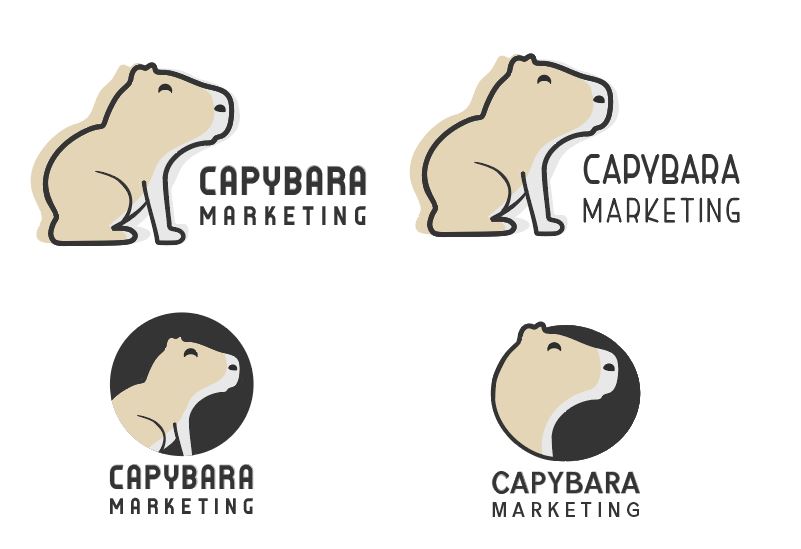
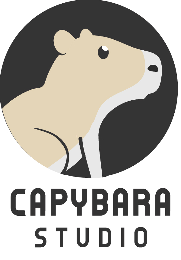
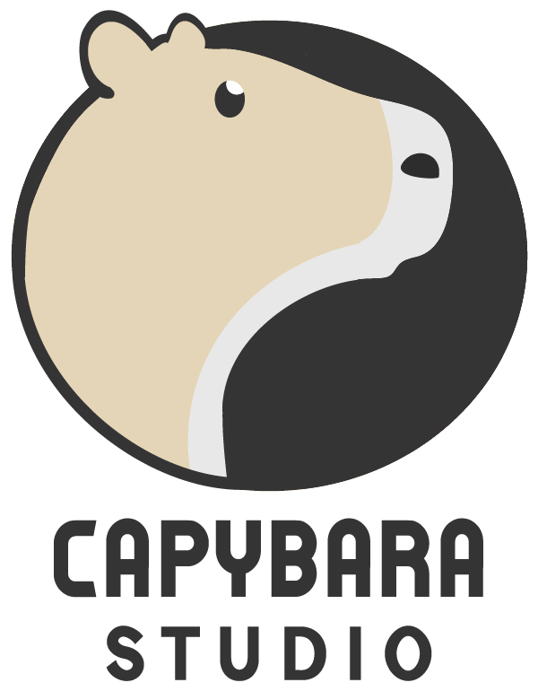
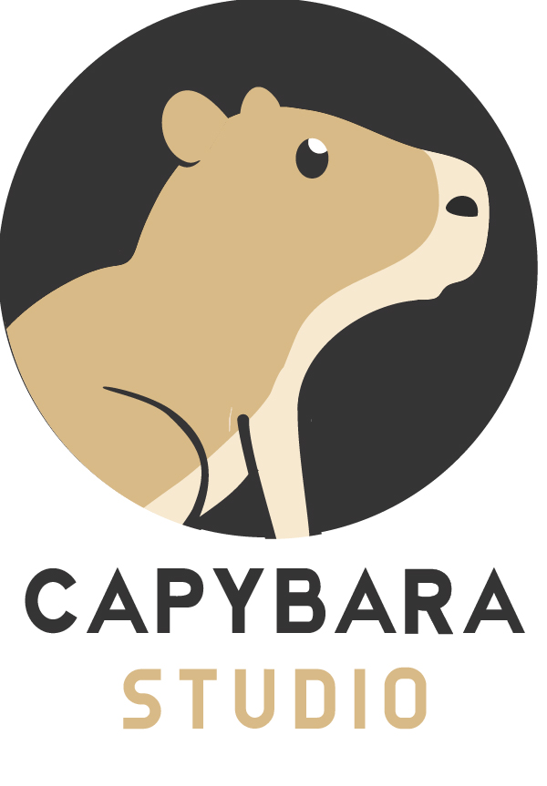
I tried to change the ears and the eyes, Moreover, I tried to test some other colors aswell. I tried to play around with the typography a little bit more. I would love to hear whether you guys thing there’s some progress with the typography, if you prefer the whole-body or just the head logo option and also if you think the colors should be more light or orange’ish. Also, any more suggestions are always appreciated.
You have been helping me a lot and I have made some progress (hopefully) thanks to your advices.
This has made some really excellent improvement. I see a lot of people are giving you great advice so the only thought I’ll add is that (on your most recent posting of the 4 versions) I like the type treatment on the first and third options the best, and I liked the capybara better when his eye was closed and his colors were offset from his outline.