Having found my current portfolio a little bit lacking, I’ve decided to start CATS’ HOME, a comprehensive project which comprises of 3 phases: Logo/Identity Design, Website Design/UI Design, and Product Design.
I’m posting this project here hoping to hear everyone’s comments and critiques on what are I’m still lacking in and what I could improve on to further my career.
Thank you for your interest! And thank you in advance for your kind time, efforts, and consideration.
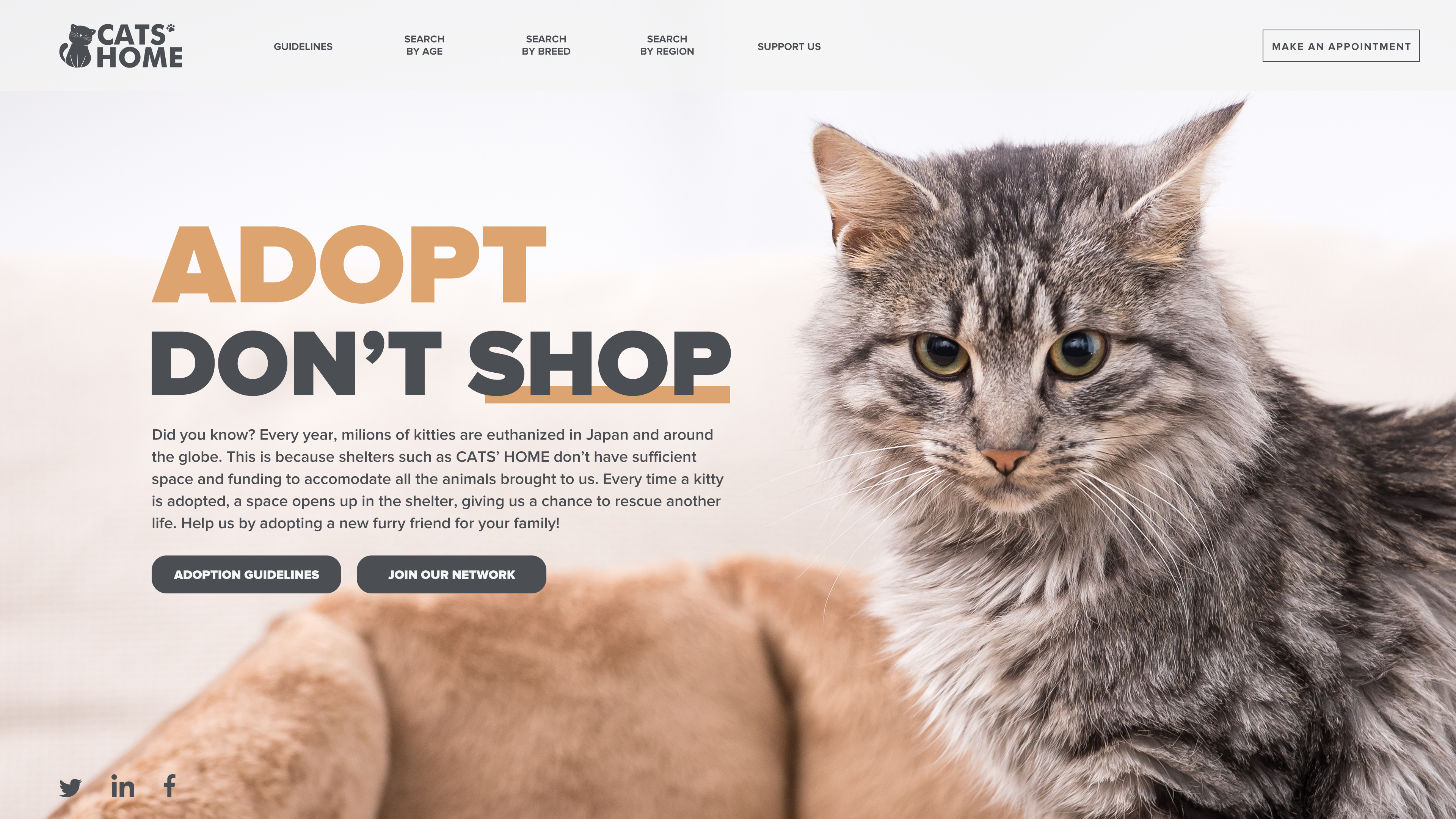
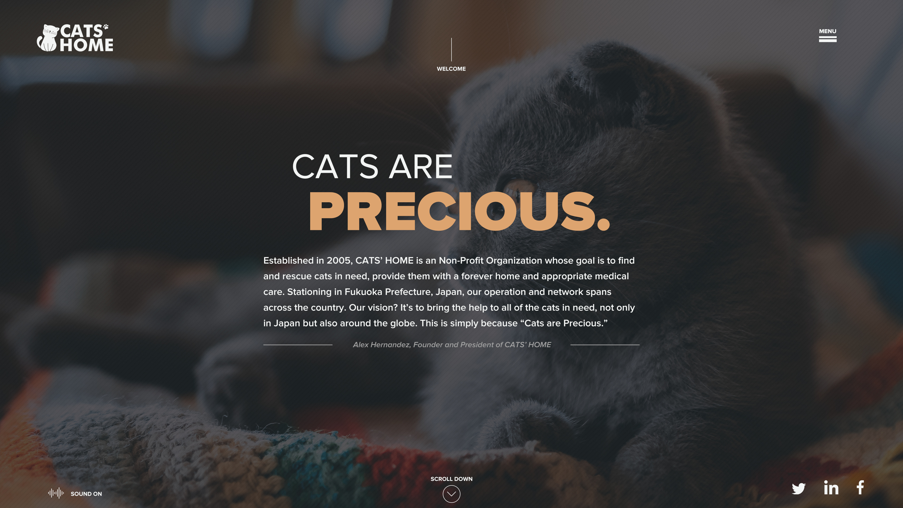
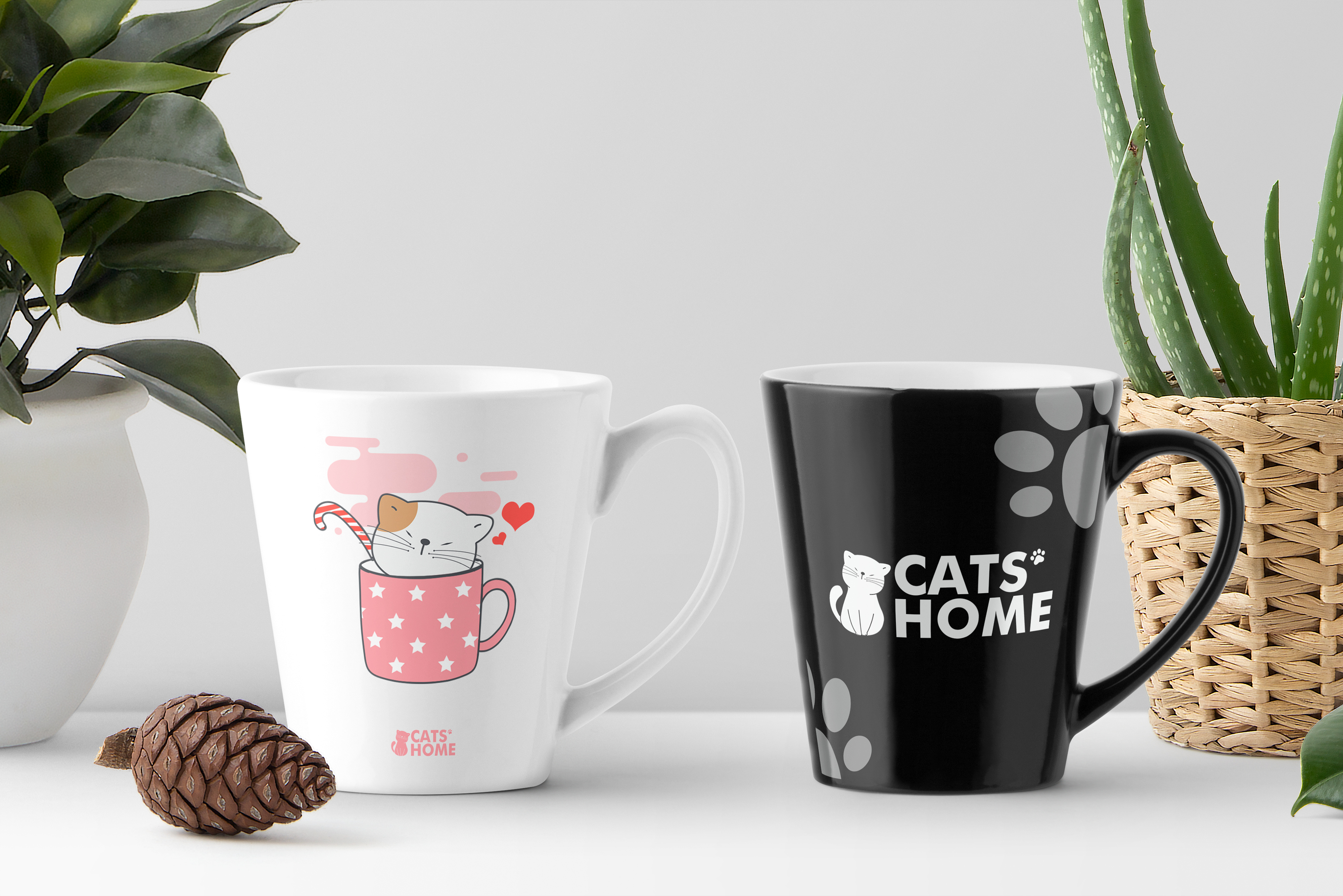
P/S: In addition to the link above, I’m attaching some images here as a quick sneak peek at what the project does. I hope you don’t mind this action of mine.
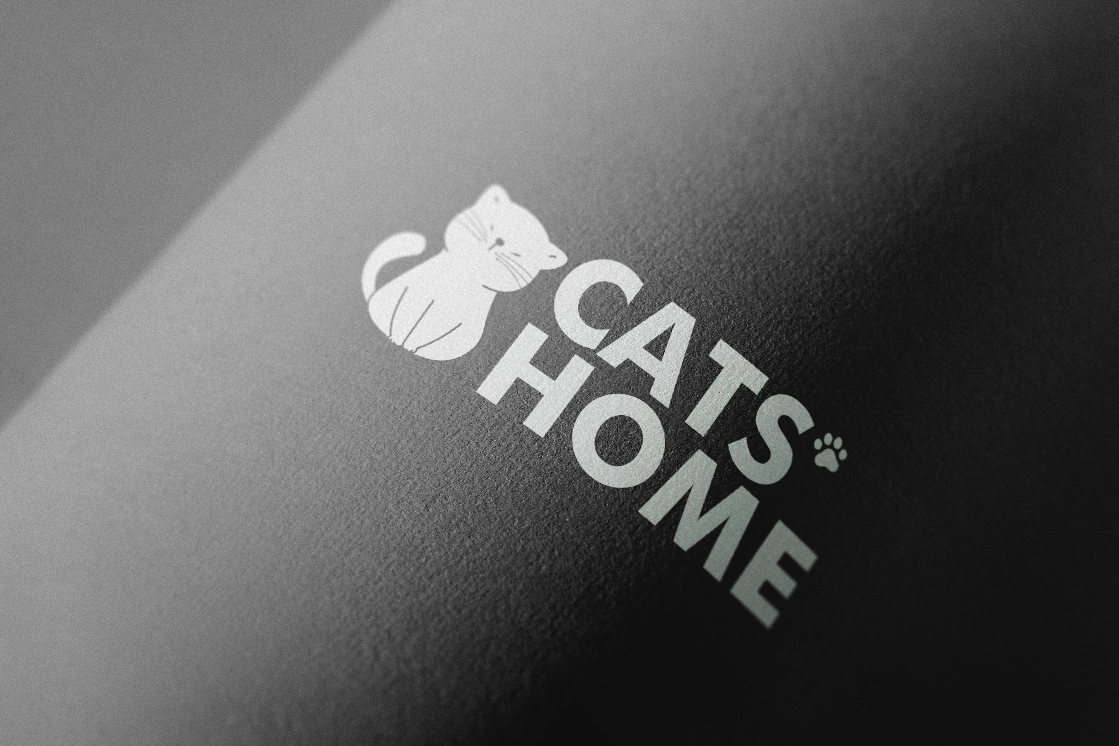
I like it too, but the thin lines inside the cat would never hold up at small sizes or with some kinds of printing on some substrates. The front page might pose some positioning challenges in a responsive layout. It does look nice, though and would likely be effective.
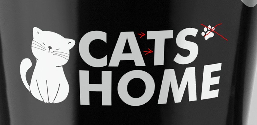
This looks really nice! I agree with @Just-B, the lines in the cat don’t hold up when the logo is small (see the pink mug, and even on the website the whiskers almost disappear) and I don’t think the paw holds up well either. When the logo is super small it kind of looks like a trademark symbol. I also think that the welcome with the line seem kind of out of place for me. I get the line mimics the ones below the paragraph, but I wish the menu button, cats home logo, and the ‘welcome’ weren’t all on different lines. Or that the line above welcome started at the same y-value as the menu button.
Besides these really small (no pun intended… or was it?) things, I think it’s a really beautiful project. I especially like the mugs!
@Just-B@st17
Thank you for pointing out the issues that may happen when scaling the logo down, and also for pointing out the positioning issues. I’m still a bit inexperienced so these feedback helps me a lot. And yeah, I can see the puns there
Kerning between the letters C and A - Maybe I’m wrong on this and I would hope some of the ultra experienced designers correct me if I am - but I would move the A just a little to the right.
I too think the paw print is superflous - I would just let the cat mark be the hero rather than trying to do two things at once.
Keep the colour of your mark the same colour as your text. You’ve done this really well everywhere else, but on this mug they start to look like two seperate things.