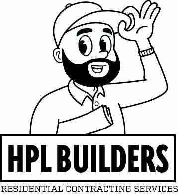
Hello, I have been away for graphic design for decade and I have recently decided to pick it back up. I figured a good project would be working on a logo for my company. I am a general contractor and I want to create a cartoon character of myself that would also look good on the back of a shirt. This is a early attempt but I wonder if I am headed in the right direction. The font I picked is just place holder. I want to get the character right first
Honestly; cartoon characters for self-employed trades is one of those awful design clichés, along with jigsaw puzzles, crosswords and light bulbs. For me it is a real ‘nails down the blackboard’ thing. I am not even sure why it became a thing. Why would you want a jaunty comic character associated with a business that can have serious potential downsides? I want an electrician that isn’t going to burn my house down; a builder that can build a straight wall that isn’t going to collapse in three years time.
I know the received wisdom is that it makes you look approachable and friendly. In reality, although that is of some importance, what I want from a tradesperson is quality, trustworthiness and skill, rather than a cheeky chappy to chat with over a cuppa.
Apologies if that is not what you want to hear. My advice is, dig deeper and don’t stop at the first idea. What differentiates you from your competitors? Work on that and come up with a solid idea.
Good luck.
Yeah, I agree with Sprout to a degree.
For me, if I’m looking for a builder or someone to do work around the house, the first thing I care about is how to get in touch. That info needs to be clear, easy to find, and when I reach out, I want a reply. The number of builders, electricians and plumbers I’ve contacted who just never respond is wild.
So before getting too hung up on the logo style, think about your message. A tagline or motto can go a long way in setting the tone.
HPL BUILDERS
Residential Contracting Services
That line makes me think you’re high-end, maybe focused on full builds or big projects. But then the cartoon character gives off a totally different vibe, friendly, casual, maybe domestic repairs or renovations.
So the two don’t match. It’s giving mixed signals. Are you building full homes with developers, or are you doing bathroom refits and attic conversions for homeowners?
Right now the logo comes across as playful, which can work, but only if your brand backs it up. If you’re serious and skilled, show that in the design. If you’re approachable and affordable, then lean into that. Just make sure everything lines up with who you are and who you’re trying to attract.
I’ve never been a fan of single-stroke outline art, though I know it’s a style of simple art these days.
Maybe think about giving more weight to the areas that would be in shadow. Or not.
I’m with the others on using comic characters to represent professionals.
I see a van every once in a while on my commute. A painter. His cartoon character looks like a child holding a huge brush, and to top it off, there are brightly colored paint spatters all over the van. Uh…no. I don’t want paint spatters all over the place. Makes me smile though. For all the wrong reasons. LOL.