I posted in another forum about doing a Broadway Play poster; and though decided it was a bad idea overall I already started one. I finished it off and was just hoping for some constructive criticism.
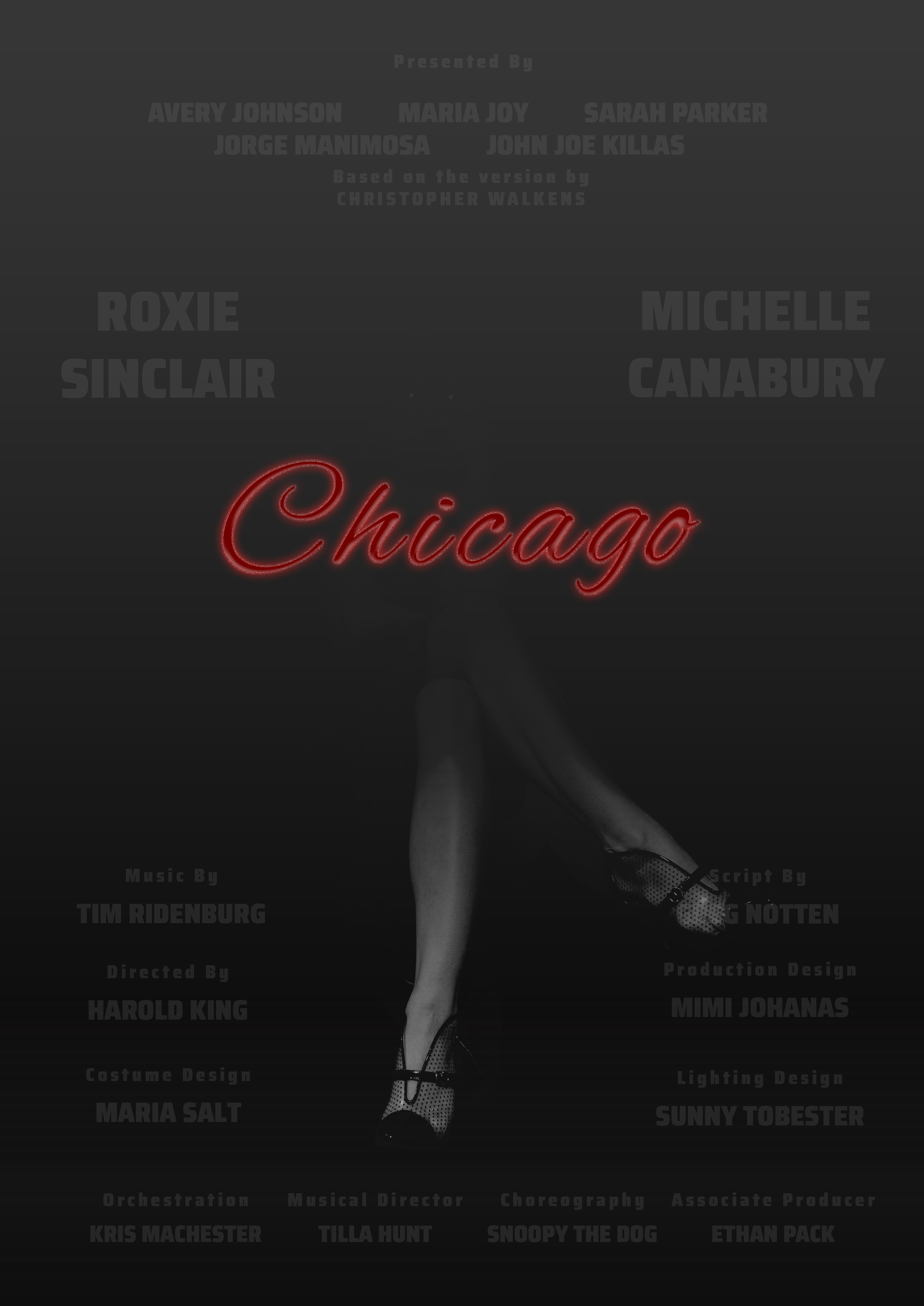
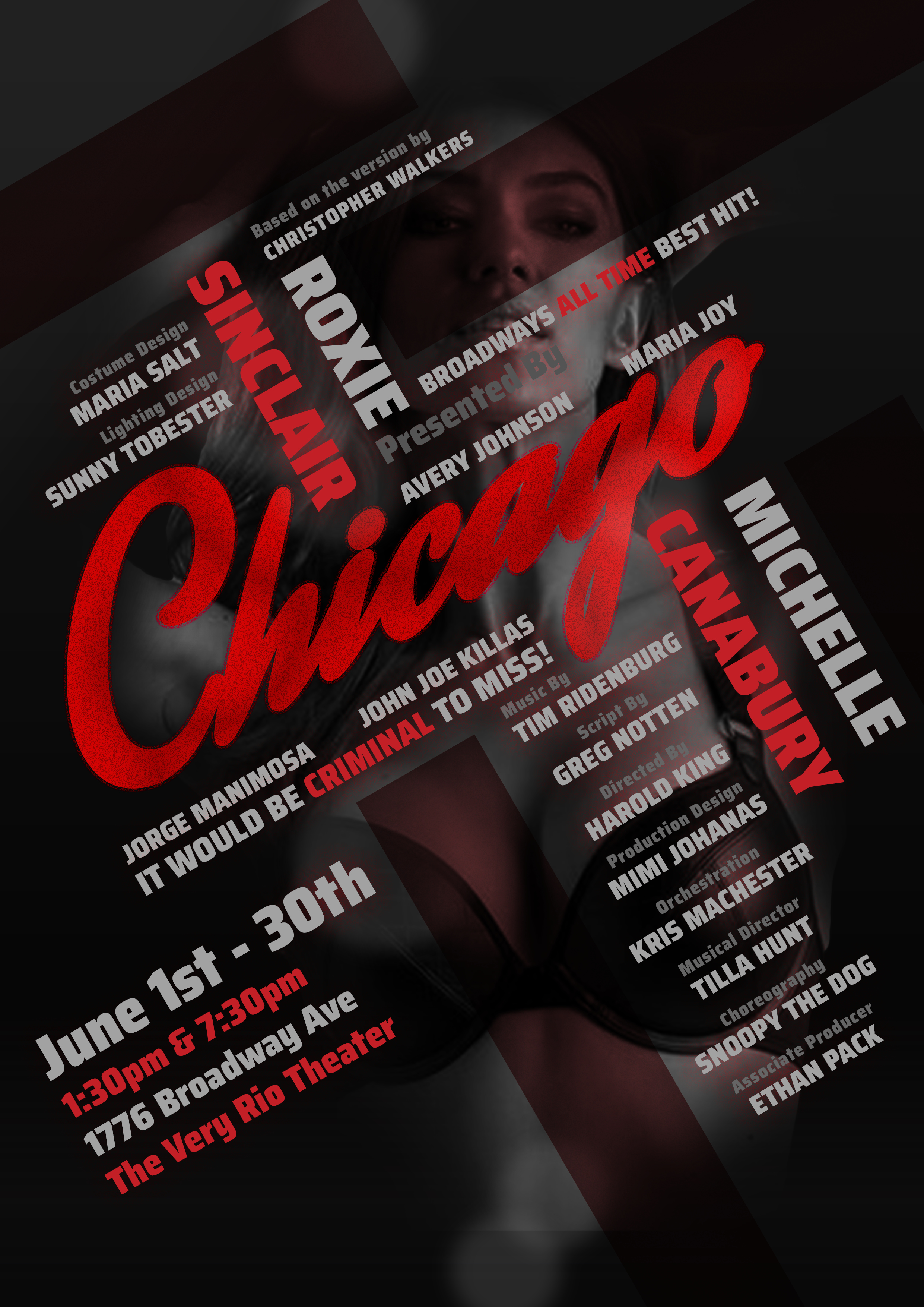
Its for the Broadway play Chicago. Everything is made-up except for the shows name. The show itself is a burlesque/mystery based on a 1927 play written by a court reporter who covered a case of a woman who murdered her lover. The poster is meant to have a sense of femme fatale mystery. I went away from the actual Chicago Branding (bold exciting with a sense of noir) in an attempt to make it my own and give it a darker tone.
Im not sure about the low contrast on the typography. but I didnt want it to overpower the graphics.
You may as well put pretty feet on a totally black background. You have no contrast at all in the text. Even the red text will not stand out much. Totally not sure who wrote the script as it falls behind the shoe…
The point of a Show Poster is to tell someone across the lobby about the next upcoming show, who’s in it and the run dates/times.
This one will not work.
As my college GD professor was fond of saying,
“Do Over.”
I wish it weren’t the case, but I need to agree with the others.
The whole reason for a poster is to attract attention and communicate a convincing message. In other words, it needs to be legible, readable and easily understood — preferably from a distance as well as close up.
Squint your eyes or look at it from a few meters away and it’s a sea of black. The word Chicago might be readable, but there’s no real clue as to what it means. The script typography makes it look more like the logo of the popular 1970s band named Chicago than the Broadway play.
The legs might suggest dancing, but it comes across more like a noir movie that doesn’t really match the jazz personality of the play.
In addition, you’ve played it too safe with the layout. The play is a big, bold production, but your imagery is small and understated. Sometimes, a designer needs to seize control of the page and unambiguously spread the message across it in a way that demands attention and reinforces the personality of the subject matter. Carefully spreading out all the elements, like you’ve done, looks a bit more like an exercise in social distancing than a Broadway musical.
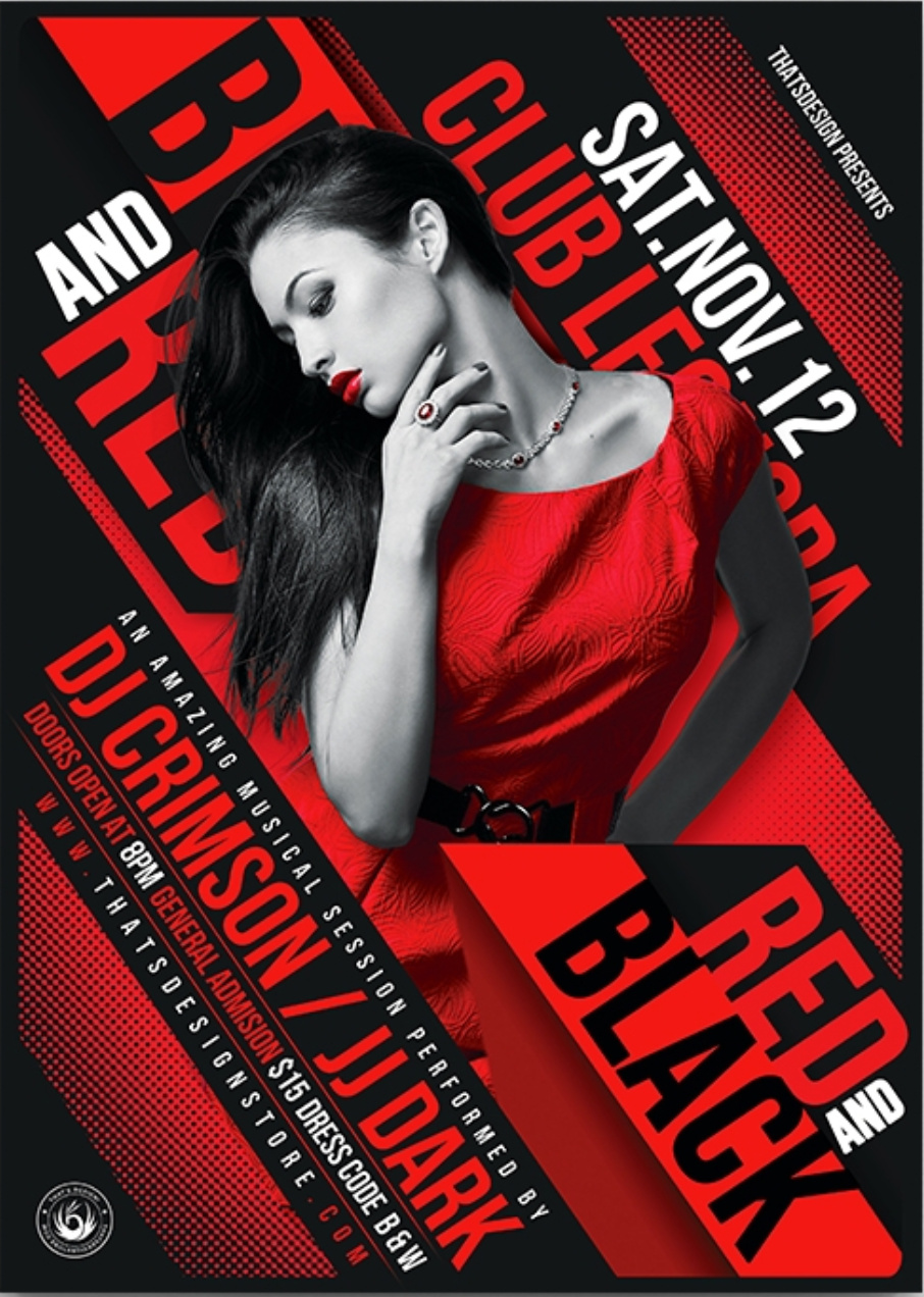
That said, I’ve seen some really cool-looking posters using red imagery on black. The difference being the aggressiveness of a layout that demands attention, like the one below.
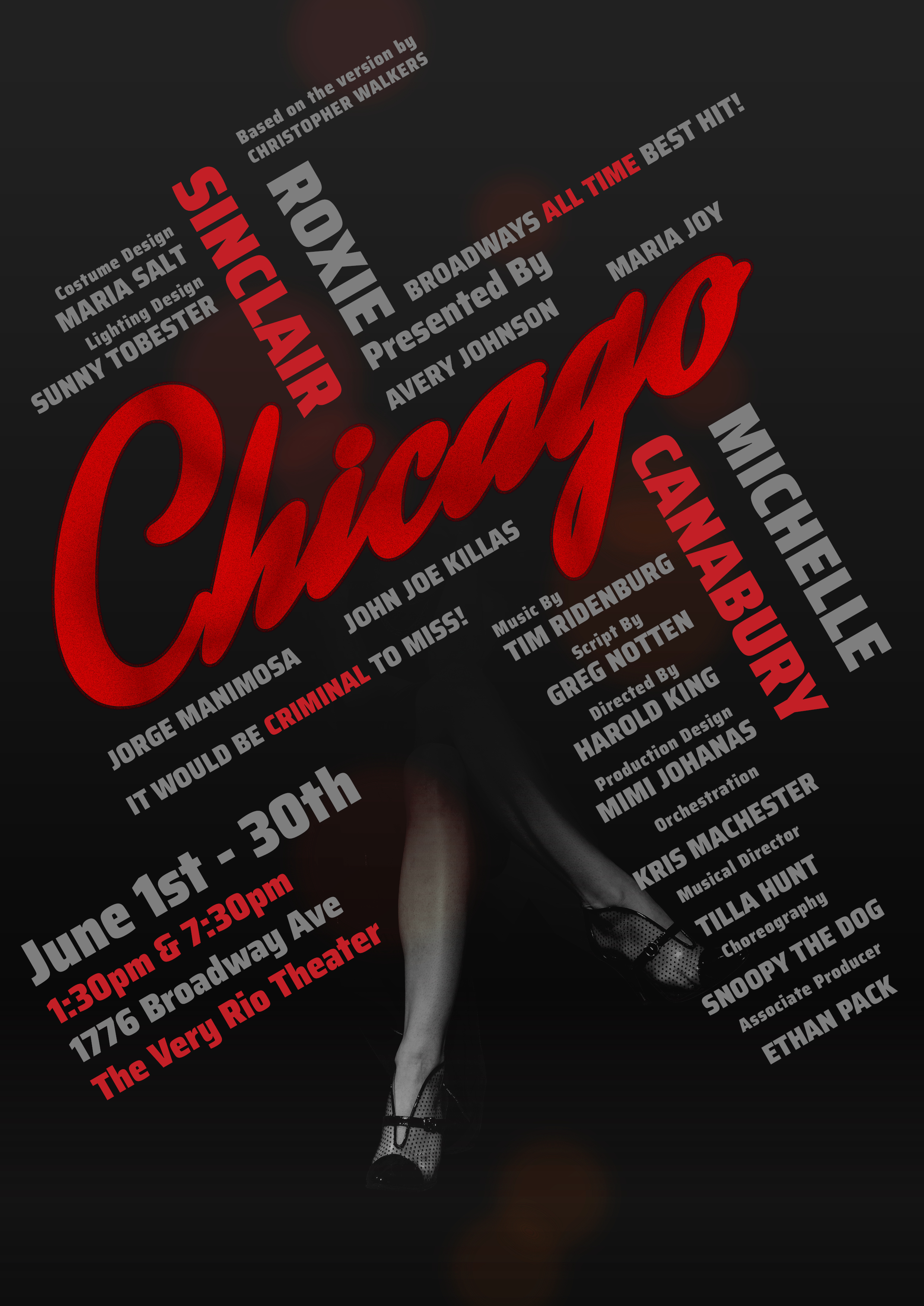
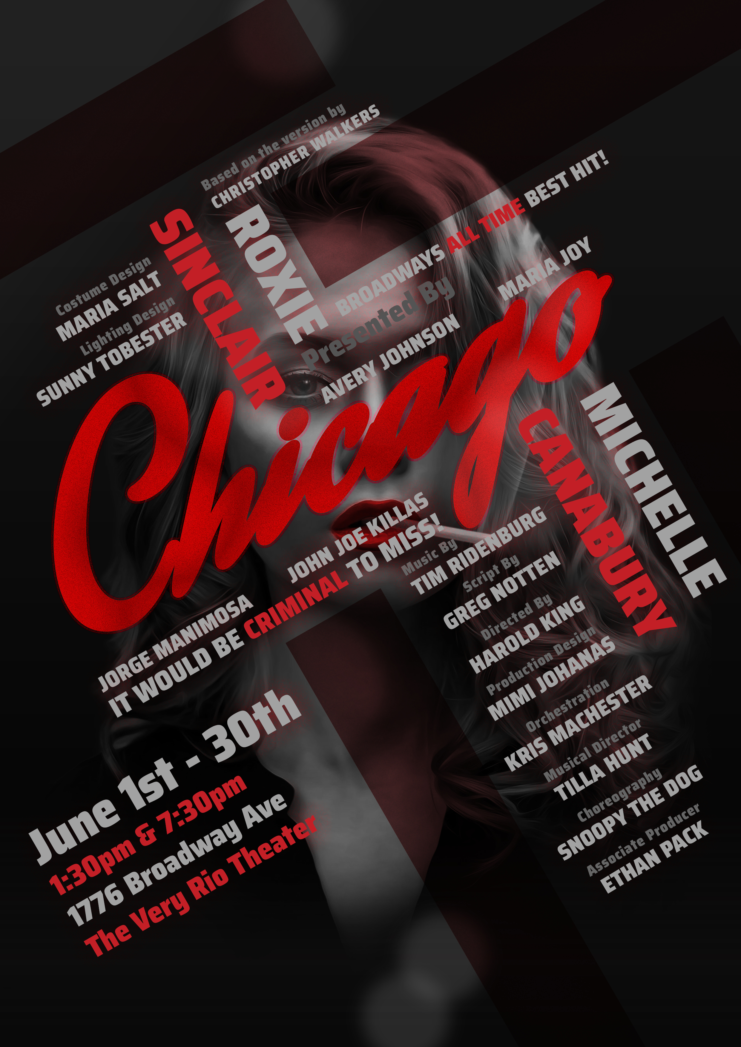
Hey, thanks for the feedback. I didn’t really want to keep going with it but the resounding negative feedback really hit where it hurts. Very valid concerns. I guess I was thinking too muted for a big Broadway play like this. I did a redo. Stuck with the same imagery of the legs fading into shadow, I personally like that imagery I think it gives off a mysterious vibe but I think it doesn’t work well this the new layout. Lemme know what you think! Thanks
Now you have a hierarchy problem. Things going in two different directions and basically all the same size. You also have the names more prominent (less grunge) than the title of the musical.
It’s just occurring to me that, out of the close to 50 theatre shows I’ve worked on, I don’t think I’ve ever seen Chicago in its entirety, and never worked a production. I had to look up the synopsis to see why you chose to use a woman’s legs (or other anatomy) as a focal point. Not sure that’s a wise choice simply because the theatre audience that is able to afford tickets to today’s productions is often more “woke” than the general population. Just sayin’.
Are you able to explain the heirarchy issue in a bit more detail. I personally thought it was ok but could always use a few more pointers to learn.
I also don’t understand what you mean by woke. Could be that they are more liberal or that they are more conservative and wouldn’t like the imagery. I’ve never actually seen Chicago but based on my research it’s a burlesque type of show(probably not strip down naked type) and typically Burlesque nowadays generally are about womens sexuality and feeling powerful and beautiful and comfortable in their own skin.
I don’t understand the purpose of this design. If this is for a real production of Chicago, then you may have issues with the image, depending on the venue and production itself. Is this production aiming for a more edgy vibe or are you just selecting images you like?
As far as the hierarchy goes, it’s closely aligned with the emphasis, a principle of design. Basically, it means that the most important elements are noticed first. This can be accomplished by placement, color, type size, and other things that can shape the way someone views the content. The most important elements are usually the most noticeable, sometimes, but not always, on top and the largest. With so many names on this poster, I’m a bit confused about what is important. Does the public really want full production credits or do they want to just know the stars and the run dates?
The usual formula for show posters seems to run
-(insert producer name) Presents
-NAME OF SHOW
-The two main lead actors/actresses (especially if big-name draws)
-The director
-When and where
-Sometimes the producer is listed here instead of at the top (depends on name draw)
-The rest of the credits and cast, if listed at all, are usually in smaller type at the bottom. This goes for ensemble cast shows too.
Look at some images of “Broadway Show Posters” to get the idea. I was gonna post a link to a goggle-search but the URL’s too long.