This is my idea for a children’s album that I have produced. I am (obviously) not a graphic designer and have only basic Photoshop skills, so any critique would be appreciated.
I am trying to convey a sense of fun and quirkiness in sort of a 1950’s style.
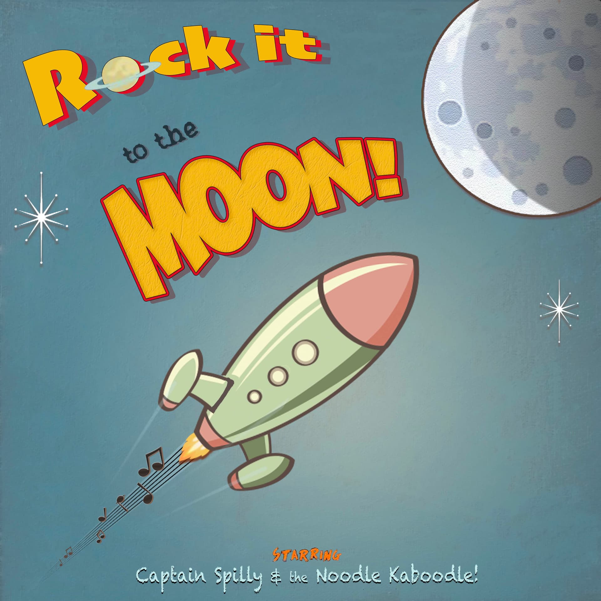
How can the graphic be better balanced? It seems like the use of space could be improved.
How are the fonts?
How are the textures? Colours? Shapes?
Any other comments?
Photoshop is completely the wrong tool for this task. You should be using Illustrator, considering you only have basic photoshop skills.
Needless to say it’s ‘Photo’ ‘Shop’.
Anyway - how does it look?
I know nothing about children’s music market, or the artists for this CD.
Did you come up with the illustration?
What’s the age it’s aimed at? Boys and girls?
The treatment to the Rock it and the Moon text are very different - why is this? It’s disconnecting the words, strange choice.
Is there ‘Rock’ music for kids?
Is there any benefits? Plain words, simple tunes, dance steps, a free poster inside, follow words on screen…?
Does it encourage activity like dancing, hopping, sing along etc.
Brings me to the main point - it doesn’t look like an album cover at all.
It looks like the cover to a cartoon series for kids about space travel to the moon.
I think the music trail of the rocket is too complex and I don’t think kids would understand - but depends on the age group I guess. How many kids see musical scores and know what they are?
I like the overall style and look. It’s fun, playful, and has a kid-like look from the 1950s or early '60s.
As Smurf2 mentioned, Illustrator would be easier to draw this in than Photoshop. That said, if it were me, I’d probably finish it up in Photoshop to give it a softer feeling more reminiscent of what one might see in the hand-illustrated art from the 1950s — for example, the textures and exhaust lines coming from the rocket engines.
Well, congratulations on seeing the first thing I would change. In a nutshell, the negative space isn’t interacting with the positive space, and none of the positive space shapes are interacting with each other. You drew a rock, some headline type, the moon, some stars, and the type at the bottom. Then you plopped them all into position equidistant from each other as though you were trying to spread them all around with the same amount of space between each separate element. Don’t do this. Fill up the space. Overlap things. Don’t just position the elements equally on a big sea of blue. Make the shapes dynamically interact with each other and the blue void behind them.
They’re playful and fit the mood of the illustration. However, I don’t care for the “to the” type or the typefaces you’ve used at the bottom. Save the clever, personality-driven typefaces for the headline. The other type can be lots more conservative (as long as the personality fits).
I’d definitely integrate the entire headline into a single composition rather than three separate things. I like what you’ve done to the word “MOON!”, but I’m puzzled why you haven’t done the same with “Rock it” and tied the lines together somehow with the “to the” line of type better integrated into the composition.
In addition to my suggestion of using a different typeface at the bottom, I’d make it bigger. I don’t know how much attention you want to give Captain Spilly and the Noodle Kaboodle, but they look and feel like an afterthought right now. It just seems like the words need to be larger.
As for the stars, if it were me, I’d make more of them in different sizes. I might also put subtle shadows in those moon craters to match the overall shadow on the moon. The light’s coming in from the left, so the shadows would be on the left side of the craters to indicate they are depressions rather than hills.
Again, I like where you’re headed with this. I’d just fix a few things that I mentioned.
As someone who designed Album Covers for many years, I have a very important question to ask.You say you are not a designer, so where did you get the images? It is vital that you make absolutely sure that you have a license to use any image you downloaded or you can get in big legal trouble very quickly.