I designed this poster on the fly a few weeks ago… any critiques? I’m used to working with a whole team of designers, so I’m really missing their opinions in this new freelancing thing… ![]() Like I said, this project is already completed, but I’m looking for any input towards future projects.
Like I said, this project is already completed, but I’m looking for any input towards future projects.
1 Like
This is a small thing, but if it were me, I’d warm up the colors a little to give it more of an inviting atmosphere. The beiges might be looking a little too beige and soulless.
I’m not sure about the script face you’ve chosen. It looks a little weak and oddly irregular for my liking. The lowercase r, for example, drops down further than the surrounding letters, which to me, looks sort of off. The apostrophe looks a bit too high and the separation between the n and s exposes one of the underlying problems with script font glyphs that are meant to connect — when they don’t connect, it’s noticeable.
1 Like
I have three thoughts.
First, the “n’s” really bugs me. Take out the apostrophe so that, hopefully, the “n” and “s” will connect. If they don’t, kern them so that they do. Set the apostrophe on its own and tuck it down where it belongs.
Second, for those unfamiliar with the Lyrics sacra Children’s Choir, it would be nice to know a little bit more. Not much as this is a poster, but something along the lines of “kick off the holiday season with a festive mix of Christmas favorites” or whatever. Right now, you’ve announced the event, but you have not given me a convincing reason to attend. Also, maybe a line about tickets, registering or say “free, and open to the public.”
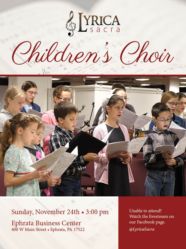
Third, the photo is only so-so. It appears to be sharp and well exposed, but, with everyone in street clothes and what appears to be an office, it looks a little unpolished. I would like to see the kids in matching clothes on a stage.
On the plus side, the layout is nice, and the info that’s there is presented clearly.
The thing that struck me immediately was the image. Those kids sure don’t look like they’re having fun.
The typography only came in second. Might check the glyphs chart. Sometimes script fonts will have an S to be used after an apostrophe that has a longer leader. And be sure your links align. Don’t rely on the font kerning to do it for you. Your cap C’s don’t connect to the H next to it and the R’s show a gap. I saw this typeface recently for a project, or one similar, and there was no help for it. The typeface was poorly drawn.
Yes, I totally agree with you about the image. ![]() Unfortunately, this was all I was given to work with, soooo… yeah.
Unfortunately, this was all I was given to work with, soooo… yeah.
Thank you for your tips on the typography. That would definitely be my weak side.
Thanks for the typography tips - I need those! Yes - street clothes would be the word for it. ![]() Sadly, all the photos I was given to work with were just from a rehearsal… soooo no nice concert clothes.
Sadly, all the photos I was given to work with were just from a rehearsal… soooo no nice concert clothes.
Nothing wrong with updating the type and dropping in a stock photo to create a second version of this for your portfolio.
Agree with the apostrophe, kern that tighter. When one writes a word with an apostrophe they stop and start the s all by itself, it is one word that is supposed to be connected. Especially with a script font.
Looks like there is a white rule under the kids picture but the cranberry box is on top of it covering it up.
In the future try uniting all the boxes by placing some atop of each other
using an effect like a 70% opacity on the children singing can make the poster interesting.