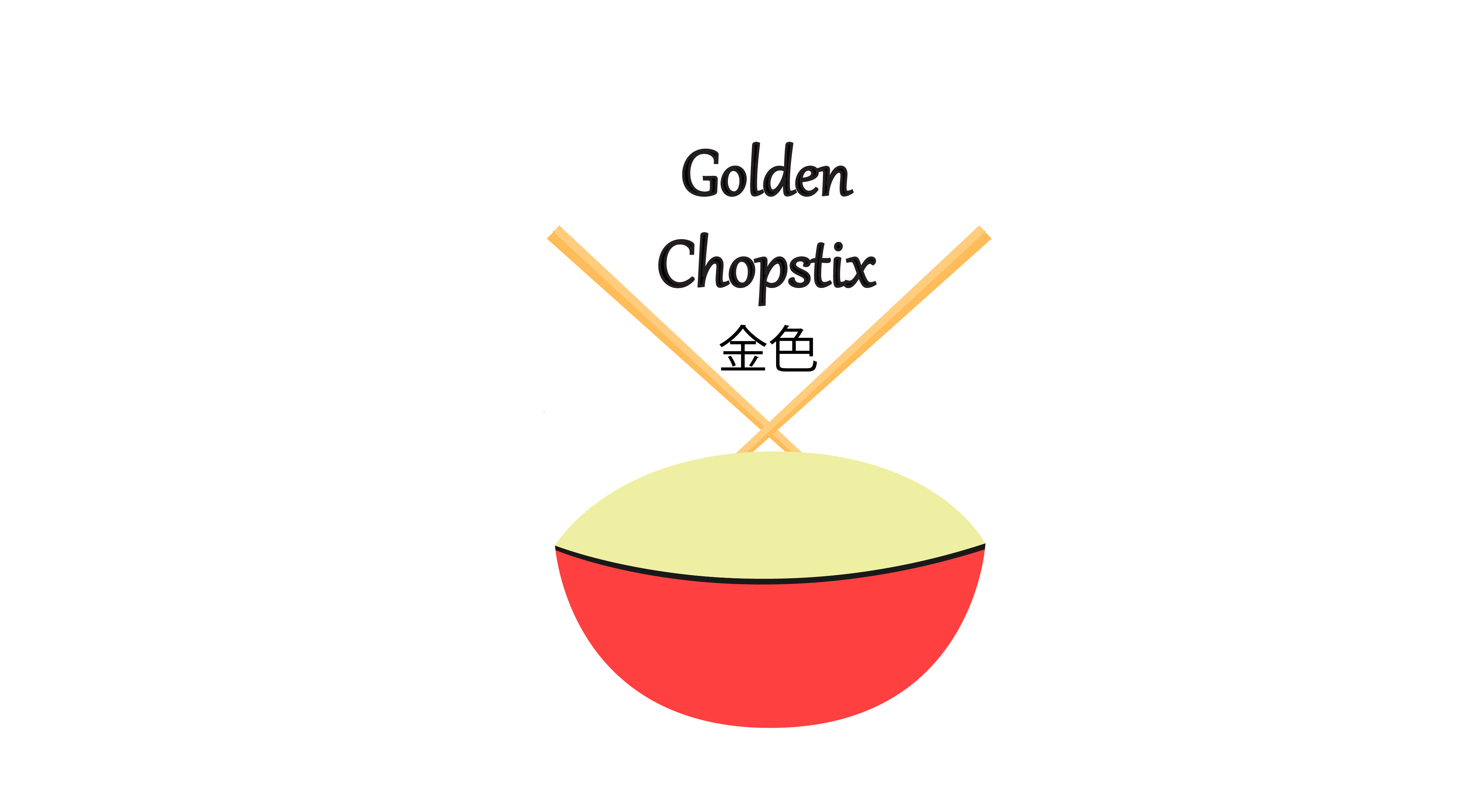
I’m a student doing a project where I have to completely redesign a logo for a restaurant. My restaurant, Golden Chopstix, is very welcoming to families, comfortable to eat at, and affordable. It is incomplete and I’m planning to put noodles in it. Is there any advice you could give me?
Are you in the same class as vrosas7 from this other thread?
Hi! I like what you’ve done so far, some suggestions would be to place the Chinese characters of ‘golden chopsticks’ onto the bowl as it would integrate the text into the logo in a more natural way. It would be great to have the English typography in the style of noodles (loopy fat or flat noodles). Good luck!
Just my grain of sand here.
When designing, one has to consider the cultural references included in the design. In most countries of Asia, specially Japan, it is considered bad manners to leave the chopsticks standing up in your bowl as it is seen as a reference to death because they resemble the incense sticks lit to honor the dead. So, I wouldn’t be too sure about the positioning of your chopsticks.
I think the font lacks grace and personality: try to use the words as another piece of your composition, something that can add vibrance and strength to your logo, and not just as an afterthought or “something that needs to be there”.
Thank you for bringing that up Elewys.
I was going to post this:
https://everythingchopsticks.com/Guide-to-Chopsticks-Etiquette-Around-the-World.html
As for adding anything more to this logo, It’s already too busy with too many fine details. Noodles would push it over the edge.
Consider all logos for restaurants as if you were reading the name on a sign out in the street. It needs to stand out, needs to be inviting, or at least look like someplace someone would want to eat.
Do not let your unfamiliarity with the software limit your imagination. Do a LOT of sketches first, then figure out how to make the program do what you want.
2 Likes
I’m in agreement about the cultural reference. There’s a story about a non-Chinese girl who put a Chinese character on her body to mean “chick”, not knowing the same character also means “harlot”.
Allan: The lesson is – verify the translation is legit.
What grade level are you and what’s the course is this assignment is for?
Agreed. Good logos don’t need much detail.
Here’s a logo with chopsticks that uses the “X” for the sticks.
This is good, but I would suggest more detail on the noodles in the bowl
The bowl doesn’t look like a bowl. I think the foreshortened circle needs to be compressed further.
Also the texture of the chopsticks is different from that of the bowl. It might be better to stick with one style or the other.
I agree, they should add shading to the bowl to make it match the chopsticks
Bearing in mind that gradients are one of the top 10 crash landings for a logo in production?