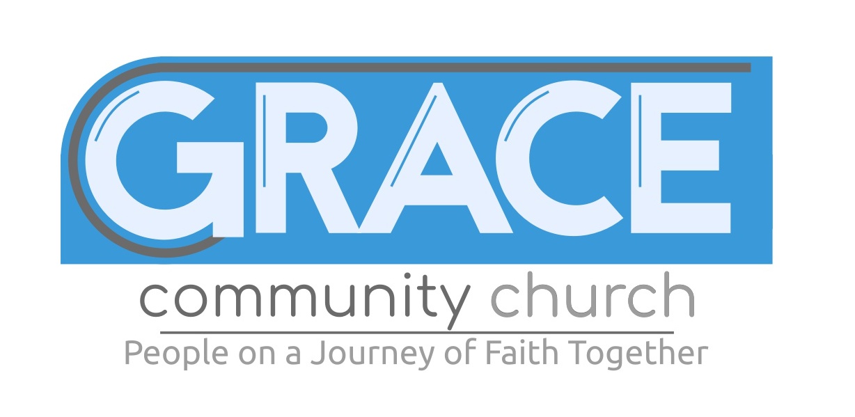
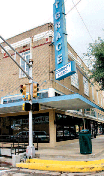
I have been working on a new logo for my church, interested to hear what you guys think. The church has been around for many years, we’ve recently remodeled and updated the facility on the inside. It’s still has a very rustic, small town Texas feel, I wanted to capture the history of the church but at the same time give it an updated look. The most iconic part of the building is the old sign at the front, I wanted to work off of that sign. Here are some rough draft ideas, any thoughts would be appreciated:
1 Like
I think that’s a pretty good start.
For better readability and print quality at a small size, I’d suggest you:
- Remove those skinny lines in the letters (they serve nothing)
- Remove the bottom message (too wordy for a logo)
- Make the “Community Church” larger
I also have a font suggestion. I created some signage for a church program, and used the free font Teen because I felt it had a church-type feeling.
![]()
1 Like
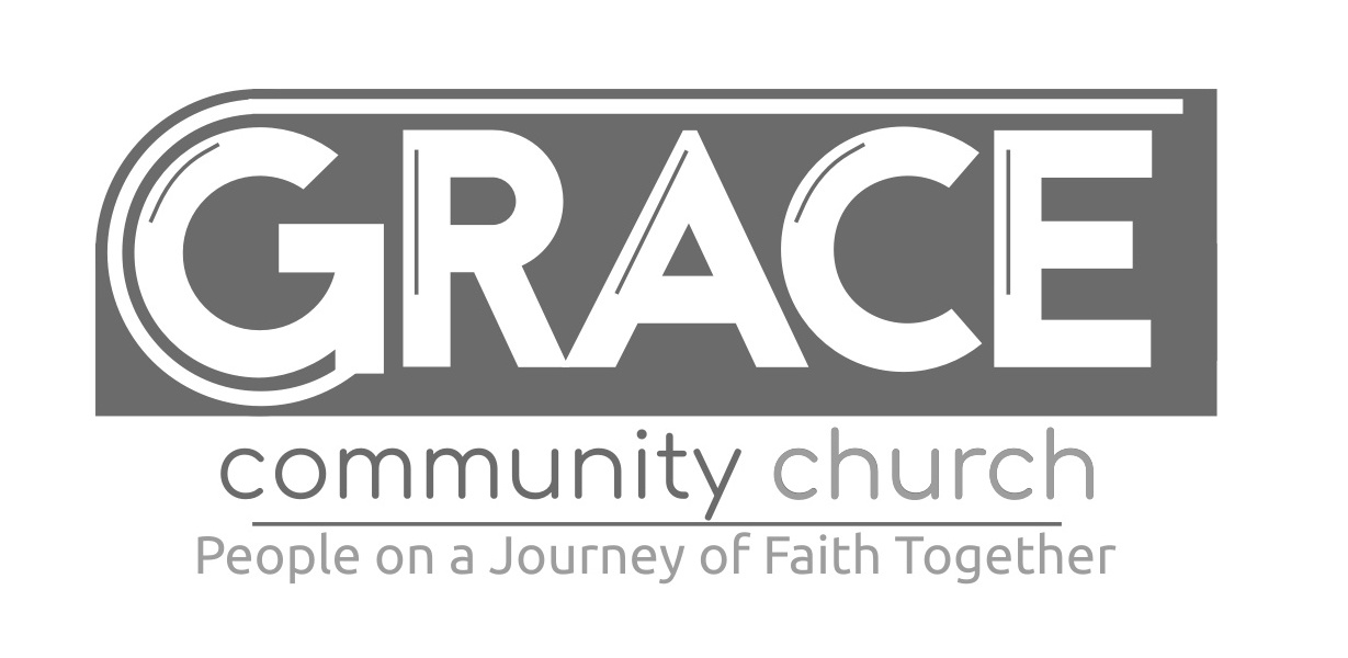
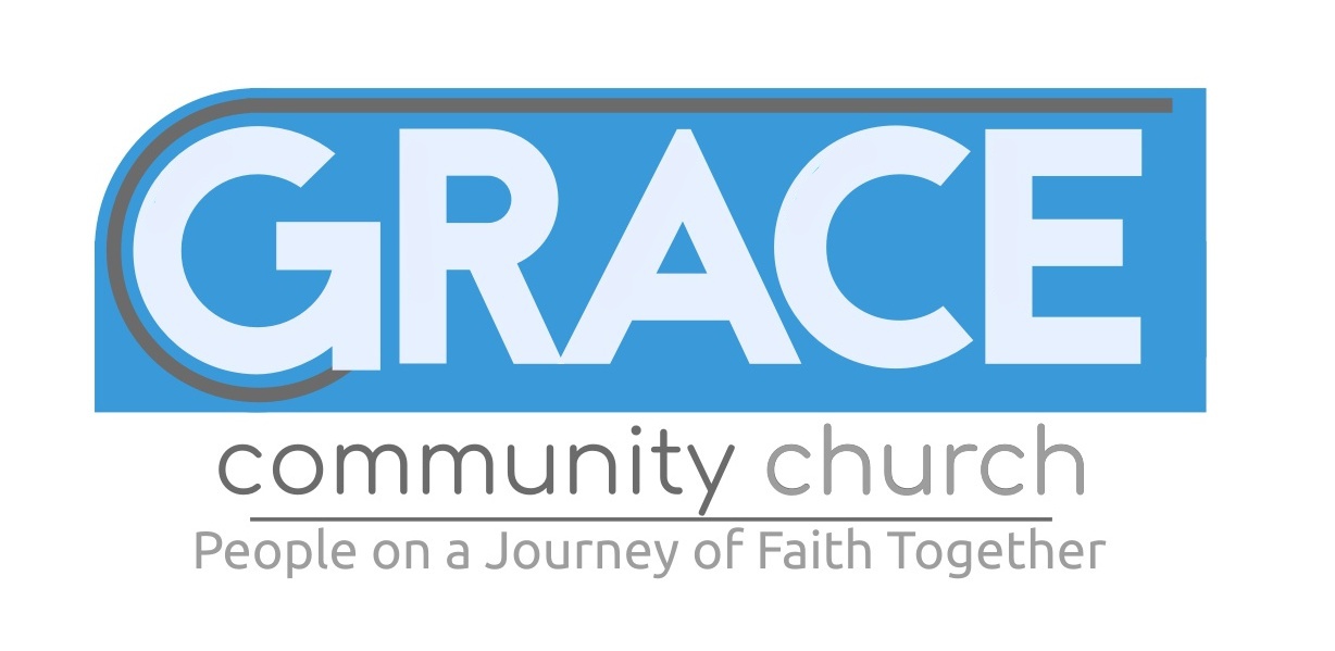
The 3rd logo loses the thin lines withing the typography. A smart choice, as those lines will prove difficult to print.
If that’s a third typeface on the tagline/slogan i would conform it to the one above it. Also, if you came up with the tagline yourself, I don’t like the way it reads.
People together, on a journey of faith
People together on a journey of faith
Together on a journey of faith
People on a journey of faith
What will happen to the vertical sign? Will you adapt your horizontal logo to be vertical? If so, since that sign might very well be the most public identifier of the church, shouldn’t you have designed the logo to fit the sign?
What is the significance of the gray line that wraps around everything? Is it just decoration?
Why is the G slightly larger than the other letters?
From the looks of that “R” on the sign, I might have to put the typeface as Helvetica - if you’re going for a match on the signage.
Oh yeah, that can go too.
I say that because everything on a logo should be deliberate and serve a purpose.
I say fabricate a meaning for the line ![]() (or at least I hope there is a predetermined meaning)
(or at least I hope there is a predetermined meaning)
Otherwise what have we got left? A Futura-esk-bold type in a box.
That’s no fun!
They can put the black line between the top and bottom pieces, okay? ![]()
The gray line does not work at all with the blue.
Are they getting rid of the old neon sign?
I wonder if the congregation has an attachment or fondness for that old neon sign. I wonder if the community at large loves it or hates it. Those questions need to be asked. Removing a local icon can have repercussions.
What is their intention for their new sign?
Do they own the building?
I prefer the lettering on the actual sign to the typeface you’ve chosen to mimic the sign. Was there a reason you decided to go with a different face?
Thanks for all the suggestions, outstanding stuff here. I don’t necessarily want to match the sign exactly, I wanted a more modern feel for the logo. The sign isn’t going anywhere, it’s one of those small town landmarks that has been there forever and people love it.
I appreciate everyone’s input, you guys gave me plenty of work to do here. ![]()
I like the third one. But like others have said, I would get rid of the grey line. I’d also try some different fonts for the word “Grace” as at the moment, it doesn’t look very graceful.
The rounded font you have used for the subtitle is nice and friendly, although I am not sure if it will be too small to read (Maybe make it a little bolder?) I’d also put community church in the same colour, as it seems a bit odd to read when word is darker than the other.
I agree with that. The personality of the examples posted says something closer to “industrial degreaser.”
That said, I doubt I’d give it high marks if you had given it the typical peaceful meadows treatment so many church ID’s seem to get.
I also think Community Church should be title case, and the tagline should be scrapped.
I might consider trying a simplified silhouette of that street corner with the recognizable awning and sign just as they are.
I think that’s an idea worth pursuing. Huge potential for logo recognition.
Hi Jake,
I think you’ve produced a great logo. I’m sure your Church members are grateful for your time and effort. I tend to agree with Biggs’s suggestions regarding the tagline/slogan and his recommendations to tweak/rearrange the wording ever so slightly.
If you’re adamant on keeping the line that wraps the G and hovers over the name (GRACE) you could always suggest to those that enquire that’s it represents a staff - a horizontal shepherd’s staff - symbolizing - leading the people.
All the best.
1 Like