I designed this magazine article for a class project and would love to get critiques on it.
Target Audience: 22-25 year old young adults, readers and writers, especially those interested in activism.
Use: Feature article in a literature magazine.
I designed this magazine article for a class project and would love to get critiques on it.
Target Audience: 22-25 year old young adults, readers and writers, especially those interested in activism.
Use: Feature article in a literature magazine.
You’re playing it awfully safe and confining yourself to not much more than getting the basics in.
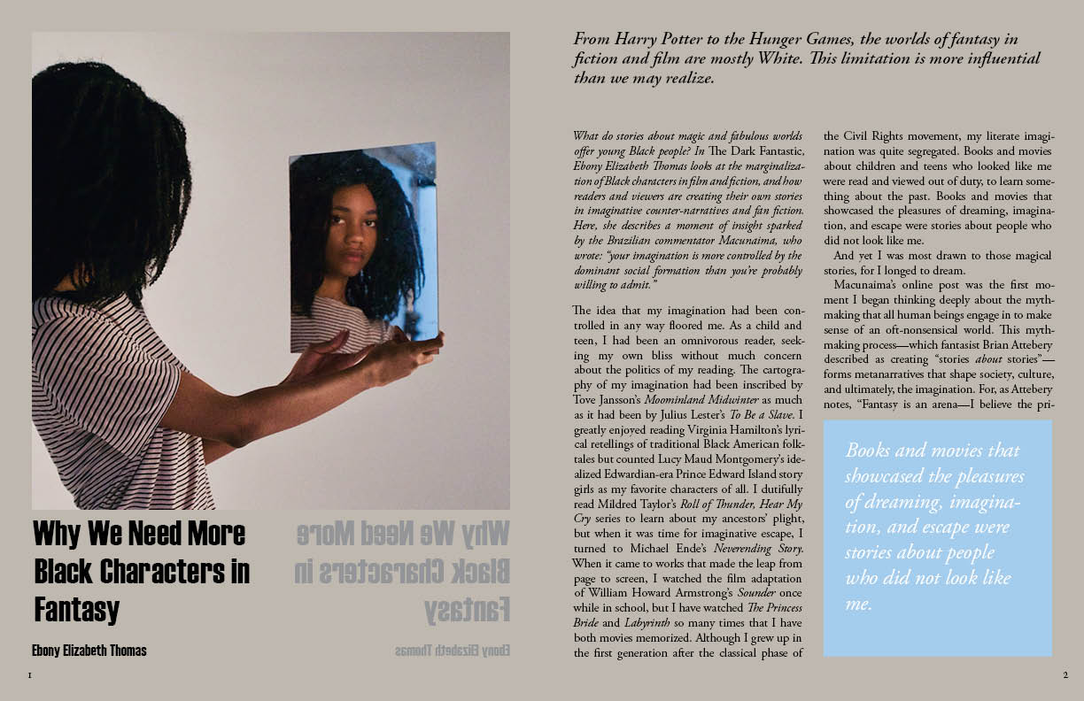
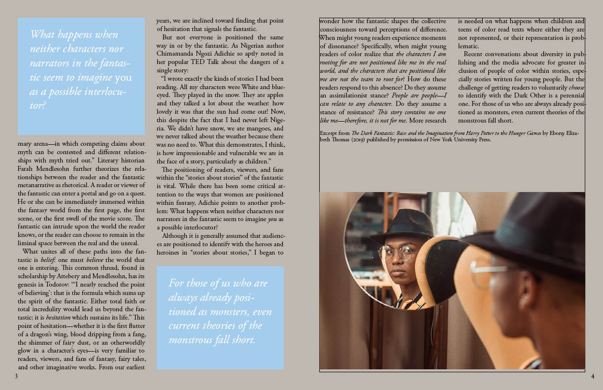
The mirrors in the photos and the mirrored headline are showing your creativity, but it seems like you’re a little hesitant to really embrace it.
Every consumer magazine has boilerplate pages that make up the bulk of the magazine, but the beginning spreads of major stories provide the opportunity to really make a splash with big, bold headlines, large initial caps, lots of color, big introductory paragraphs and other attention-getting graphic elements.
Your spread looks like you might have been just a little intimidated by the pages and reluctant to take control and shape them into what you want them to be. Instead, you’ve concentrated your creativity on the conceptual nature of the photos while overlooking the spread as being a single entity needing to be sculpted into a cohesive, bold statement.
Do you have a Pinterest Account? If so, there are people there who have collected various examples of really nice magazine layouts that are fun, compelling and really make a statement. For example:
https://www.pinterest.com/pin/534943261971000615/
Just start clicking around on the posted images and you’ll be flooded with the kind of layout ideas I’m referring to. Obviously, there’s no room for copying, but look at a few hundred of these pages to see what really jumps out, then notice what it is about them that grabs your attention.
I’m pretty sure you can make things a bit more exciting — you just need to trust yourself and get more practice doing it. I’ve spent lots of years art directing various publications. Believe me, your efforts are better than my student work was. ![]()
![]()
Don’t hyphenate in your pull quotes, and probably avoid it in the body copy as well. Certainly don’t let hyphenated words wrap to the last line of a paragraph alone.
Also, be very careful about ending a paragraph with one word. That’s a gaffe too.
You have a border in there on the last page that doesn’t belong.
You did very well with using the full justification. There are no rivers in your text. Very nice.
Exactly as Just-B said, it is all very tame. Nice idea, but you are not playing it to it’s best. In fact, on first glance I didn’t realise what you had done. It was only on a second look I saw it. That can’t happen in real life. A reader could potentially just skip the page unless something draws them in. Think about how magazines are consumed. You often flick through the lot quickly until something grabs you. Your idea is exactly the sort of thing to do just that, but it is so hidden, you’d never see it on a flick through.
Also, you have filled every available space, so the end result looks more like a newspaper article than something vibrant, aimed at inspiring, young, exciting, eager people with the content.
Look at examples of The Face from back in the 80s and 90s. OK the layouts are of their time, but they were exactly aimed at the age group you are looking at. Neville Brody’s type and layouts were breaking new ground at the time.
There’s also David Carson’s more extreme and experimental, Ray Gun, but it will show you how far you can push things. The age group you are aiming at are exactly the audience who will be happiest to consume more ‘out there’, expressive layout.
Learn about white space and make it work for you. You will only get this through practice. Be prepared to keep playing and playing with it, until it feels that you are never ‘get the plot’. One day, after enough practice, something will just click and you will just ‘get’ balance and dynamics and creating tension and resolution. It’s not a million miles from music; knowing the difference between disharmony and controlled dissonance. The difference between uncomfortable and jarring and holding the dominant 7th for just long enough before resolving it – or not.
Try drawing layouts before even touching typography, or imagery. Just block out the spaces for them in the area you have, until you get that harmony on the page. Then start to pad it out with content. A painter starts by blocking in with washes, then refining and tightening. Try doing the same.