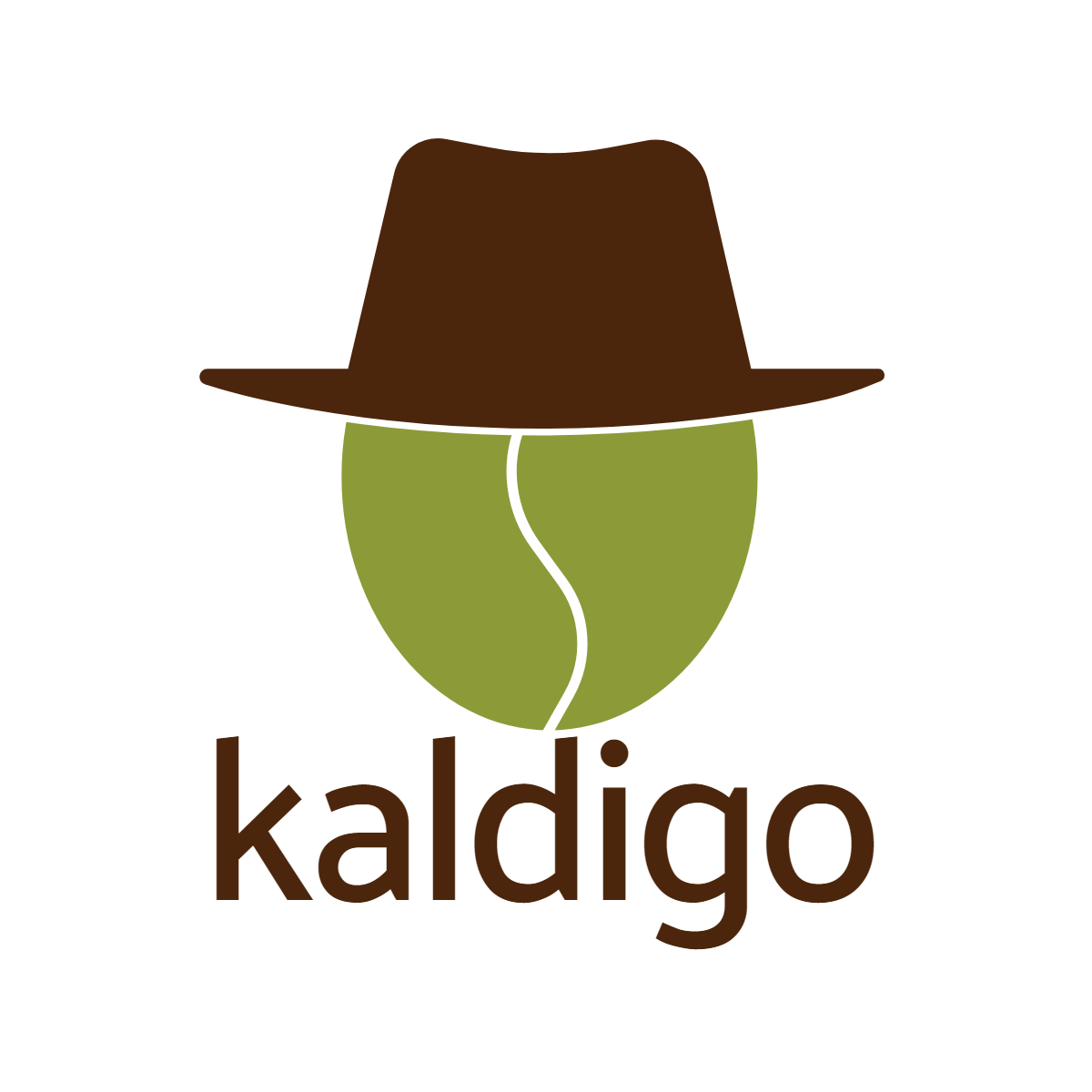
Hey there,
My partner and I are starting a coffee company and we are happy with a logo design.
Would love to have feedback from all.
Hey there,
My partner and I are starting a coffee company and we are happy with a logo design.
Would love to have feedback from all.
Why did you choose a green coffee bean for the head instead of a brown roasted one?
The ascender on the d, at least to me, is uncomfortably close to the chin of the bean (if there is such a thing). I think I’d move the entire word down some.
I might also be inclined to beef up the white lines a bit — they’ll skinny-up to the point of causing problems once you shrink the logo down to business card size.
Overall, though, I like it.
Did you design this logo?
I am not a fan of this logo. To me, it comes across as gimmicky. It doesn’t give the vibe of a place I’d want to hang out and enjoy a cup of coffee. That said, if you intend to keep this logo, Just-B’s comments regarding the color, lines, and type are all correct and should be taken into consideration.
I’d say the same.
I can see what was attempted here and understand why, but if a bean wearing a hat is the concept, that’s one thing (and tenuous enough), but for my money, a simple oval with an S-curve through it just doesn’t drive coffee bean home strongly enough. The green color only weakens it all the more.
I see a tennis ball more than a coffee bean
I’m still OK with the concept, but for me, it’s mostly an execution problem. I’m not typically one to suggest adding more detail, but in this case there’s just not enough definition of the objects to make them interesting. For example, the hat could include suggestions of three-dimensionality instead of just being a flat shape.
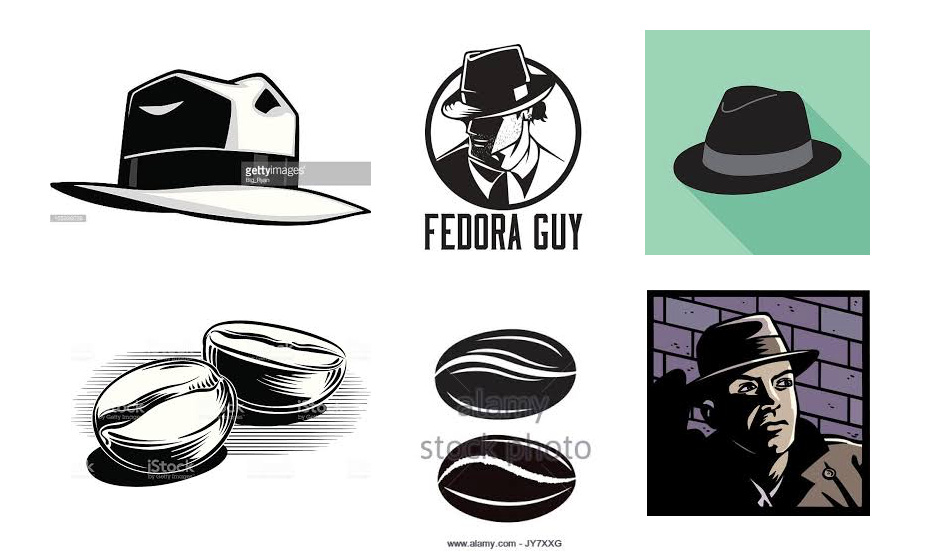
The following fedoras have a bit of the kind style and detail that I’m referring to. Carrying that kind of look over to the coffee bean head, though, might be more difficult.
An equally big problem might be the question of why a coffee bean is wearing a hat. The logo really should have some kind of hint as to why that’s the case. For example, if you’re going for some sort of Humphrey Bogart noir-like cool look, it really needs to suggest a personality of that being the case. As it is, a viewer is just left with the unanswered question of why?
How about doing everything that B said in the first post and then:
Keep only the right half of the bean green, making the left half the same brown as the fedora.
Put a handle on the same side so that the bean actually looks like a cup/mug.
You could get rid of the fedora if you want. If you keep it, it’ll also look like a hoop earring.
Yes, we designed it.
Thanks for your feedback, we will take this into consideration.
All those elements are dead. The hat, the bean, the type …all lack personality & movement.
Keep workin’ it.
I agree. The green colour is throwing me off course