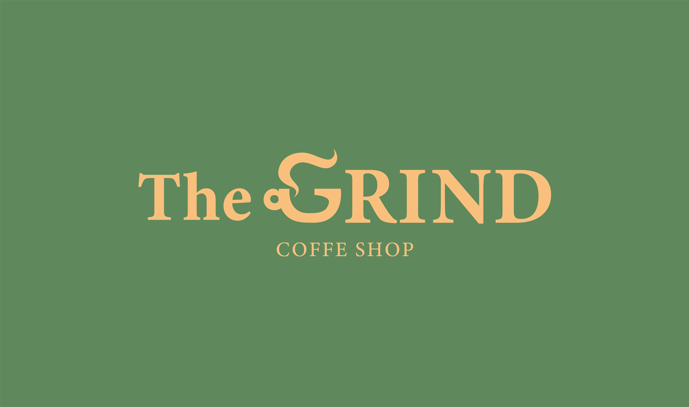
Hi, I’m doing Thirty logos design challenge (site that gives you 30 briefs for logos for you to do in 30 days), and this is logo that I created for coffee shop The Grind. They dont like brown color for this so I had to come with something different. Destroy me with your critique
1 Like
Very clever G.
Mispelled coffffe
Why is the green background banding?
You might want to rework the steam so that it doesn’t look like the hair on Donald Trump’s head. It’s a clever idea, though.
I’m not really a fan of the colors you’ve used, and I see no real logic in making The lowercase and GRIND uppercase.
1 Like
Maybe coffee should be spelled “Covfefe” then?
![]()
I see more Jimmy Neutron than Donald Trump in that G.
Guess it’s just a sign of the times…
2 Likes
To my eyes it’s more an “S” than a “G”.
I’ll give you credit for coming up with a way to make a G out of a coffee mug. However, the execution isn’t working. The G doesn’t mesh well enough with the rest of the copy. You could use the G as a the symbol and then come up with a better type treatment for "the grind coffee shop.
Coiffee!
Here’s a complete brief:
‘’ The Grind prides itself on natural and local ingredients. For our new logo, we actually do not want to use any browns! So many coffee shops around here use brown and we’d like to stand out. Maybe oranges, green, other earth tones, etc. could work well.
This logo will primarily be used as our store sign, on menus, and on coffee cups and merchandise. The Grind logo could be text based or have an icon, we’re open to either/both. We’re open to using symbols that represent coffee such as the coffee bean, plant, grounds, coffee cup, etc.!‘’

This is first version of the logo, but imo it looks better if i use this icon as replacement for G.
I tried putting all letters uppercase but it looks better if The is in lower.
Coffee scented hair spray!
I’m afraid I disagree on both points. Substituting the icon for the G and being inconsistent with the case introduces unneeded complexity that compromises the clarity of a good idea.
I like this simpler version better, but I’d still work on the hair thing and figuring out a more visually harmonious way of integrating it with the cup. The challenge, I think, is doing that while still having it read as a G. There might be some possibilities with using a double-story, lowercase g rather than a cap.
Yellow on white is a problematic color combination. Two juxtaposed light values lack contrast. On a storefront sign, for example, this would make it difficult to see and read from a distance.
1 Like