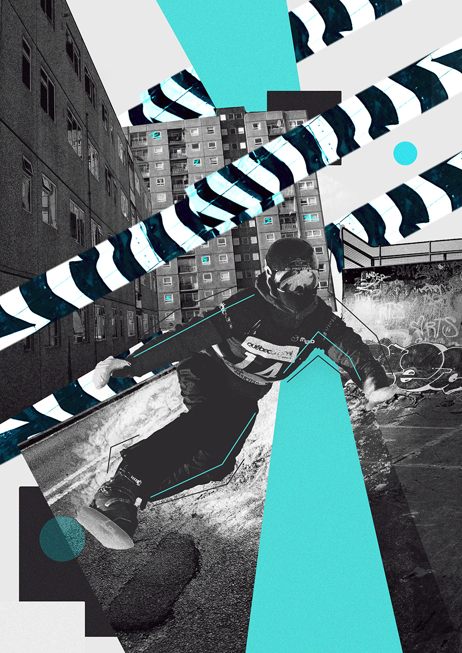
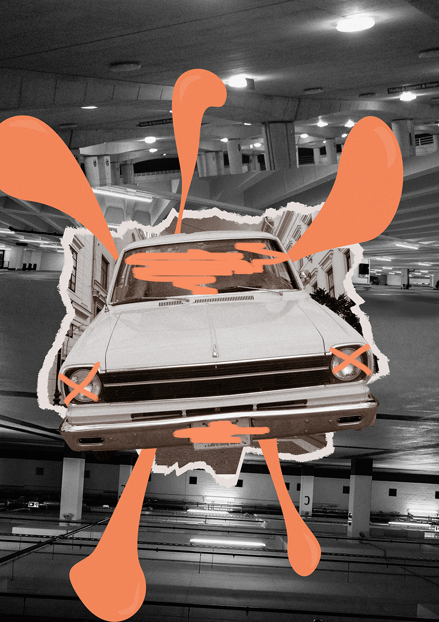
somel collage style posters i made for practice, any feedback much appreciated!
If you like them then they are fine.
Graphic Design communicates a message. These are art.
Nothing wrong with art, of course, but it makes it more difficult to critique since art often amounts to a personal statement. And that makes me wonder just what you are trying to say in the collages.
Collages are typically quite busy, but if I were you, I’d pay a little more attention to the visual hierarchy. The car in the bottom poster is the dominant element, but the very busy background is a bit distracting. The top poster has all kinds of things in it speaking different things, in different voices with the same degree of loudness, which tends to make it come across a bit like unstructured noise.
Cheers for the replies, i understand what you mean by it being hard to critique. didn’t think of that before. They were mainly made for just practicing in photoshop, with the only real direction being putting two things together that dont belong (the snowboarder & in a city landscape) but i didn’t really achieve it in the other one. Will work on more graphic design based things to upload in the future, thanks again