Providing context would be helpful. Is this student work — something for a class assignment? Was there a brief?
No, just practicing and experimenting with typography design!
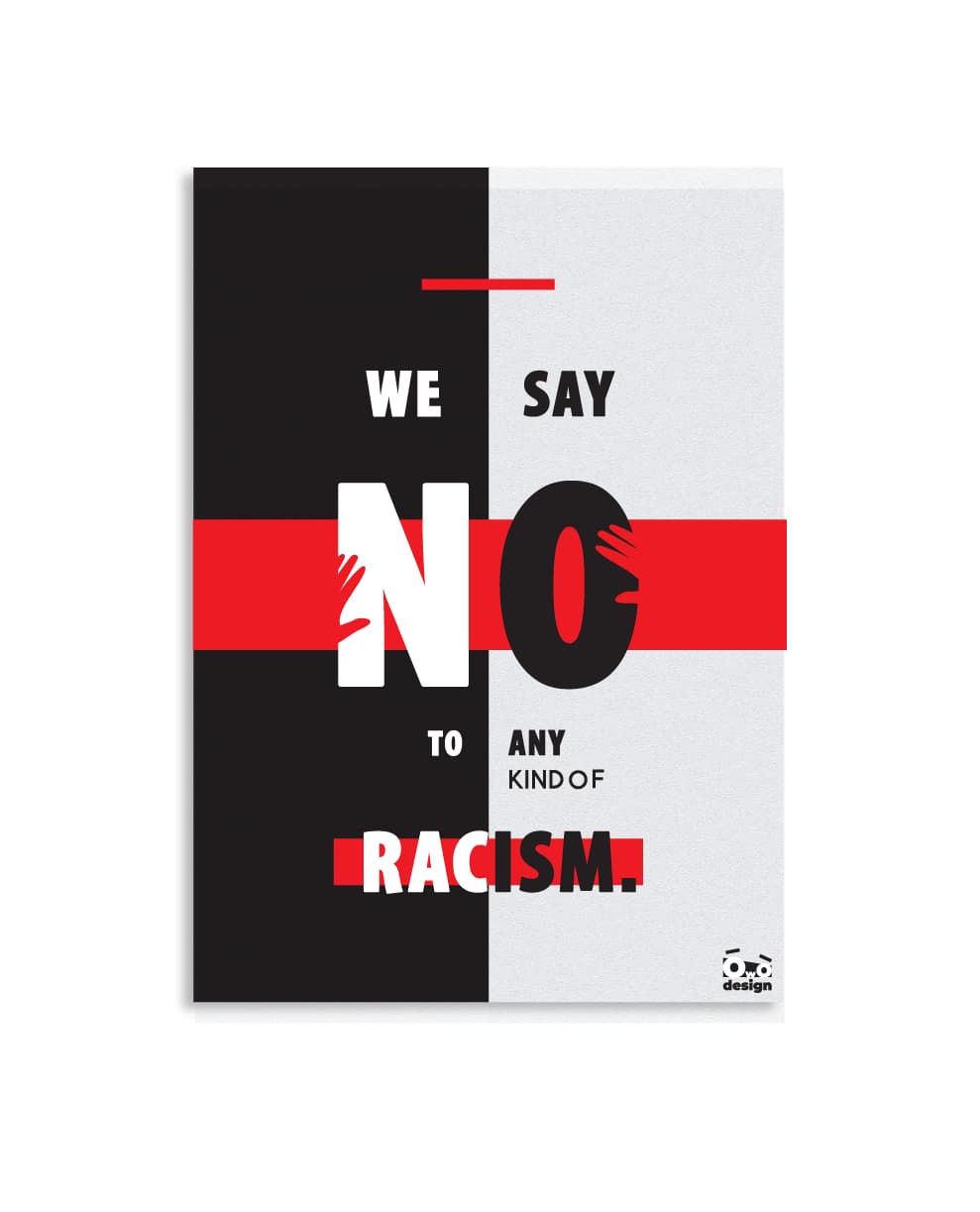
Overall, they’re very bold and interesting posters. I particularly like the last one. I think it has especially good flow. The font choice could use some work though. The “R” in racism is very playful and friendly, which is not something I would associate with racism.
1 Like
Thank you! That was exactly my thought after reviewing it a month later.
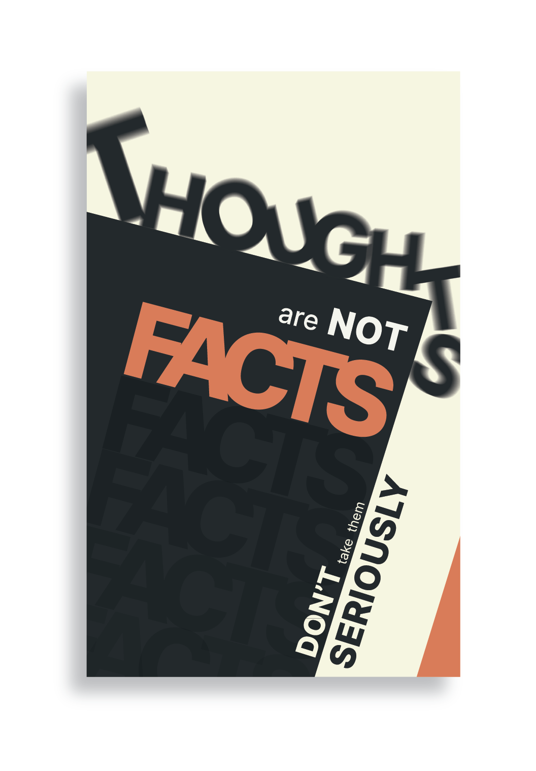
The blurry “THOUGHTS” in the first two are not necessary.
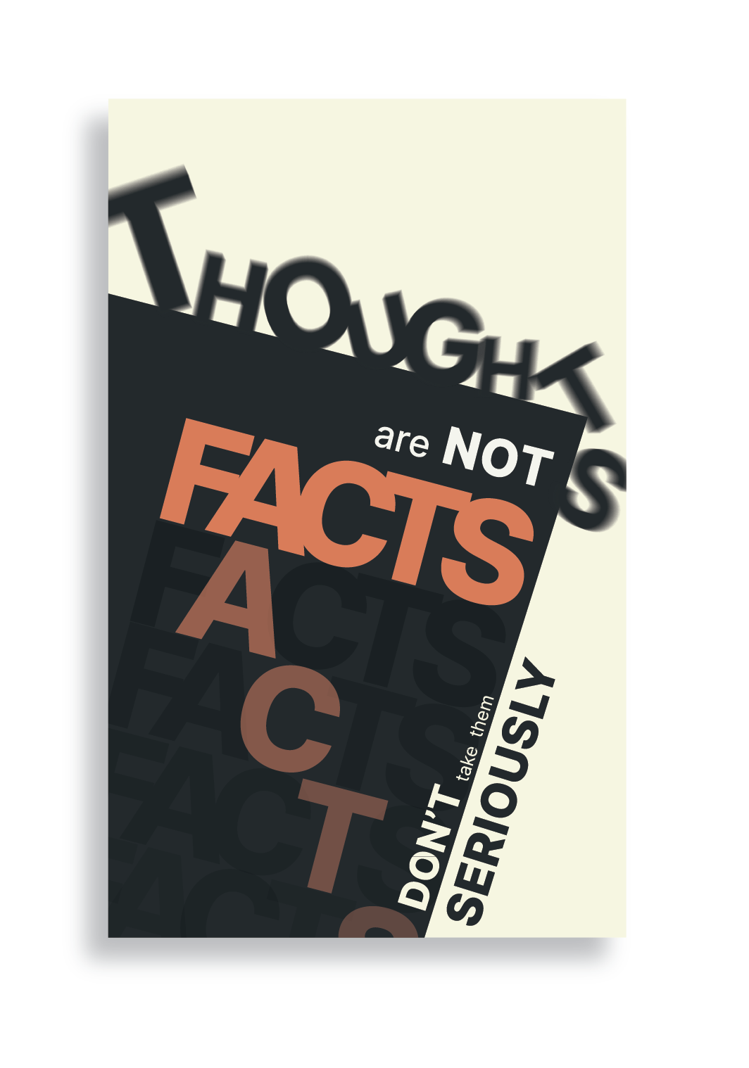
The “ACTS” in #2, ditto.
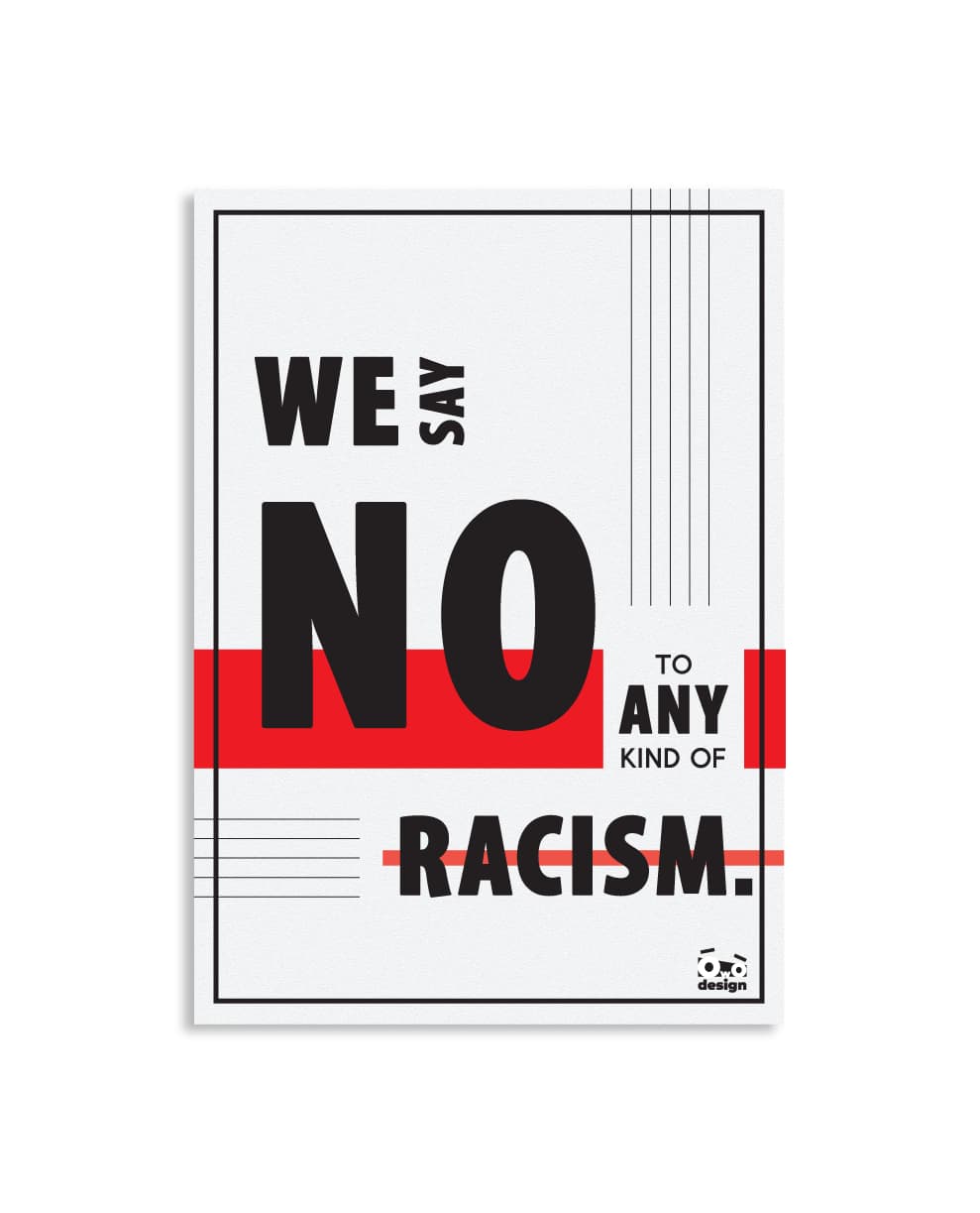
Periods in #3 and #4 are another sore thumb.
Kernings need some work.
Thank you!
-“Blurry Thoughts” give some sense of movement, like stones rolling down a cliff. Like thougths come and go in our minds.
-About kerning. “Facts” tracking is so condense on purpose, make them look more “solid”. Is there anything else that has issues with kerning? Help me learn! it is so important to me.
-“Acts”, I agree, it creates a lot of fuss, with no real purpose
-As for the periods, I use them often because they add more emphasis and highlight. Altough I can see that they make the word somewhat “imbalanced”
I love constructive criticism!
They are definitely bold and are a long way from the worst I have seen. Stick at it.
That said, here come the negatives…
The first two just feel a bit like pastiche derivatives of Bauhaus posters. The others, the same, but a little constructivist/Swiss hybrids. They just feel a bit too like you have tried to copy. There’s a fine line between influenced by and pastiched. The former is fine, the latter definitely not.
The third one, because of the vertical black/white, almost forces the eye to read
We N to say O any kind of…
I agree with eriskay, the kerning needs attention. Not tracking. A positive decision to attach letters as you have done with FACT, is fine for dramatic effect, as long as it remains legible and doesn’t leave awkward spaces and tensions. The F and A do have tension.
Kerning is different to tracking. For example, on the first posters, the word, seriously is a little unevenly kerned, so reads slightly like SERI O U SL Y. Not as exaggerated as that obviously, but it needs attention.
One trick for many people use is to turn a word upside down, that way your brain doesn’t read the actual word as readily, but sees the shapes of the letterforms and negative space. What also works for me is seeing them as groups of three, so, SER, ERI, RIO, etc.
I think your comments on the reason for treating the word ‘thoughts’ as you did are all well and good for an art piece, but this is a typographic piece of communication, with an intended message and an intended audience. It’s primary role is to impart a message to the right people in an intended way. It is not about your own self expression. You need to look more outwards than inwards and your rationale for decision-making should reflect this. If there is a good, solid reason to do something, then all well and good. If not, don’t do it.
Hope this helps.
2 Likes
Your advice is gold. Thank you.
I’m very new to typography design, and unfortunately, subconsciously my brain tends to mimic things.
Honestly I didn’t not pastiched any poster, I designed them on my own, playing with the Jost Font (free alternative of Futura).
It has been only a month I study on my own about typography. I wish I had all this knowledge you have.
If you have spare time, could you tell me where can I learn about all these artistic philosophy trends (Bauhaus, Constructivist, Swiss) etc?
You were right about the kerning in word Seriously, now its obvious to me.
Again, thank you!
You evidently have an ability. Maybe you should think about getting a design degree. That way you will not only learn the things you need to know, you’ll learn how to learn.
There is no short cut to knowing design and art history (along with its related social and political history). You need to read. However, taking a degree course will give you a structured learning programme and it will lead you off in various directions to find where your passion takes you.
I am assuming you are still young?
I ve just started studying graphic design. Next Wednesday is my first lesson.
No. Im not young. I am 37 yo. I studied urban planning engineer just to fulfill other’s expectactions, not mine. But engineering is not for me. I struggled a lot, but no. Clearly.
So I took this turn, and now I feel full, happy and motivated. Sometimes I feel scared of the fact that I am old etc. to be honest.
I just want to be better and compare myself with my past self and only. I don’t have great expectations, really, I am a very simple man.
If I manage to make my livings from designing, that would be a serious step to personal happiness.
I will keep posting things, craving for your criticism. No matter how harsh it will be, it will make me 0.01% better and 100% more motivated.
Thank you again!
Making a living these days is difficult, as there are so many people out there who think they can just do it because they have a software licence and it’s cool. Sounds like you are taking the first steps to doing it the right way. Getting yourself educated is the best way to forge a long term career for your self and stand out from the thousands of people vying for position on crowdsourced competition sites. Don’t be tempted to get involved with them. They are a race to the bottom and a sure-fire way to never make the move from hobbyist to pro designer.
Good luck and do keep posting. There are a lot of experienced designers around here who are always willing to help out people seriously interested in learning.
1 Like
Way too many beginning designers approach graphic design from the viewpoint of artistic expression. However, graphic design might be better described as visual engineering. Problems are precisely defined, and designers use all their available knowledge and tools to methodically develop solutions to achieve predetermined objectives. Art and aesthetics play a role in the solution, but they’re just that — component pieces in the solution.
Hardly anyone enters graphic design from an engineering background, which is unfortunate. I think the two fields can complement each other perfectly in the same way they do with architecture.
As for your posters, I agree with everything @sprout said (although I needed to look up what pastiched meant). ![]()
As far I can see, these are pieces of art and not graphic design.
Why aren’t thoughts facts though? I can have a thought about something that is a fact… can’t I? There I just did it.
‘We say no to any kind of racism’ is quite long winded.
Most governing bodies, especially sporting bodies, have implemented just:
‘No to Racism.’
In terms of what they are - they are artistic posters - not graphic design.
So if you like them - then that’s up to you.
Someone here said there’s no need for the Thoughts to be blurry - but I like that - somoene else doesn’t - you have a reason for it.
I got something like being deep in thought with eyes moving like you see in the movies when someone is deep in thought. That’s what I thought you meant about it.
But you had a different meaning behind it and your own vision of why it’s blurry.
And others will have their interpreation.
This is what makes it artful - and not graphic design.
Graphic design should convey the same message to the audience and not be ambiguous.
Nothing wrong with your posters - if you like them then have at it.
1 Like
Thougths are not Facts, refers to people who do live in their own senarios about the future.
A thought is just a mind product, not a fact that happened or will happen 100%.
So the meaning is not to let our thoughts rule our lives (for example me, I tend to overthink).
Its a philosophy based on Krisnamurti/Maharaj, who say that the only time that exists is the present. Past is just impressions of facts (impressions may vary according to someone’s age/ mentality etc). Future is just scenarios our minds produce and nothing more. Nothing is certain about future.
I hope I managed to explained it with my mediocre English ![]()
I think I understand the difference between art/illustration and graphic design.
The first one is about expressing yourself, the second is about delivering a message based on principles of visual communication.
I don’t know if its bad to mix them though, or where is the limit.
For example, the “Thoughts is not Facts” poster, I tried to follow the proximity, hierarchy, legibility, contrast rules. (at least I tried ![]() )
)
Thanks again for all your valuable comments.
… and I thought one and one is two. Got to rethink.
or ten
1 Like