I need one more person to provide me some feedback as part of my assessment for my course. Provide as much feedback as you can, it will be very helpful to me.
Sorry, I’m not downloading anything.
Post some screenshots of what you are wanting critique on.
That’s fine. I will post a link of the screenshots of the pages I have done. Let me know if the link of the screenshots don’t work.
As part of my assessment, I need some feedback from anyone in the forums to these screenshots. I used Dreamweaver and it is a tricky website to use.
Your feedback will be very helpful to me in the long run as a future Freelance Graphic Designer.
Double posting. Topics merged.
Sorry about that.
1 Like
No worries ![]()
I was wondering, is there a problem with the link? They are both screenshots and I had checked to see if the link works or not.
They work. It’s still early yet for most of our members. As they check in I’m sure someone will give you some feedback.
Thanks. I very much appreciate your help.
1 Like
I don’t mean to go off topic here, but… Dreamweaver?
I think it’s kind of passe now. Probably some companies still use it, but Wordpress is more widely used these days. I hope you’re also taking Wordpress classes.
If you can post screenshots here in this forum, I’d be more willing to provide a little feedback. I don’t want to go off and submit comments on another site.
Thanks, but as for now, my trainer or assessor wants me to use Dreamweaver as a start, before moving onto Wordpress. I will search up tutorials on how to use Wordpress.
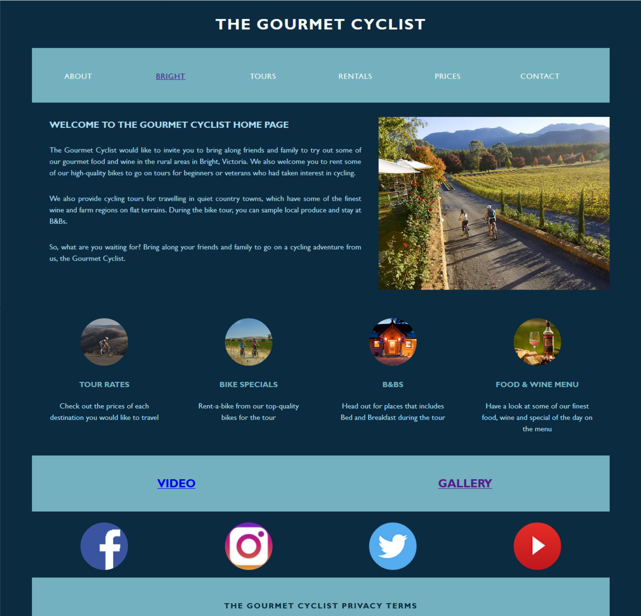
I like the basic layout.
But I think readability is an issue. Remember, you have mere seconds to keep them on your site, and you’re competing with Google.
To start with, I’m having a problem reading the tiny text. I think you need to research writing for the web. People don’t like to read paragraphs, they like to scan brief, bulleted text, big enough to read easily. Especially since they’re using phones, they’ve just ridden 50 miles, the sun is in their eyes, etc.
The color scheme could be higher contrast. Remember, the website’s job is to convey information. “First make it work, then make it pretty.” The reversed light blue on dark blue isn’t contrasty enough.
I’d also put a statement in the upper left, that briefly states what the website does for you. Is it a source of restaurants for cyclists in certain areas? Worldwide? Is it a tour company? A source for good rides? I can probably find this all out by reading the tiny text, but I don’t want to. ![]() And neither will they.
And neither will they.
Also, I’d find a more compelling image. People respond to images viscerally, and they often form a reaction before they realize it.
Users will be using smartphones to read it. Most people use phones, and especially cyclists out on the road. So make sure it’s responsive.
But more than anything else, the readability needs improvement.
Thank you. I agree though, readability is a major issue for me to improve on when it comes to developing a website. I also agree with the text and that is what everyone who had given me feedback as well. It needs to be bigger, so people can read the content and not squint at it so much. Fair enough, I will keep this mind and thank you so much for the feedback. I very much appreciate your feedback. ![]()
You are welcome. ![]()