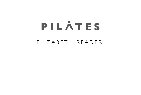
As you can see from this I’m trying to get the central letter A to represent a figure bent over as a pilates exercise. Do you think this could be made to work?

Any thoughts appreciated.
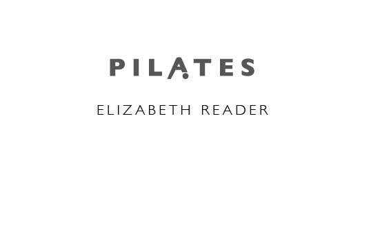
As you can see from this I’m trying to get the central letter A to represent a figure bent over as a pilates exercise. Do you think this could be made to work?
Any thoughts appreciated.
Yes it works but it is very subtle and easy to miss, maybe the ‘A’ might look better if it was altered a bit to make it look more like a person bent over. However this is a good idea and can work. ![]()
Just a thought …
Thanks PJ. You’re right it is a bit subtle, but I was trying to stay away from buggering up the design by using a silhouetted figure. I’ll play around with it a bit more. I did this in about 20 mins. Logo designs should be clear when small as well as large.
Cheers for the comments.
A silhouette might be a little unsubtle but maybe a logo/icon figure like one of the icons used to denote the sport in signage (I don’t know what they are called).
Just as a quick and dirty illustration of what I mean.
I’d think really really hard about other connotations of what that head down person looks like. Yeah, my brain is about 14 years old. But so are most people’s…
Just sayin’
Yes, but have you seen some of the positions they get into doing pilates? And in leotards. I take your point but I was trying to be more cerebral…ahem.
I’d give up on the A gimmick. It’s forced.
I’d also reconsider (or encourage the client to reconsider), using Joseph Pilates’ name as a brand. It was declared a “generic” term over 20 years ago, but I still just wouldn’t.
^ That too
The problem with the A here is that the person is falling over, the legs are leaning forward and person’s head is on the ground.
The other iteration looks like an architect.
I’d think it would more successful with the L or the I as the icon.
Yes, I’ll give that some thought.
To me, the person looks more like a high diver that just jumped off the board.
Yep, good point.
You too? Juvenile minds think alike.