Hello friends! I have updated my portfolio. Could you please take a look?
Here is the link :
https://www.behance.net/ManuelLisP
And thanks so much for all your help and support !
Hello friends! I have updated my portfolio. Could you please take a look?
Here is the link :
https://www.behance.net/ManuelLisP
And thanks so much for all your help and support !
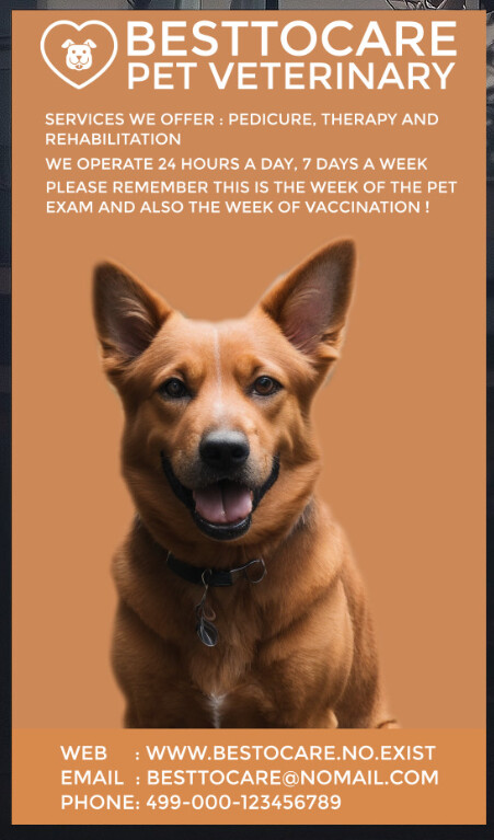
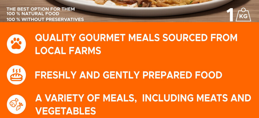
You’re doing good - but somethings are just not quite there. Keep going - and if you can fix up things and make the portfolio even more streamlined then even better. For instance - all the below - and also don’t double up on different designs on the same page. Site Safety Notice at end of one design for some reason, the Canes is good - but then there’s nother irrelevant vet advert underneath it.
I want to start with light praise some creative thinking, it’s clear you have potential for composition and visual impact. You’ve put time and effort into developing your ideas, and that shows. There’s a decent range of which demonstrates a grasp of design fundamentals and a willingness to explore different formats.
That curiosity is a necessity in this industry, so keep nurturing it.
That said, there are a few areas where tightening things up would really elevate the work to a more polished, professional level. These are the kinds of details that make the difference when you’re presenting to a client, creative director or agency. I’ve jotted down some observations below which are all intended to help sharpen your foundations.
Watch out for letter spacing issues. Things like uneven kerning or awkward gaps can really jar and take the polish off an otherwise strong piece. These are easy fixes but make a world of difference in how professional your work looks.
Avoid bad line breaks where single words or awkward chunks end up dangling. This is one of those details that might seem small but screams amateur when spotted. A cleaner line ending gives your design breathing room and a more considered finish.
Your tagline here is saying too much when it should be saying just enough. Keep it punchy and to the point. Also, the way the promotion is worded doesn’t really reflect how travel agencies work in the real world. I’d recommend checking out some Cassidy Travel brochures (I’ve worked on them myself) to see how it’s done commercially.
If you’re creating hypothetical projects, they still need to stand up in a real-world context. Think like the client and the audience. The Primate Zoo piece, for example, is trying to say too much in the footer. Zoo posters are all about impact and quick hooks check out Dublin Zoo ads for how they land the message fast.
Prehistoric Times - looks like a rip off of Jurrasic Park - which is not great for a portfolio.
This one leans heavily into Jurassic Park copyright. It’s never a good look to have portfolio work that could be mistaken for a rip-off. Either rework it so it’s distinctly yours or leave it out. Also, the punctuation is doubled up another one of those small things that makes a big difference.
No idea what this is
https://www.behance.net/gallery/223825097/Do-you-feel-like-a-(Brutalism-Design)
Honestly, I had no idea what this was trying to sell. If it’s dark glasses, it takes way too long to get there. With advertising, your message should hit within seconds. If someone needs to think about it too long, you’ve lost them.
A lot of your ads are text-heavy. Remember, in environments like bus stops or billboards, people have seconds not minutes to take it in. Keep your copy lean and impactful. Also, your services list is tiny and hidden, when really these are your key calls to action. Flip the hierarchy.
This piece was confusing. I have no idea what the symbols are?
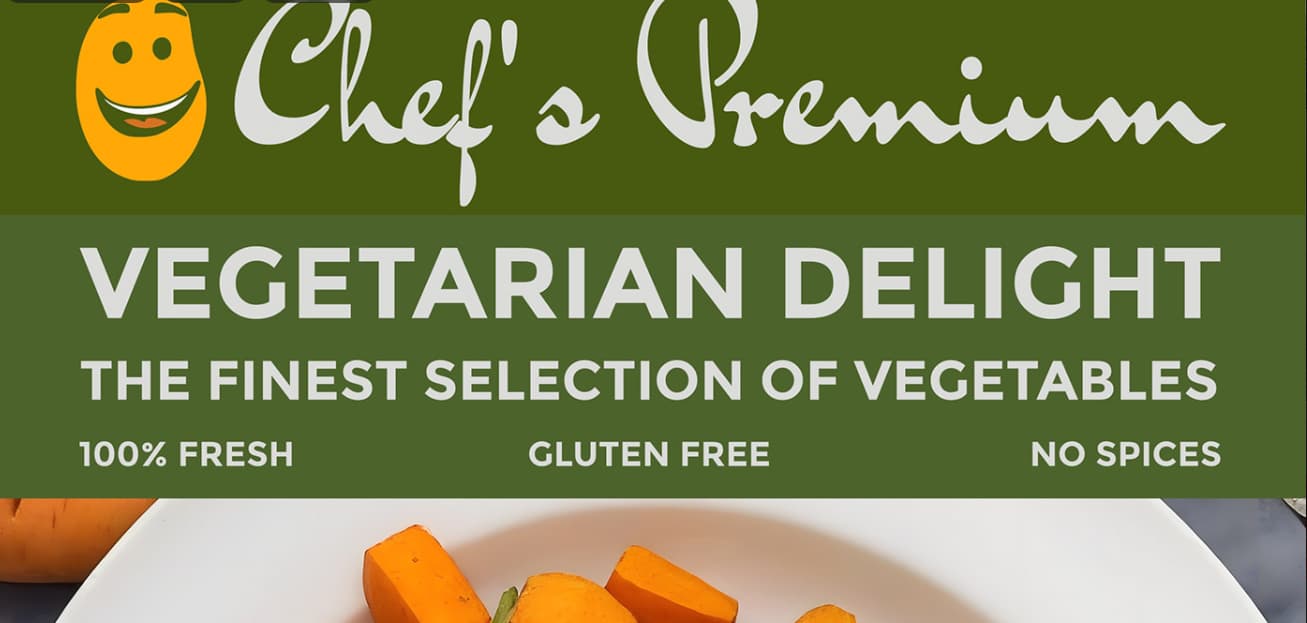
I was confused by the site safety notice shoved on the same page.
I noticed some designs follow the same formula big banner headline, big banner footer. This quickly makes the work feel samey. Try experimenting with different compositions, type treatments and visual flows to show more versatility.
https://www.behance.net/gallery/215728343/Graphic-Design-with-Animals-(Design-Inspirations)
This is probably your strongest piece in the set. There’s a nice visual hook and the design grabs attention. That said, you’re still falling into the trap of burying important info in tiny text while giving too much space to less relevant details. Think about what the key takeaway is and make sure it’s front and centre.
You’ve got a strong foundation and a clear interest in making work that grabs attention, which is half the battle in design. The next step is sharpening your eye for detail and pushing your ideas further so they work not just as nice visuals but as real-world, functional communication. Think about how your designs live in the wild how they’d be seen, read, used. With a bit more refinement and a stronger grasp of hierarchy, messaging and context, you’ve got the potential to turn good work into great work.
Keep at it, keep questioning things, and don’t be afraid to push outside your comfort zone. That’s where the really exciting stuff happens.
Thanks so much for your answer ! Smurf2, this is really helpful. I am going to work wit them today and this week !. I forgot to say about Prehistoric Times that I tried to make a poster for a movie, but I am going to change it for something different, may be something like a museum (should be better that confuse like a movie).
Hi Smurf I am making all the adjustments and fixes to my portfolio, it will be already in the following days !
Hi again! I began to see about the compositions and may so many changes !, I am really appreciate what all of you told me, I am experimenting with different formulas (different sizes and different ways to show products!)
Hi Smurf2 or anyone there, I made many adjustments and fixes for my portfolio (and added new creative stuff). If anyone would like to see go here:
https://www.behance.net/ManuelLisP
And also I took out some stuff that was not useful ! to all of you thanks for all your help !