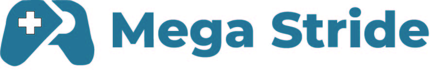
Company Name:
Mega Stride
Company Description:
We are a little corner-shop that sells video games. Our main product stands out because
of its superior quality and convenience. Our target audience is college students. We want
to convey a sense of comfort, while at the same time being approachable.
Job Description
You must create a logo using the information given in this brief. They would prefer a
combination mark that uses the color blue. The logo will be embroidered on uniforms.
Take into account the company’s values and preferences, and make sure it will work for
the planned use-cases.
Was this work done as part of a contest or crown sourcing site?
As for your question, the answer is yes. (Reply to OP.)
I’m not a college-age gamer, so I might be missing the mark.
With that said, I like the simplicity.
However, my first response to the logo was that it was a pair of lungs with a medical cross. Hospitals almost always use blue colors, and the cross drove home the medical connection.
I know it’s a gamepad/controller, but not being a gamer, that wasn’t my first reaction, and I didn’t see it until I read the brief. Perhaps that’s important, and maybe it isn’t, because if the target audience is gamers, they will likely respond differently from me.
For a dermatologist, would a drawing of a boil or a skin carcinoma be appropriate? Of course not. The logo should, instead, be reassuring, soothing, and communicate medical expertise. Similarly, a stylized controller isn’t a great solution. It’s a representation of a game store’s product rather than something that resonates with the emotional vibe, fun, and excitement of games.
As others have suggested, the brief reeks with the awfulness of a client-created crowd-sourcing description of what they want instead of what they need.
For example, they want blue. Why blue? To me, blue or your greenish-blue, once again, doesn’t communicate the right vibe. For the dermatologist I mentioned, it’s a great color because it’s calming and reassuring, which is why medical companies almost always use those colors. But for a game store, no, it conveys the opposite emotion from the reason gamers play games, which is fun and often an adrenaline rush.
The typography also appears somewhat stiff and heavy. It’s a nice typeface, but does it convey a sense of fun and the nimble reflexes of a gamer? I don’t think so.
es para mi portafolio,use una ia para que me de un brieff