Hi, I’m a newbie so perhaps I’m not on the correct forum? I’m trying to create a flyer with some pop. Is this the best forum to upload a mock-up to initiate conversation re: how to further develop the design with others sharing design suggestions re: shapes, patters, font styles, colors, etc? Thank you!
Don’t know if it’s “the best” forum, but you can certainly post an image and will tell you what we think.
Sorta sounds like the OP wants you to do the work they don’t know how to do. In my world, that costs money.
1 Like
I’ve done the work. I’m looking for helpful suggestions to take it to the next level in helping a smaller, rural library better communicate with the community.
Post away – though be prepared for an honest, if sometimes quite brutal, critique.
There are a quite a few pro designers around here who know what they are talking about and I’m sure they’ll be able to give you pointers.
As I say, be prepared for it to be honest, based on what we all know works and what doesn’t. On the upside, if it’s good, we’ll tell you that too.
Please understand I’m not a graphic designer. I work at a library and I’m just trying to create a flyer which will visually attract people who haven’t visited a library in a while. Thank you!
The first thing I’d say, is you need to determine what you want to say, what your main message is and make that your focus. Right now, the first thing people read is, ‘Do you know you can…’ (that’s without getting into the fact you’ve asked a question without a question mark)
That gives no information about what you want to say or even who you are. Chances are people will pass it by because you won’t have grabbed their attention.
You are evidently (once I drilled down and read it), trying to make people aware that there are more services than they thought, available at the library. (I know this one well, as my wife runs our local library on a voluntary basis.)
Straight away, off the top of my head, that’s where the focus should be.
‘You get more than books at your library.’ or similar.
I am not saying use this exact phrase. It’s too weak. It needs a hook, something clever and relatable to make people want to read further.
Also, it’s good to personalise it, make it relatable to them. ‘Your Library’ or similar, gives people ownership, makes an emotional connection, etc.
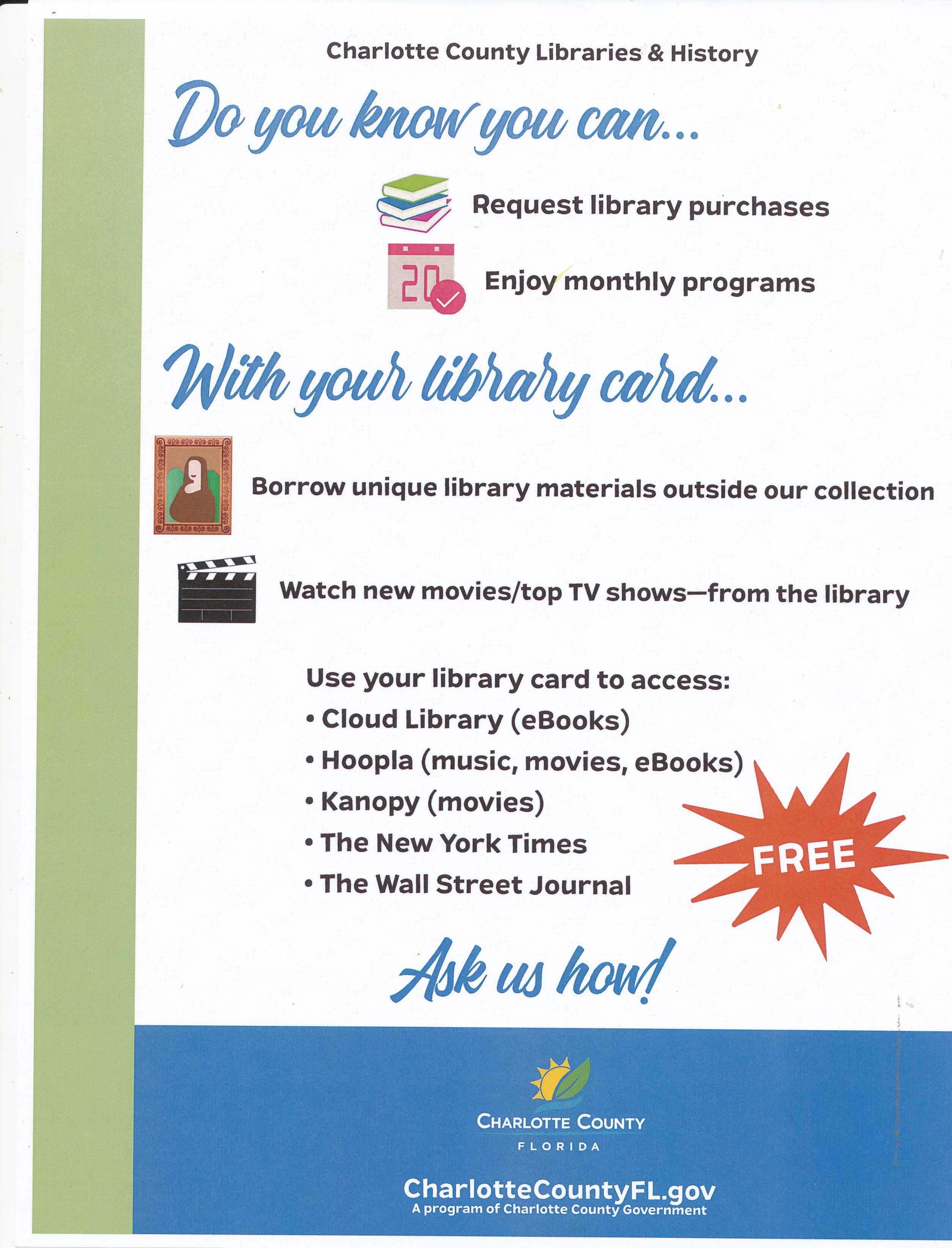
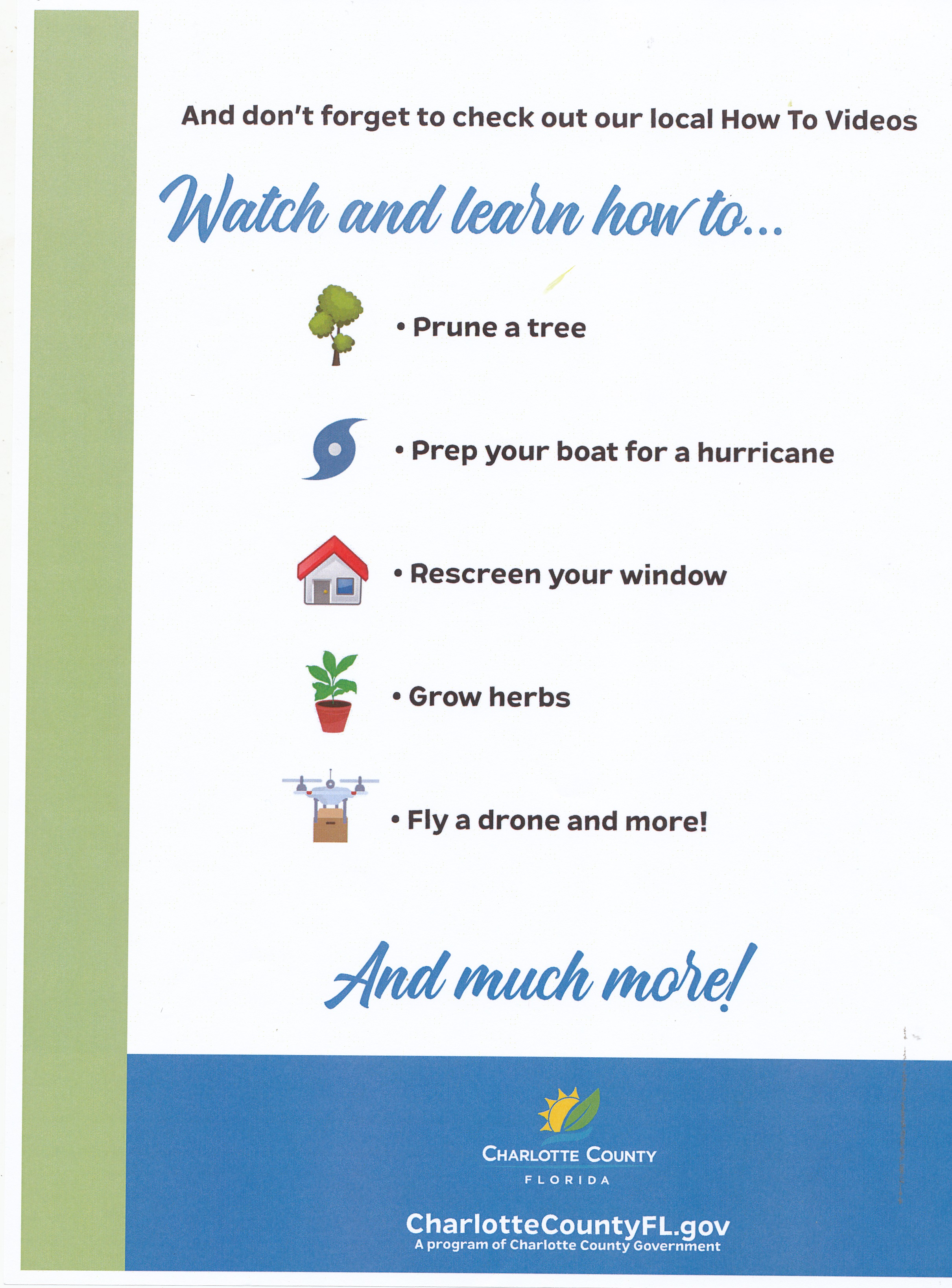
To the design of the poster itself. It is not the worst I’ve seen, but it has no hierarchy to speak of. No focus. Your eye jumps all over the place. You need to lead the eye to what you want people to read.
It is also far too peppered with clip art. This adds nothing and serves only to cheapen. Much better to have one strong supporting image instead, with a strong headline.
Visual cliches like the FREE star, are always going to cheapen. It’s a library, not a pile-em-high-sell-em-cheap sale.
Typographically, is smacks of the MS Word school of aesthetics.
Look at collateral from other, larger libraries, to get a feel for the kind of things they produce (not other small local libraries, as they will likely also use the DIY approach). This may give you a feel for the typographic flavour you should be aiming at.
Another possibility is to find a local designer who may give their services for free, or reduced, for local community projects (my wife leans on me for this).
Hope this helps.
1 Like
I’ve moved this topic to the Crit Pit part of the forum since it’s evolved into a critique.
Similar to what Sprout just mentioned, the message, the text, and the design suffer from a lack of hierarchy.
Specifically, the visual hierarchy lacks a dominant, attention-getting element that instantly communicates that there’s something here worth knowing. You’re trying to do this by asking a question about what one can do with a library card, but you’ve broken up the question in a way that dilutes its impact.
The little pieces of clip art, the random placement of the different elements, and the inattention to the negative space add up to a cluttered look without a cohesive hierarchical structure. It comes across as though you’ve loaded up a shotgun and haphazardly sprayed the content onto the page.
The little pieces of clip art are gratuitous and appear to be there for the simple reason that you thought you needed some pictures of something. Nothing is really lined up, which adds to the visual confusion. During my initial scan of the page, my eyes jumped from one object to another instead of being visually led through the page in an orderly way, with each hierarchical step building upon the one before it.
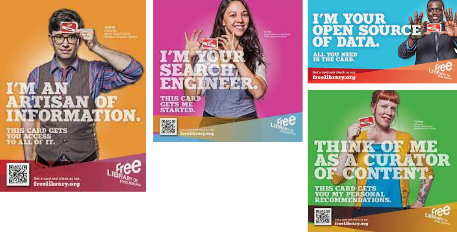
Here are some ads for a library that do not have the problems I just mentioned. They’re not flyers and they lack the kind of informative detail you want to include. Still, they demonstrate my point about visual structure and nothing looking wishy-washy, random or arbitrary. There is a solid, structure to the ads that demand attention
2 Likes
This. Especially look at what’s being done at county libraries and large city libraries in liberal parts of the country.
General critique… too much information, no attempt at inspiration. Try to generate an emotional response in your audience, and that’s where you get your pop.
They are not, but they could well be. Unless it had to be a single-sided flyer, there would be nothing wrong with having minimal information on the front to create impact and the having the detail on the reverse. These examples demonstrate exactly the kind of strength and focus I was alluding to. Whether the style or feel are what you want to achieve (that depends on the demographic you are talking to), this level of impact is exactly what is needed to make people pick it up in the first place.
Getting people to pick it up is 90% of the job. Once they have, they will almost certainly turn it over to read the detail, especially if the front teases a little, so they are compelled to turn over to read more.
Finally, it would help make it as easy as possible for people to contact you, to be able to find out more information. If the current flyer did happen to pique someone’s interest, but they didn’t even have a library card yet, there is no obvious way to find out how to get one, apart from a very buried, general url at the bottom.
1 Like
sprout - Just- B and Mojo.. This is a wonderful start! Your comments re: graphics cheapening the flyer are well taken. Also, re: a clearer message which should be visually engaging is valued feedback. We have many residents plus those who work and attend school in our community who don’t have library cards, as they have never been in any library or haven’t visited one in decades, so they don’t know what they’re missing! We want to convey that in this flyer, so it piques their interest to come take a peek either in person or online. Maybe… the lead is “What You’re Missing…at the Library!” instead of “Do You Know You Can…? Thank you so much for including graphic examples of photos and the messages they convey. Phone #s, emails and web links would be helpful – a big Homer Simpson – Doh! ![]() We don’t have a budget for Illustrator or Photoshop so I’ve been crafting this in Word and MS Publisher. Has anyone found Affinity Publisher to be helpful? It looks amazing (for $50) as I poked around but I have never used it. I’m so grateful for all your thoughts and kind help.
We don’t have a budget for Illustrator or Photoshop so I’ve been crafting this in Word and MS Publisher. Has anyone found Affinity Publisher to be helpful? It looks amazing (for $50) as I poked around but I have never used it. I’m so grateful for all your thoughts and kind help.
MS Word isn’t a layout application — it’s a text editor. It can be awkwardly coaxed into creating various kinds of layouts, but if you plan on having this commercially printed, don’t use it. MS Publisher is better. It’s an actual layout application, but I know of no professionals who use it for anything.
The Affinity Suite is great. I’ve used all three for some big projects and had good success with them. They don’t have all the bells and whistles of Adobe’s software, but everything you’ll need is there.
As B said, it’s good, but if you’ve never used InDesign, etc, there may be quite a learning curve, especially learning what you need to do to get it print ready.
I’d still look at seeing if you can get a friendly designer to help you. One who cares about supporting their local library. You could save yourself a headache and potentially expensive mistakes at the printers.
1 Like
Does your library have books on graphic design?
1 Like
I agree with sprout, and I’ll add that getting people to value the library won’t be solved with a flyer. You need a brand. That’s a much bigger conversation, and one that should include a professional. I’m in Los Angeles and most of the library systems here have degreed graphic designers on staff to do this type of work. Since that isn’t possible, find a friendly designer and see if you can work a deal. Offer to give them recognition and exposure as a ‘media sponsor’.
Side question here… from what you describe, the purpose of the flyer is to act as a tool for outreach and recruitment of new patrons. How are you going to put the flyer into the hands of people who aren’t visiting the library?
1 Like
That’s where I have to beg to differ, I’m afraid. To do something I n return for exposure is almost always an inequitable exchange. Whenever I do freebies like this, it’s because I give a damn about the cause. Exposure in such a context is usually meaningless and amounts to nothing tangible.
As for creating a brand, often even small, rural libraries sit under an umbrella of a municipal or county library brand, so this needs to be considered.
Good idea, Sprout! I heartily recommend that eager1 use it as a Header. Since the poster admitted that he/she is not a graphic designer, and most likely is in a situation (library) that would not have a marketing budget, and working with non-graphic design software (MS Word) to create his Flyer, then I think free advice is appropriate.
Sprout . How about leading with …“What You’re Missing…at the Library!” No one likes to miss anything so that might be a grabber? You’re correct we have zero budget so we’re just trying to be as creative with the little we do have (no Marketing Dept, Publicity, etc.) When I’m on the floor at Circulation and Reference and I share our other assets besides books people are impressed but I can only reach so many one on one. Even flyers alone in the library are not enough which is why I’d like to start an outreach campaign visiting schools - local community college, high schools, middle school as kids get their family involved with tech, etc. and they’re more apt to listen than adults who think they know all they need to know. A really cool, eye-catching flyer would be great to grab kids’ attention to listen to the rest of the pitch re: why a library is a good thing, especially for those whose parents or grandparents haven’t visited a library since they were a kid. Thank you!
Sounds too negative, to my mind. No one wants to be told they are wrong, they are missing something, they made a mistake, overlooked something, etc. Take that sentiment and spin it positively. I am always a great believer in stripping things down to the bare minimum. You have little enough time to grab people’s attention at the best of times. You need a bit of punch, ideally something a bit clever.
If you want to do a leaflet (see further comments below) and follow my previous suggestion – but remember, it was an ‘off the top of my head’ thing and I’d put no real thought into it – strip it right down, so it has impact. So…
Starting with secondary, in terms of size, but large enough to be obvious, at the top, I’d put the name of your library, then immediately underneath (perhaps white-out text overlaying, a suitable photo of something obviously ‘library’ – scanner, barcode, bookshelf, librarian, etc), put, ‘more than books’, or ‘more than just books’.
Ironically, given it’s for a library, brevity will have more impact and create an apparent contradiction – enough to break the circuit in what people expect to see. Library + not books. Hang on!
When you walk into a room looking for your coat, you often don’t even notice there’s a new chair in the room. This is known as inattentional- or perceptual blindness. In short, we see what we expect to see, or are looking for, and don’t see the gorilla standing next to us. If you can break this expectation and create some perceptual dissonance, then you have more chance of breaking the inattention and people picking up your leaflet. Of course that is just one of the tricks in the box, but in his case, I think it would likely work pretty well.
However… I think I mentioned my wife runs an un-funded public library. With ours, the council provide the books and access to ordering books from other libraries, with weekly delivery and collection. The library is seen a satellite, branch library, so they removed all funding, so to keep it open, we had to find willing volunteers (don’t get me started on the dubious morality of this) to run it.
With that experience in mind, my instinct is that I’m not sure printing a leaflet is the best use of what limited funds you will have. I am also not convinced by your suggestion that kids are more likely to pick up a leaflet, no matter how bright and eye-catching.
Your instinct of engagement is, in my experience, a much better path to travel. If libraries are to survive, given that their main demographic are dying out, literally, the future is to get kids when they are young enough and give them ‘ownership’ of their library.
One of the things we did was approach the local infants’ school and arrange a weekly story time. Instead of printing leaflets, the library bought one of the soft, interlocking play mats, so 20 kids at a time, could come and be read a story. They loved it and really became engaged with the library. Most joined and many became regular visitors with their mums, outside of school. It was great to see their excitement. We created a mini lounge at Christmas, replete with fireplace, rocking chair and an oversized book we wrote, illustrated and made, about a fictitious boy from their own school. Those kids use their library. They then become adults who will likely continue.
For me, this is a better use of resources than a leaflet. Libraries are local, so far better to engage locally. Hold events, publicise them (still using clever ideas and visuals) on local social media networks. Takes more effort, but it’s more fun too,
All that said, not sure how it will all shake out post-covid. We only opened up again a week or so ago, with social distancing, etc in place. Once things get back to normal, we will have to restart engagement all over again, I suspect.
Hope this helps.