First time poster here! I did an adventure, outdoors themed badge and wanted to get some feedback on it! is the type too heavy? how is the line work? Thanks guys
1 Like
What are you going to do with it?
IOW,
is it always going on a black background with a black infill?
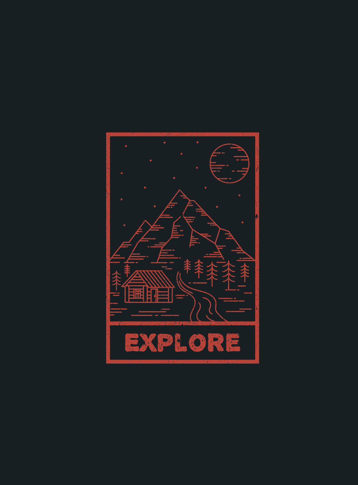
You have some semblance of perspective in the road (river maybe?) and the trees, but your cabin ignores any perspective.
All the line art is nearly the same weight.
How big is it when used? That line art is almost too fine for my LED monitor and the grunge in the frame is, practically speaking, lost.
The border and the word “explore” do work together nicely. Not so sure about the rest of it.
If this is to be embroidered, you might want to check with a vendor on that line weight at the size it is being made.
What do you mean by a badge? Is this something that would go on a uniform?
Any design needs to, both, work within the limitations of how it will be used and take advantage of the opportunities there to accomplish whatever the design is meant to accomplish. Until I know those things, I have no way to critique your design beyond surface appearance.
Looks good to me. Where will this be used?
It’s just a post for my online page, not a commissioned work or anything. I agree with the lack of persepctive in the cabin, i’ll fix it. Also should i have different variations of line weight? and is it all to close together. thanks for your reply
Its a digital upload for my online pages, but that is the idea yes.
thanks! well its just to post to my online pages but the idea is that it may go on a uniform or something, or possibly be a sticker.
I don’t know your background, your experience, your education or your objectives. I don’t know if you’re a high school kid who’s exploring an interest in design, a college design student or a professional looking for work.
So with all that lack of knowledge taken into consideration, I’m going to assume you’re either a college student or someone trying to get a job as a designer. If I’m wrong, disregard what I’m about to say. If you’re a high school kid or someone who someday wants to work in this field, this might not apply until you’re actually looking for a design job. If this really is just a personal art project, well, my criticisms don’t mean anything at all.
I think the “badge” is nice looking. Yes, the cabin perspective is distractingly off, and perhaps the border and type stands out as being too different from the lines making up the illustration. Still, there’s something interesting about it all that suggests some nice possibilities. Just based on your badge artwork alone, it seems you have talent and an eye for design, so don’t let what I’m about to say take anything away from that.
I interview lots of graphic designers and look through lots of portfolios. One thing that pretty much always guarantees not moving forward with additional interviews is when the designer relies solely on aesthetics as the selling point of the work.
As important as visual aesthetics might be, the ability to make something look appealing is just one of the necessary talents in a graphic designer’s toolbox. Graphic design is a business — it’s not a job where you get paid for making art projects. Instead, it’s a career that involves critical thinking and solving problems that always have a point, and that point is usually about satisfying a client by influencing a target audience with specific objectives in mind while doing so within budget, on time and within production limitations.
As nice-looking and interesting as the badge might be, you haven’t provided any information about why a client might need a badge with an outdoors scene that says “EXPLORE.” In all likelihood, you didn’t think a whole lot about that. And I doubt you thought about the production limitations of embroidering a badge or patch with thin lines and containing distressed, grungy patterns in the solid areas.
As a sticker, instead of a badge, like you mentioned, it could work, but I’ve never yet had a client come to me with a project so vague as to enable me to design something that might be this or maybe that depending on how things turn out. It just doesn’t work that way.
Based on your post and your subsequent answers, it seems the problem you were solving was that of a personal art project that took the form of an imaginary badge whose only goal was looking nice.
Yes, I know this is a made-up project for an online web page, which is fine. Even so, it’s not a realistic project with realistic parameters that solves an identified (imaginary or not) problem. Judging from your posts, there was no creative brief guiding what this project was supposed to do or accomplish. Instead, it just became whatever you wanted it to be, and that’s not how graphic design works.
Really appreciate your extensive response and you’re correct entirely. I am a university student studying graphic design currently on holidays and i did this artwork for a bit of fun without any brief, or thought of client needs.
From now on i’ll take your advice and work to a brief and make my work have a point that needs solving when i practise. Do you have any recommendations of a more useful way to go about this when practising my design work, should i follow a realistic brief more often?
Once again, really appreciate your valuable information.
I don’t have any specific suggestions other than keeping in mind that professional graphic design, outside a university setting, centers more around achieving business objectives than aesthetic innovation or interest.
I don’t want to downplay making things look good, because that’s extremely important too. Once you’re finished with your university studies and searching for a job, most any good art or creative director will be viewing your portfolio with an eye toward how your work looks and how your work, creativity, critical thinking, maturity and understanding of the profession can help them make money or keep clients happy, which is almost always the bottom line.
In other words, keep the practice stuff realistic in a way that mimics solving real-world design problems and you’ll be doing yourself a favor.
1 Like
Thanks very much. I’ll keep all of this in mind.
This answer gives a lot of good suggestions.