I made some flyers for an event happening. He told me he wanted something which looked cool with. colors most info about the event in the middle. I also decided to use the company’s colors (orange, white, purple, black) Thank you!
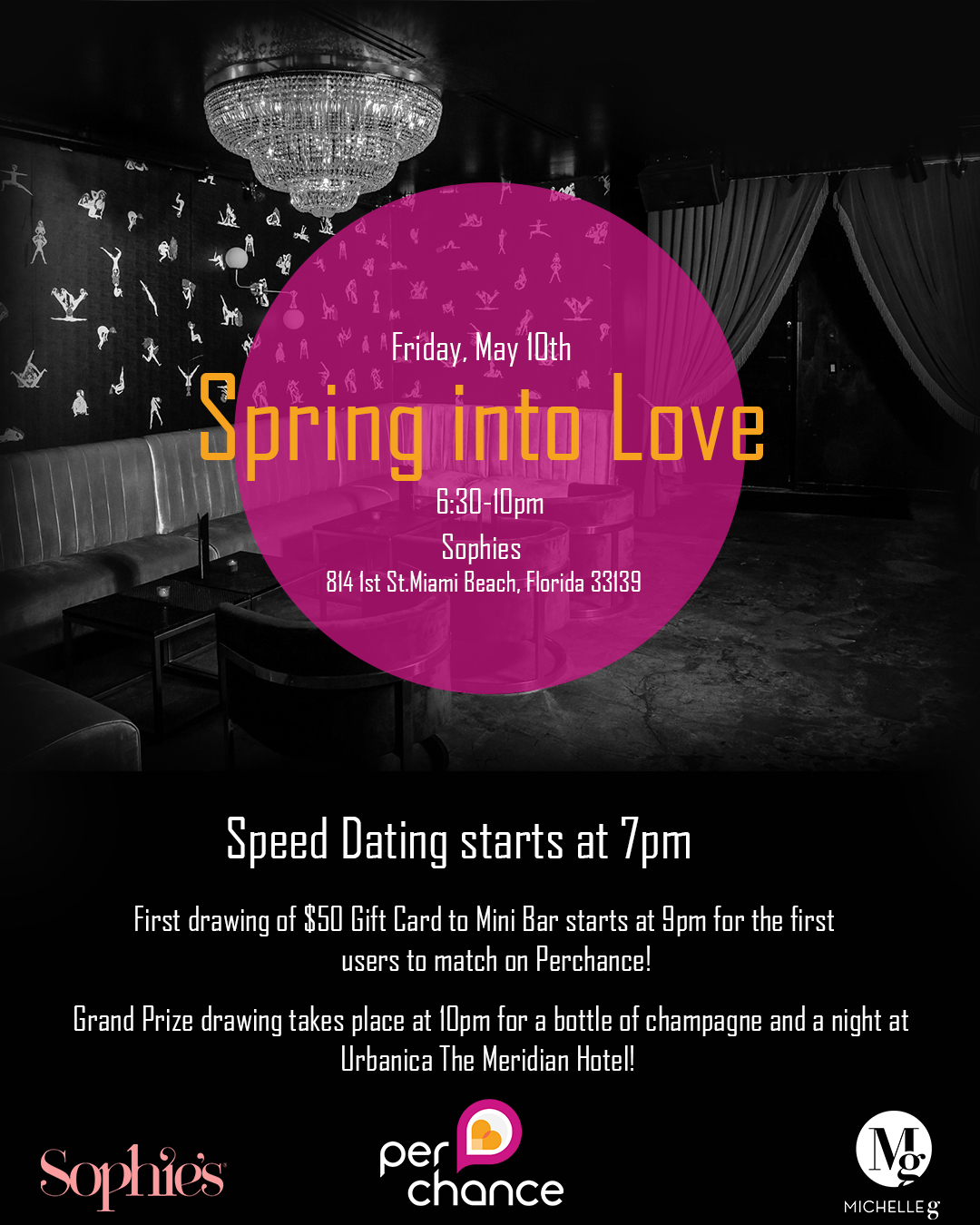
The black background on the top example looks a bit scary — like a place where creepy things could happen. It doesn’t say much about springing into love.
Honestly, it reminds of of the weird dream scene from Twin Peaks:

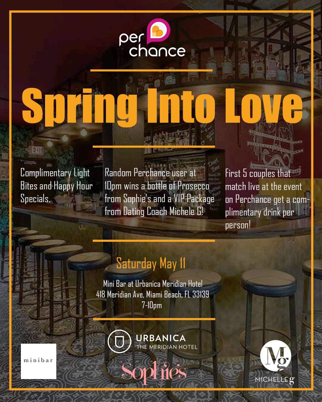
The typefaces in both examples are not especially love-like — they’re squarish and geometric. To me, the subject matter seems to warrant something softer and more inviting.
I like the background image in the bottom example better. It’s obviously a bar, which I suppose is the place where this event will take place. Better still, it doesn’t seem as though any strange-talking dwarfs will emerge from behind the curtains and start dancing. The background images, however, is impairing the readability of the typography just a little. It’s especially getting in the way of the Sophie’s logo at the bottom. You might to selectively darken those areas up a little to make the type a bit more distinct from the background.
Just an edit: there are no people in the images. The entire event is about people meeting other people, so why are you showing empty rooms? Photos of relaxed people having a good time seems more appropriate.
What a fantastic series that was.
1 Like