
The most usable logos are very simple and can reproduced very small or very large. The typography on your logo, for example, would mostly become illegible when reduced down to the size of a business card below. Usually, the typography is positioned separately from the logo itself for this very reason. This enables the type to change in size as needed without it being locked into a proportional relationship to the logo itself.
Logos are typically more abstract or stylized — not so much actual illustrations of the products themselves.
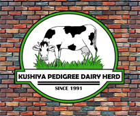
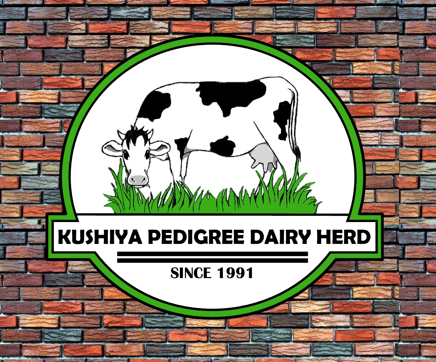
the cow looks human, most artists cannot draw animals, i have that problem at times.
to remedy this i draw the animal on a separate paper, room or area.
animal have fuller face features.
Don’t use stock art / clip art / royalty free art for a logo. Any logo art should be an original work. If you can’t illustrate yourself, hire and work with an illustrator.
humans will buy or use that cow drawing?
jeez, where are we going?
Ya know…?
We see this far too much.
I wish logo designers knew the penalties involved in supplying a client with clip art as part of the logo they were commissioned to make.
Logo designers should have to carry malpractice insurance.
there is a dairy farm title Kushiya in Mazabuka, Zimbabwe that hunts animals, so i would add guns and other barbaric images
and this was the third logo critique posted within a month.