Hello.
I’m in the process of creating a logo for my portfolio website. Here are 3 very similar options. Any feedback on them will be much appreciated.
Hello.
I’m in the process of creating a logo for my portfolio website. Here are 3 very similar options. Any feedback on them will be much appreciated.
Transparency, fuzzy drop shadows and fine lines…
You need to think really hard about all the ways this “logo” will be used.
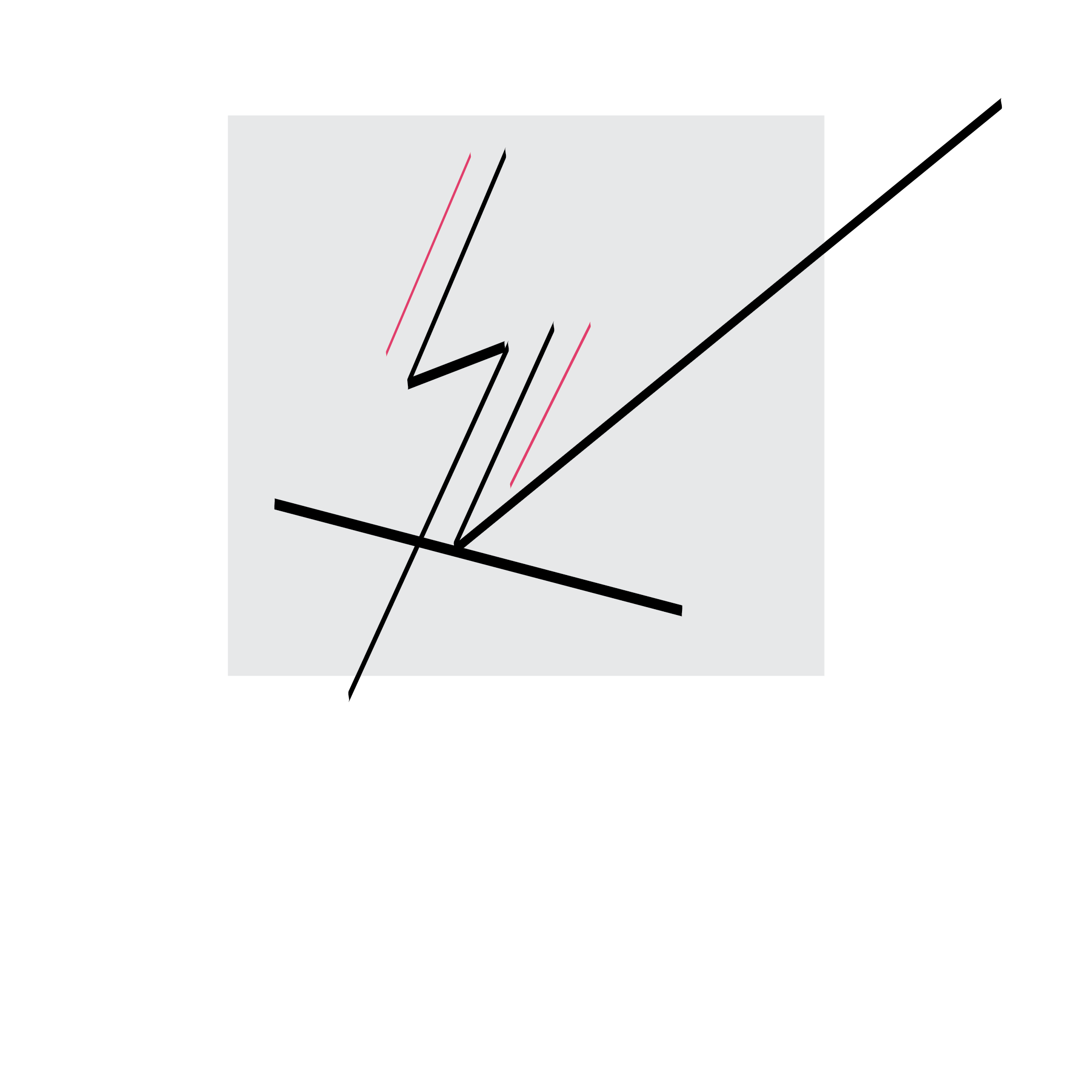
Guessing it is initials in some fashion?
SV? I like that it’s a very original look. It’s very sharp though. You have to choose the business well.
What are you trying to achieve with these logos?
I don’t think there’s any way to judge them beyond their looks since you provided little context about their purpose, why a logo is needed or what they represent? You mentioned them being possibilities as a logo for your portfolio website, which leaves me wondering why a portfolio needs its own logo. Even assuming portfolios warrant their own logos, I haven’t seen the portfolio, so I don’t know if any of these will work or not.
A logo isn’t just a cool-looking symbol of some sort for a one-off usage. A logo’s purpose is to embody or represent a business or other entity by means of the logo’s consistent use and application across all the organization’s outreach materials. In other words, the logo becomes a recognizable and remembered visual nickname that represents the organization’s presence in the world. Maybe you actually do have all that in mind with your logo, but without knowing a bit more of the context, all I can say is that they’re interesting and look sort of nice.
I’m not sure what you are trying to say or sell with this logo. Is it supposed to be a monogram?
Thanks for the replies.
SV are my initials.
The purpose I thought a logo could serve was to give me a kind of visual identity to be used on my website and my business card. I wasn’t thinking of it as something permanent but something that I could periodically change to give some character to my portfolio.
Here’s the link to my portfolio: shwetavachani.com
I didn’t share it earlier because of forum rules. It’s a work in progress.
I thought it was common for designers to have their own logo for their portfolio. But if you people feel it’s unnecessary I’m quite open to ditching the idea.
Depends on what the portfolio is for.
It used to be frowned upon to have a logo in your portfolio if applying for a job working for someone else. It implied you might also be in business for yourself as well and possibly a conflict of interest. That doesn’t preclude having a tasteful monogram though.
If the portfolio is for a freelance business, you should have a corporate brand. You are a Business if you are a freelancer. A logo is usually part of any business marketing strategy.
When you say freelance business or corporate brand, do you mean I should have a company name like Yada Yada Designs (instead of just my own name or initials) and then create a brand identity/logo for it?
Can’t I work on a freelance basis as an individual rather than as a registered business?
Sure, you can use your name if you like and work as a sole proprietor.
Not sure where you are located, but be sure to check the difference between a sole proprietor and any kind of LLC (limited liability company.)
If you do work as a freelancer under your own name, without being incorporated in some fashion, you run the risk of all your personal assets being on the line if you happen to be sued for some reason.
Getting sued and suing someone else is part of doing business these days.
It could be something as simple as being late on delivery for a project, or totally boning a print job. The story I love to tell is about this billboard that went up that I see on my way to work. The imagery was done by doing a live trace of a person’s face. Looked like a horrible paint-by-number and didn’t stay up more than a few hours. Some designer ate about $5000 worth of vinyl and install on that, maybe more, if the client lost their billboard slot for the month as well.
Thanks, PrintDriver. I will keep what you say in mind.