Hi All,
i’m currently studying my diploma and i have been asked to share my design for this assignment for critique.
it is for 2D and 3D design.

Thank you,
Jess
Hi All,
i’m currently studying my diploma and i have been asked to share my design for this assignment for critique.
it is for 2D and 3D design.
Thank you,
Jess
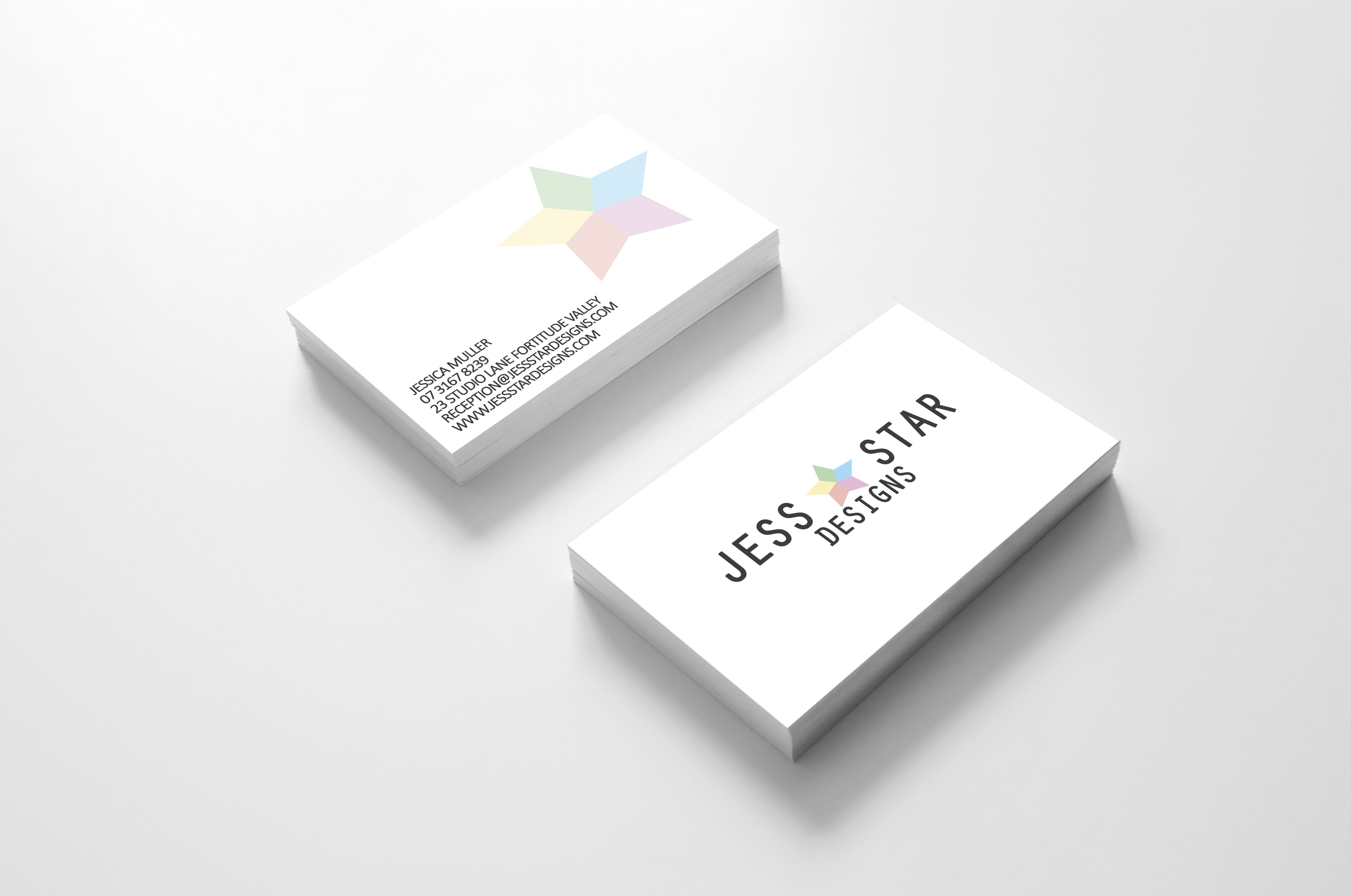
Hi!. I don’t understand what you mean when you say “it’s for 2D and 3D”.
I would suggest to take care about the space of the elements. There is so much air between the letters, but the “DESIGNS” tag is too close to the name.
Care about the proportions of the elements.
I maybe dislike a bit the font pairing as they are too similar, but this is just a personal opinion.
And if you go for a star symbol, maybe give it a twist so it offers somthing different amongst the billion stars out there.
While I can understand wanting to understate your logo for a sterile white office wall, is it a really good business decision to blend into the background on everything, including your business card?
On the previous forum these assignments were one of my pet peeves as I make and install these kinds of things all day long.
In the design of 3 dimensional office graphics, it does not matter at all what your rendering looks like. That 's just a simple photoshop skill that you may not even use to any large potential in the real world. When we do in-space renderings, the exercise takes 5-10 minutes, or quite often it is a push button in AutoCAD or Vectorworks that renders while you are doing other things. Otherwise you are wasting billable time.
The question that needs to be answered with such an assignment is do you know how it is to be built? Or do you at least have a concept of what it is, how thick it is, how it’s going to be lit, where the power is coming from for the lights, where your shadows will fall in reality, and all that wonderful stuff that makes your office logo a success or failure?
Would you consider carrying the wood elements of the desk up into the logo area to tie the look together? Right now the focus is on those two wooden areas of the desk at opposite sides of the room, not on the logo above. And I can guarantee, from experience, that the client would be calling you to have the fabricator come back and put some kind of a modesty panel on that desk…![]()
As for the business card, that isn’t 2D design. Your logo on the screen is 2D design. The business card again only shows your mad photoshop skillz. These things tend to hide bad design in the skewing. As previously mentioned, you have too much space between the letters of your name, inconsistent kerning between the T and the A and the R of STAR, whatever all that mass of text conveying the all-important contact information is jammed around your logo bug (which is more important, the bug or the info?)
On the subject of the logo bug, you have a 5-color logo. That’s 1 more plate than 4-color printing if you decide to do spot colors. And speaking of spot colors, those look like really dim opacities or tints of solid colors that may or may not reproduce well at that fade level in various print processes. Some print processes have an ink limit of 5%.
2D design in the way this assignment should be taught is to create something else environmental in space. Anyone can do a business card. But could you source and create a large wall mural? Or ADA wayfinding? Or an integrated branding experience for the client waiting space?
Not your fault. I blame your professor.
In addition to the rest of PrintDriver’s good points, this is his hint of fundamentally poor typesetting. All caps, that tightly tracked, on solid leading is the direct opposite of maximum readability. The mistake is woefully compounded by the silliness of displaying it in a skewed and tilted, design-mangling mockup.
thanks guys, i still have a lot to learn don’t I.
I haven’t asked for much critique before in the past so this is very helpful.
PrintDriver, the assignments are pretty vague so of course there is no mention of lighting - maybe I’ll add that into my assignment ![]()
You are already showing down lights in your mockup… The trouble with mockups taken from online sites is that they don’t let you think too hard. You just add your logo to a layer and the template does the rest, whether it makes sense with the shown environment or not. You are at the mercy of the template creator.
Get some kid’s refrigerator magnet letters that have a bit of thickness to them and play with lighting angles to see where the shadows from the top line of text will fall in relation to the bottom line. Also note how shadows in the counters work, or don’t work.
And bear in mind that when showing real world usage to a client, a Mockup is not ever going to be available. You would be working, at best, with a photograph taken of the raw space. No template. No handy actions or layers.
Not only ^that, but a lot of these student posts state that the assignment is “2D and 3D Design,” but I have yet to see any actual “3D Design.” Again, this reflects poorly on the instructors and curricula, more so than the students.
Perhaps actual 3D design isn’t required, but the distinction really should be clearly made (by educators), toward and among aspiring practitioners of Graphic Design, which at its core, is the business of accurate and effective communication.
So to be clear (to the OP and other students who may read this thread going forward), your graphics are designed in 2D, and as such are specimens of 2D design. A simulation of your 2D design in a 3D application, contrived by various image-based effects (shadows, etc.), does not constitute 3D design, and is in fact, only an extension of your 2D design that is just as much only 2-dimensional. Do not make the mistake of believing that by virtue of this exercise, you’ve been introduced, let alone prepared, with respect to producing design work that specifies or directs the fabrication of material 3D objects.
Contrast is important. There are very few unique situations where low contrast design works. Branding is typically not one of them. Washed out colors do not work well for branding purposes.
Just to reiterate to the OP, we aren’t taking you to task for any of this.This assignment is a current trend in Graphic Design curricula that is just being lazily taught.
Like I mentioned, I fabricate this stuff all day long. I will work with any sort of design concept and budget to get you something close to what you envision. But the closer you are to a solid idea of what you want, the less money is spent on development and the more money can go into the actual implementation. This subject should be taught with actual concept drawings, research into materials used and possible lighting/paint/print/sculptural elements that can be added to the actual dimensional objects. A course on basic “environmental design” could take up a whole semester itself.
Here is a link to a slideshow for a huge city branded sign package to show how a dimensional piece of signage should be annotated. Note the mockup is just a representation done in AutoCAD and in this case is even used as the dimensioned drawing. All the meat and potatoes is in the drafting.
View slideshow:
I’ve noticed that we professionals on the forum have a tendency to critique student assignments from the perspective of our professional-level concerns. I don’t think that’s bad a bad thing, and it’s good to let students know the real-world obstacles they’ll need to deal with once they’re out of school.
At the same time, though, the immediate concerns of these students are about the assignments at hand and getting critiques relevant to the instructor’s expectations. The main purpose of most of these kinds of assignments is introducing students to the basic principles of design. Fabrication and implementation, as important as they might be, might be best saved for the advanced classes (although most schools have a tendency to ignore them altogether).
I suspect by 2D and 3D, the instructor isn’t necessarily talking about 3D software modeling as much as he or she is referring to applying design principles to physical three-dimensional objects rather than flat surface, like a piece of paper or a computer display.
So putting my professional concerns aside about the practical nature of this particular assignment, I think the concept works pretty well. I like the typeface you’ve chosen, but I agree with OXYD about proportions and the word DESIGN being uncomfortably close to everything else and not quite matching it.
I’m not sure that you’ve pushed things far enough, however. Your solution is clean and simple and I like that, but it’s also a bit conservative when, as a student, you might want to experiment a bit more by pushing the envelope just a bit further. You also need more practice with simulating a 3D environment — the shadows behind the letters on the wall aren’t exactly convincing.
I have to disagree, B.
Students only have so much time to be in classes. This is just an exercise in learning to use Photoshop.
Downloading a template and changing up the logo layer isn’t a class in 3D design.
Doing a mockup doesn’t necessarily mean the shadows have to be correct. The idea is to give a client a general idea what their new look will look like. That has nothing to do with manipulating stock templates.
The student needs to be aware that shadows will indeed be cast, and to what lengths those shadows will throw. They also need to do a little bit of learning about how to research such a project in case they are asked to do one in the real world. If that isn’t part of an entry level course, maybe the school should save this exercise for a little later in the game?
I’d rather hear that a professor brought in some actual materials to show the class and told them to find ways to use them in their designs, not that the brief was “vague.”
If you want to hold the critiques to how well they used Photoshop for these things, I can do that.
Or the logo itself, though again, these 3D projects tend to come about after a logo and branding plan are well developed, then the skill of the designer is to show how to create something stunning within the parameters of the branding guidelines. It shouldn’t be about kerning at this stage…
As a side note:
I found the designer’s website for that particular desk.
I also found about 40 stock sites using it, I’m sure without permission (I particularly liked the one stock site that said, “This Photo May not be Property Released,” LOL.) But that’s neither here nor there in this discussion.
I’m not really disagreeing with your general points.
In the old forum, I often expressed my dissatisfaction with the way design schools only halfway educate their students before tossing them unprepared into a world where academic concerns no longer apply and where practical business realities take precedence over the kinds of cool-looking stuff that earn top grades in school.
Students, start out with the basics, then move on to increasing levels of complexity. From the very first design class in college to the last, I think schools should do a better job in teaching about the more practical aspects of the business, and they should instill those concerns as being an inherent part of the design process. On that, I don’t think we have a disagreement.
Even in an ideal undergraduate program, however, a very good and well-versed instructor might intentionally limit the coursework to specific things that need to be learned in a sequential step-by-step approach over a four-year curriculum. When learning to read, for example, a first-grade teacher probably isn’t going to cloud the waters over concerns about dangling modifiers before the student has mastered basic spelling and grammar. Similarly, a second-year design student probably isn’t going to get marked down for failing to consider a signage fabrication detail when the coursework is actually about exploring ways to break through creative blocks.
This forum can be a place where students mix as equals with professionals, which is great. Students can be exposed to the realities of the profession while still being in school, and that just might make the transition from school to reality that much easier for some, which is really good.
At the same time, though, the objectives of school assignments are different from commercial jobs. School is about pushing boundaries, exploration, learning from mistakes and moving past them. In a commercial setting, a designer is already expected to know his or her stuff or be working with someone who does.
Approaching school assignments as a set of progressively more difficult real-world tasks isn’t necessarily the most efficient path to a good education. I think the projects in design school ought to focus more than they do on being realistic (especially at junior and senior levels), but the fundamentals need to be learned first. And quite often the best way to learn fundamentals, explore creativity or engage in critical thinking is to divorce those exercises from the constraints of being practical.
I think we can certainly mix in our more practical concerns while critiquing a student’s work, but we also need to approach the critique from the vantage of point of the student trying to master the basics while satisfying the instructor’s objectives for the assignment, which might not have a whole lot to do with the broad complexities of a real-world job.
“Design” is way too close to ![]()
Maybe we can agree to disagree.
I just happen to feel that graphic design is a trade and should be taught like one. Maybe this is why the kids from tech high schools are so much more prepared and able to do the work than a college student. If a high school graphic design program is geared toward working in the real world and requires students to learn the trade rather than exploring their Art, why can’t a college course of study be that way?
I’m curious how long this photoshop module lasts? Maybe the OP can let us know, if they haven’t stopped reading by now. Is it a week? Two weeks? Any more than a single classroom lab frame (3 hours) is too long. Maybe, if presented at the beginning of a lab frame, given 2 hours to complete, then critiqued for the last hour, I’ll give it a pass.
![]()
That’s a thought-provoking point of view that makes sense.
I think you’re right, our differing viewpoints on this one might very well stem from me seeing design as a profession, but then I’m in the end of the business where that’s mostly the case. You’re more at the end of the business that deals with the execution of the things people like me send your way.
One big problem with our country’s approach to higher education is in the way it pushes people into liberal arts-oriented university programs while doing so at the expense of equally valuable trade and vocational schools that are sorely needed and make a much better fit for many people.
Here in Utah, we used to have a very good, state vocational school system. Over the years, the entire system has morphed into a sprawling conglomeration of community college campuses composed of traditional liberal arts programs and offering both associate and bachelor’s degrees.
Students with an aptitude for and an interest in, say, auto mechanics, construction, printing, etc., end up being pushed into more academic programs that are ill-suited for their personalities, and it leaves society with a shortage of adequately trained and skilled trade people.