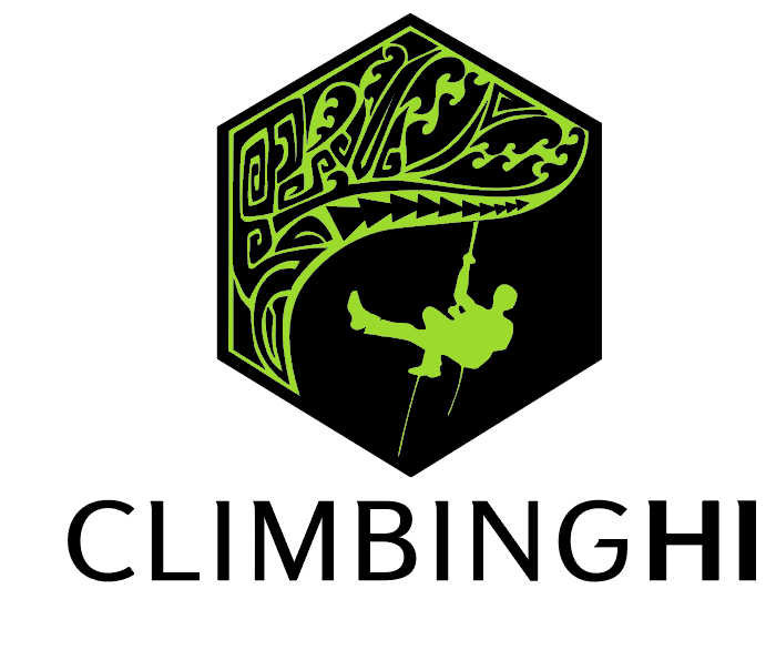
I’m a newbie. Pls critique this logo for a hawaii based tree company.
Ok got my helmet on…GO!
Thanks!
I’m a newbie. Pls critique this logo for a hawaii based tree company.
Ok got my helmet on…GO!
Thanks!
The rope lines are way too thin for any production method. They barely read on my retina display. They will just fill in when printed.
I don’t know about tree climbers in Hawaii, but around here they where long pants and boots. This guy looks like he’s rock climbing. But that might be a location thing.
Tribal tree, realistic silhouette?
Copperplate? Really?
The “HI”, the “Climbing” and the logo bug are completely disjointed. They do not relate to each other. Adding the extra busy tiki detail to the “I” is not helping matters in that respect at all.
Think of some ways to make it all work together.
Thanks!!! Yep was expecting all that…
Actually looking options for fonts…Nova Square?Avenir?
Totally agree on tiki I is too much! Client insisted on it ![]()
Yes guys here use pants and boots too lol I’ll see to correct that and thin ropes.
Also simplify tribal tree.
Tribal tree, realistic silhouette? what do you mean?
They stylized tree would suit a stylised person, though I’m not sure you need a picture of a person at all. Or perhaps a tiny stylised person would be enough.
The font you have used doesn’t work at all.
Are you based in Hawaii? I’m a fan of the tiki aesthetic which is also popular in my country. If that’s the look that the client is after, then I suggest researching other tiki logos and getting a feel for it the illustration and typography. While you might not go full blown tiki bar, there’s a lot of fun imagery and typography that you can be inspired by.


The tree isn’t easily recognisable a tree. It’s more like an ornate design you’d find on an iron railing, I suppose.
Also a smaller and different font and a way to link it to the image might help to make it come together as one unit.
When the client makes an awkward request, make it into something better that incorporates the tiki. Like the trunk of a tree maybe, not anything in the company name.
The idea is to emphasize climbing HIGH. The tiki detail detracts from that.
When doing a logo, you have to think cohesively. Sometimes it helps if you think of your logo as cut out shapes that have to fit on a board of some shape. What is the shape of the board and how do the elements of the logo fit in, how does the negative space react. I do a lot of signage. Sometimes the look of panic in a designer’s eyes when you ask them what the sign board shape is, isn’t pretty.
Question…
Do the various tiki faces have any sort of ancient local reference? Last thing you want to do is unintentionally represent the god of flatulence or something.
Too many clashing ideas.
It’s just sort of disjointed with too much stuff competing for attention. All the parts in a good logo need to speak with one voice, but you have a choir where each singer is singing a different song. Take just one or two of these ideas and work it into a cohesive logo.
The choice of a typeface should depend almost entirely on what will best compliment the logo you come up with.
Thanks all who responded!! Appreciate all feedback!!
I guess “less is more”
I’ll work on it and update asap.
Mahalo!
LOL ![]()
God of flatulence…That would be inconvenient!! hahaha
I think tiki is out of the design for good…didn’t even like it in first place.
Mahalo!
If you stumble across the motif for the god of flatulence, please share. Asking for a friend.
![]()
![]()
![]() will do
will do
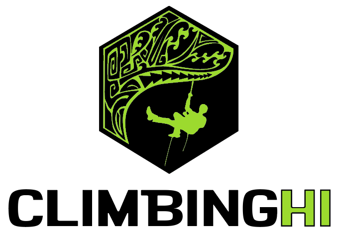
Tribal tree: eliminated the tiny shapes. Don’t think its necesary to make tree more tree-like cause its already identified as a tree by the viewer.
Made climber with pants and thicker ropes.
Tiki bye bye…
Changed FONT!..finding the right one is the hardest part.
I think it has to be simple as the logo has a lot going on.
I like the little serifs on this font, i could make them more obvious ?
I think you’re getting closer! I’m no expert (I’m a student), but one thing I notice is that the “HI” could use a little more contrast. It blends in too much with “CLIMBING” in my opinion. Maybe make it even bolder?
Hmm… I feel like you are just refining the same design. Were there any other concepts?
Yes, I am trying to make this one work, there were other concepts at the beginning …client is my husbands company ![]() yep he’s paying
yep he’s paying
Well he loves the logo! wanted tiki and all, so to convince him otherwise I showed him these critiques!
Now he wants me to make this one work, but no time to redesign whole thing cause they need to make business cards, tshirts etcASAP. (they actually started using the logo as is ![]() )
)
So…I’m trying to get the right font and proportions.
Not the typical work scenario ![]() Good (paid) practice though!
Good (paid) practice though!
Thanks so much for your input!!!
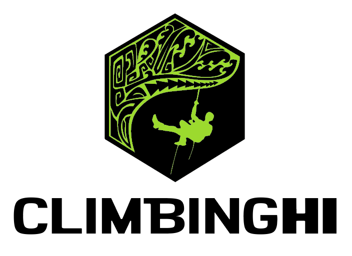
Um, don’t outline the HI. It’s no bueno.