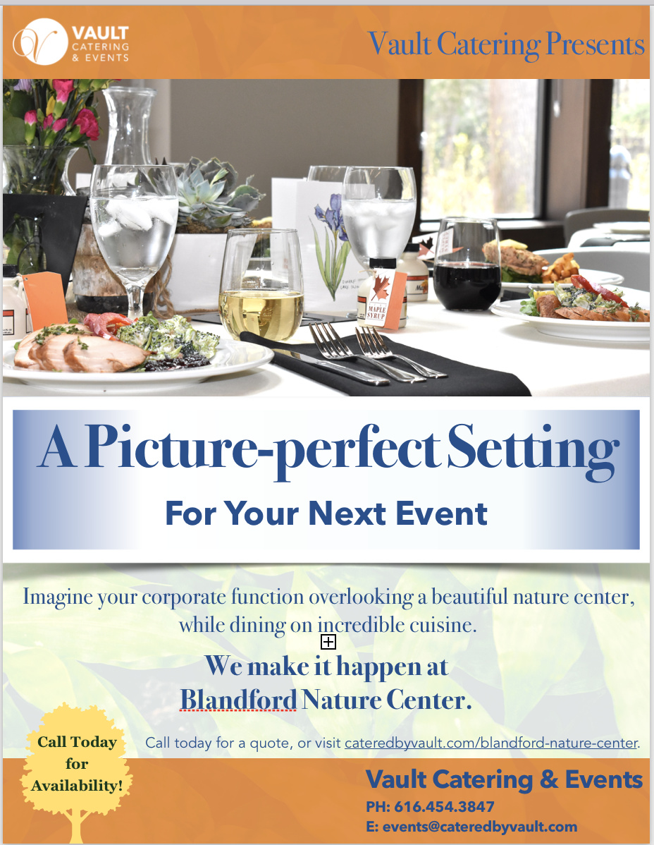
There are some positive things about what you’re showing. Working from the top down, I saw the logo, the photo, and the headline. So that’s good. The copy is short enough that I actually read it. With the horizontal banding, it’s easy for the eye to work its way from the top down.
That said, this needs some work. Here are some suggestions.
It looks like blue is Vault’s corporate color, but blue is an unappetizing color. Google restaurant logos and see how many are blue. Not many. Since this looks like a high end caterer, going by their website, I think you could get by with a pretty subdued color palette. Maybe even just black and white.
The hero photo looks a little bland to me. The colors are kind of flat, and there are far too many things to look at in the photo. It looks more like a snapshot to me than a professionally shot table.
Speaking of photos, you talk about how beautiful the nature center is, but you only hint at it with a ghosted photo. A photo of a corporate folks enjoying a catered event at the nature center might be the better way to go.
Edit, edit, edit. No need for “Vault Catering Presents.” Instead of multiple CTAs, just say “Call to plan your next event,” or something like that. Then you can loose the generic looking tree that isn’t doing anything.
I think you’re rookie status is showing up in the typesetting. It’s kind of all over the place right now. Simplify the type.
Things are too close to the edge. For a flier like this, I’d give myself at least 0.25" between the edge and any type or graphic element.
The shadowing on the headline graphic that makes it look like it’s a curved piece of paper is a bit dated at this point.
Consider reordering things a bit. Move the headline to the top, and move the logo to a signature position at the bottom with the photo and email. That way you can cut the Vault Catering & Events" at the bottom.
I’m assuming the box with the plus mark is some sort of artifact from a preview and not part of the design.
So, you’re off to a start, but it needs work. Push it, and post your next attempt. You could end up with a piece that will perform well for the client and a nice piece for your portfolio.
Good luck.