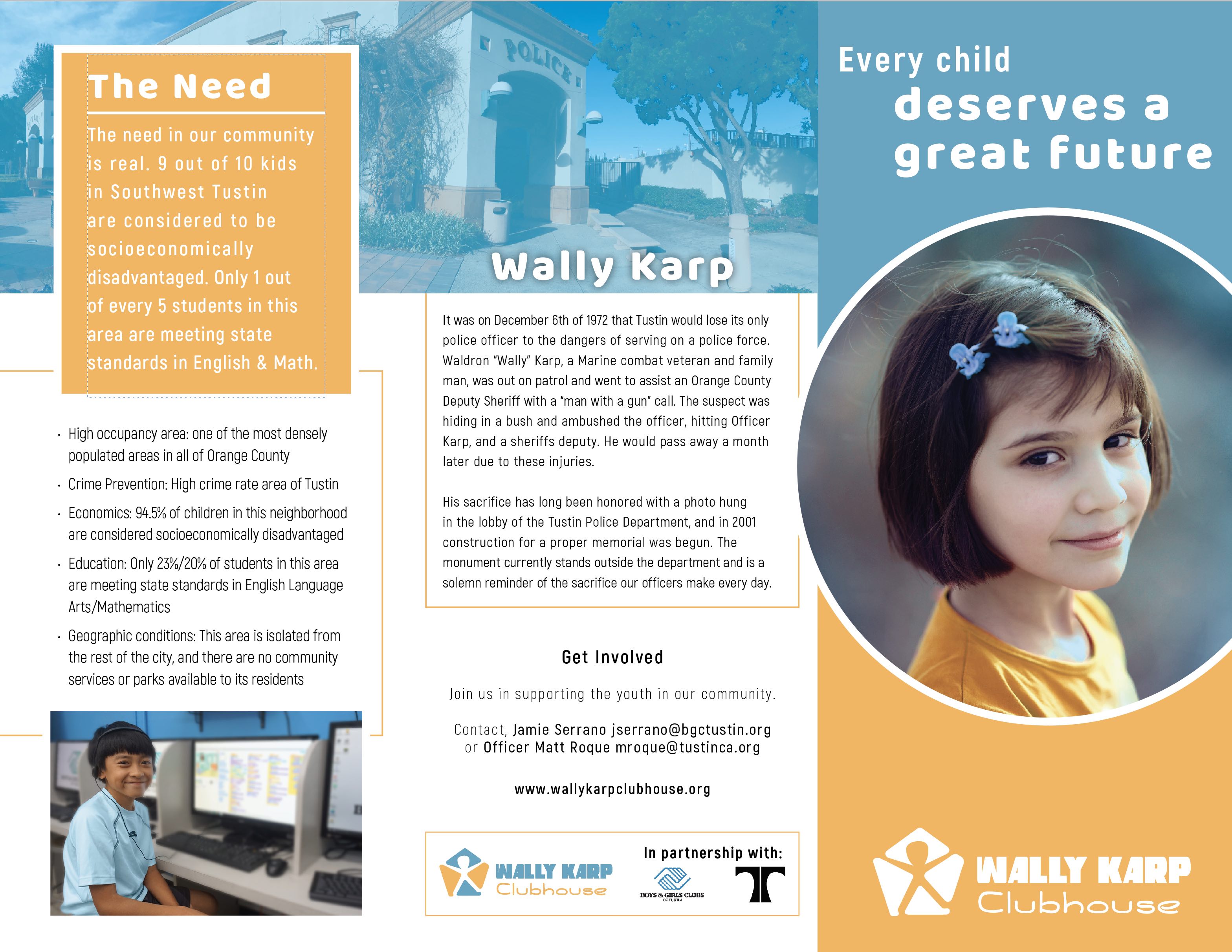
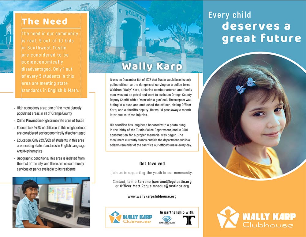
Hey everyone, so the one thing about doing freelance is that you have no reliable designers to bounce ideas off of or get feedback from. I believe in the power of getting other views and eyes on a project, so here is a pamphlet I am working on for a local charity, The Boys & Girls Club of Tustin. I am still working on the interior side, but I would love to get some feedback for this.
Also, please crit the logo since that was a part of the project too.
Odd, It seemed fine on my end. I did notice (after your reply) that it is claiming the image is larger than 5072kb and so I rezzed it down a bit and it should be working…
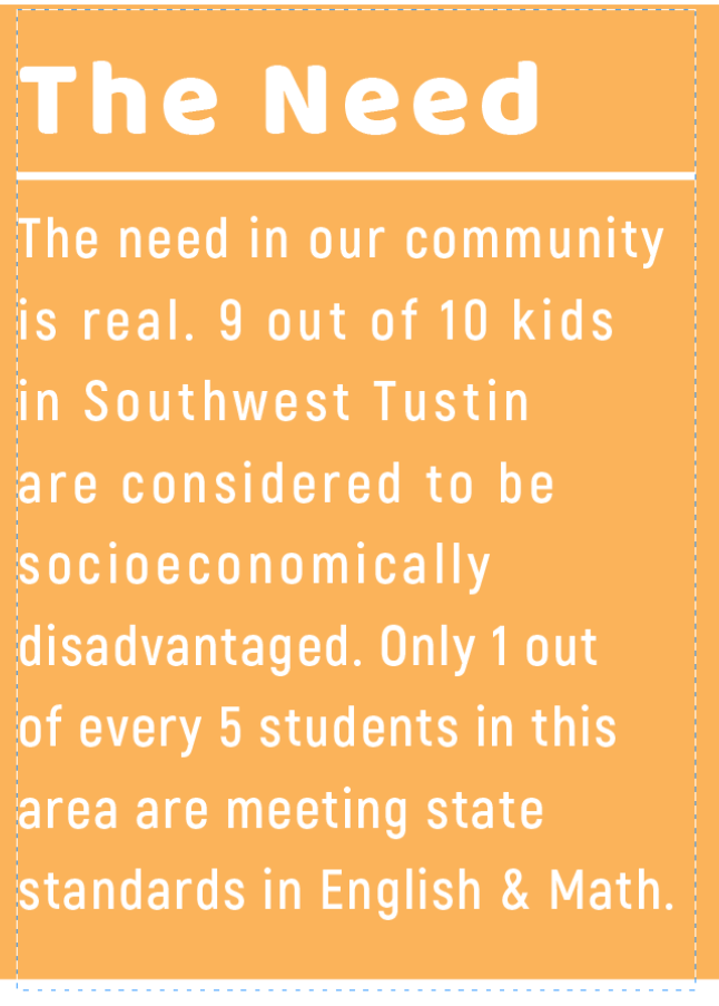
I feel like the tracking is inconsistent. Some is tight and others loose. Is this to force the full justify?
Size of fonts, I would stick to 3 text sizes: Header: The Need, Wally Karp, Get Involved
Intro: The need in our comm…, Get Involved…
Body: Bullets, It was on December…
The stroke is just an artifact from me taking a screenshot in InDesign for this (the bounding box).
Yeah, the tracking is to play with the justification, but it still needs a bit of tweaking. I’ve been kind of rushing a bit on this as the flow of content has been sporadic and time has been in short supply this week. – But I will be sure to double check my typography. I’ll admit, I tend to come back to that near the end and try to clean it up as opposed to being too critical at the beginning. I’ve historically had so many changes and revisions that I always feel like I get too bogged down in the typography just to have some change that makes me have to go through it all again
BTW, I liked the colors because it is supposed to not be “Boys & Girls Club” branding and so I figured a different blue would work so it still feeds off “police” and “B&GC”
Given that Wally Karp’s memory plays such a large role in this, maybe you could insert a small scan of his photo that the brochure says hangs in the police department lobby.