Hey, guys!
I’m a college student in need of some critiquing for a magazine design assignment. The article is meant for millennials who are working professionally and seeking advice for achieving success. Any feedback is welcome! Thanks in advance.
1 Like
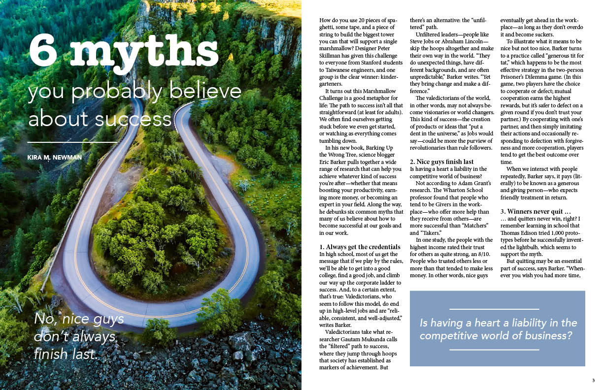
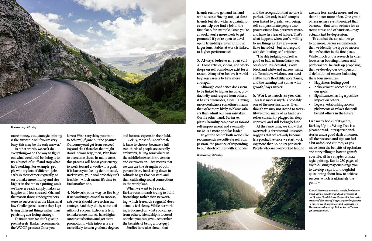
Your layout demonstrates some reasonable levels of page structure sense, but the typesetting is too pedestrian to produce the desired effect. That effect is to draw the reader into the article, of course. So first, you’ve got a which-road-to-choose? theme going on in the photos, and that’s well and good, but that third one is uninteresting, obvious space filler, and a clear indication that you rode the concept just a bit too hard. The first two would be enough.
Getting rid of that third photo will free up some space and allow you to install some type treatments to make this more inviting and easier to digest. Some things to consider:
The lead-in: It’s a common tactic because it works. It’s weak to begin an article in the type style that will be used as body type throughout. If that first paragraph (and perhaps the first sentence of the second), was set apart, larger than the body type, and positioned so that the reader almost can’t avoid reading it, you’d hook a lot more readers into staying engaged for the whole thing.
The subheads: Also a lead-in tactic. Again here, yours aren’t set apart enough. A different font, different weight, some space after, etc., would go a long way toward making those subheads much more effective “mileposts” for the reader. The way you’ve set them, same font only 1 or 2 points larger, leaves them ineffective.
While your body type treatment is fairly typical of magazine fare, it’s a bit tighter than it needs to be. I’d experiment with reducing its size a point or two (It’s hard to know what size you used, but if the author-note at the end isn’t too small, the body type can be smaller), and adding some leading to breath some air into those columns. I’d also consider a more “millennial” -familiar sans-serif, seeing as that’s your target audience.
You (or the author) may have overused the em dash in there.
The pull-quote style question would be more effective in a location other than the bottom-right corner of a page.
1 Like
It leads with 6 myths, and yet there’s nothing in the layout, even larger called out subheads to indicate what those myths are. The layout is ok, but it’s bare bones minimum. The lead photo is nice, but I don’t get what the curved road has to do with the headline or story.
If you haven’t already, go look at magazine articles at Barnes and Noble (or somewhere like that preferably, that would have “nicer” magazines. If not, check out Walmart or Target or even go online to a site like https://issuu.com/ and click around through their online magazines. Don’t copy but use those as inspiration or to get some ideas on how to really push your layout.
Hey maryntan, ![]() Am still a student as well, but am sure if am wrong the experts here will corrects me
Am still a student as well, but am sure if am wrong the experts here will corrects me ![]()
the subheads needs more contrast, i remember i read in the non-designer’s design book by robin williams that if two elements are sort of different but not really, its not a contrast then, its a conflict, and also don’t be afraid, if you want that two elements looks different then make them looks *really different, otherwise it will just look like a mistakes and not intended to be different,
for a more effective contrast try at least contrasting two of these: the form of the typeface, the weight and the size.
in the last page, the bullets looks too far from the text for me
in the last page as well, in the last chapter you didn’t use an indent, am not sure if this right “as i said am no expert”, but shouldn’t you stick with just one thing either indent or extra space to show the beginning of a new paragraph??
in the last picture it took me a second to find its caption, because the caption was in a different place in the previous picture, maybe this would be confusing if you had lot of pictures in a long magazine, there should be some consistency “no surprises” , maybe some experts here will tell us if am right or wrong,
i like the pictures by the way ![]()
can a drop cap solve the problem?
No. It’s not only visual. It has to generate interest by conveying a message that piques the readers’ curiosity.
See how it’s done here?
The headline leads your eye to the larger-set, introductory text, which can be a contextual teaser, or a summary/promise of what’s in the article, or something else aimed at whetting the appetite of the target audience (because you know who that is and have done research to learn what they like and want) and induce a desire to read the whole article. In the end, delivering the content effectively and conveying the message are the core objectives, over and above making it look nice.
1 Like
Thanks a lot HotButton ![]() , this really helps.
, this really helps.
and can you critique my critique above, if am wrong on anything?
For several years, I was the design director of a regional outdoors magazine, so I sort of have to jump in, even though I agree with most everything that’s already been said. So at the risk of being repetitive…
Your layout isn’t at all bad; it’s just a bit conservative given the nature of the magazine, its audience, and the fact that this is a major feature story within the magazine.
As has already been mentioned, your lead paragraph is a big problem. It’s not at all obvious where the story begins. There are several ways to fix this, like giving the lead it’s own headline, running the first paragraph over two columns in a larger point size, adding a larger initial cap.
And speaking of the lead, you definitely need to place a byline before it, as in, who wrote the story and his or her title.
Photos need more elaborate cutlines (captions). Eye tracking studies indicate that readers have a tendency to jump around a page before committing to reading a story. They first look at the photos, then the headline, then they typically read the cutlines or the pullout quotes before jumping into the story. This sequence means treating all these elements with the importance they deserve. In other words, make the cutlines (and the pullout quotes) enticing, informative and compelling enough to engage the reader and pull her into the story.
Your headline is literal, yet your photos are metaphorical. By that, I mean the photos suggest a journey (which is a great idea), but you’d never know that without reading the story. You might want to rewrite the headline to tie in the photos with the story. For example, “The Road To Success: Six detours to avoid on your journey.”
Long blocks of uninterrupted text are intimidating to readers. People are short on time, so you need to pull them into the story through multiple entry points. I’ve already mentioned cutlines and pullout quotes, but you’ve missed one huge, gigantic opportunity with this particular story. Readers absolutely love stories with top ten lists or five things on the way to this or that. Your story is exactly this kind of story, but you’ve ignored the potential to play those six things up as visual entry points into your story. Instead, you’ve just added weak, little entry headlines into each of the six sections. Take advantage of this and beef them up with a little interest, like big numbers that grab attention, and bold in-line heads to each section.
Your pullout quote is sort of weak. The quote itself is okay, but it’s treatment is dull. Use some big quote marks and bring a little typographic interest to the quote.
Every magazine has a style as to how they treat odds and ends, like page numbers, vertical and horizontal rules, credit lines, running heads, etc. You’ve ignored all these things other than the small, lost-looking page number down at the bottom. These odds and ends provide, both, an opportunity for visual interest and a means by which the magazine, as a whole, establishes and maintains a distinct personality throughout the issues and from one issue to the next.
Like I said, though, your fundamentals are good, and your layout isn’t bad. You just stopped too soon and were too timid about grabbing hold of the pages and making them do your bidding.
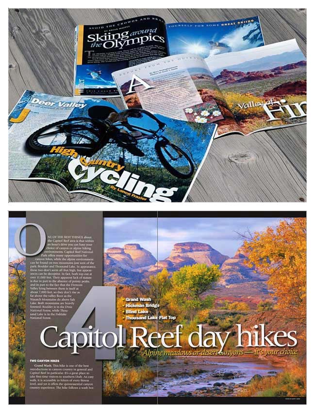
For better or worse, here are some spreads I designed for the magazine where I worked. The nature of the magazine is different from yours, but they show some of the ideas I mentioned above.
2 Likes
Wow, I was not expecting such thorough feedback! Thank you all so much for taking the time to help me see where I can improve my design. I know I have a long ways to go, so I really appreciate you pointing me in the right direction. I’ll share my rework once I get to that point. Thanks again!
1 Like