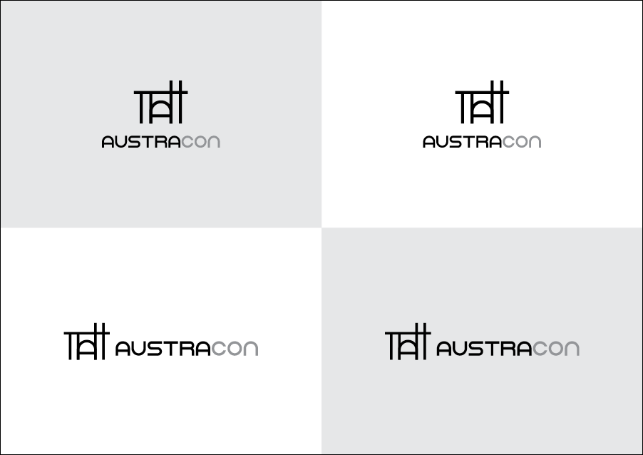
not sure how i feel about this, i love it but would love other designer opinions - they build luxury homes, and i designed an icon that used lines and curves to represent the houses and so that it balances well with the logo name… keen to hear feedback ![]()
1 Like
Is it supposed to spell a word? All I see is Tatt at first glance.
I like it.
I like all the lines in both the type and the house being the same width. I like that you’ve incorporated the same A in the words into the house as the door. It’s clean, It’s simple, It’s clever, and its understated, and this is what usually works best for higher-end brands, which you’ve said yours is.
On the bottom two, where you’ve positioned the type out to the side, the vertical positioning seems arbitrary, have you tried positioning it lower — matching up the bottom of the letters with the bottom of the icon? It seems it needs to line up with something — even if it’s the cross bar of the door A — but it’s just floating there not really lining up with anything to visually anchor it.
Like RKK, I first wondered if there was something spelled by the icon, but I soon decided there wasn’t other than the A. Personally, I didn’t have a problem with that. If others do, though, well, maybe it is an issue.
I really do like it, though.
no it’s not meant to spell anything, i just used the A from the word as the door in the icon because i wanted to include a curve somewhere in the icon so that the logo name and icon would work well together ![]()
You’re right, i have played around with the positioning ![]()
thankyou so much for your feedback!
Ok no problem .. I just wondered is all ![]()
I do like the idea you had going at first with the A but once I keep looking at it I am not finding a house. I think its probably because a door is not curved at the top. I keep seeing a curved gate like you would see at the front of a property. I would say stop focusing on building the logo in front of the name and build it between Austra and con. This will also help because it will keep the name from reading like a tech company. I did these 2 things. First I covered up the name and just looked at the drawing and felt I was looking at a bridge. Then I covered up the drawing and felt like I was looking at a tech company logo.
If it helps I attached a logo I did for a investment company that buys homes.
Hope this critique
helps!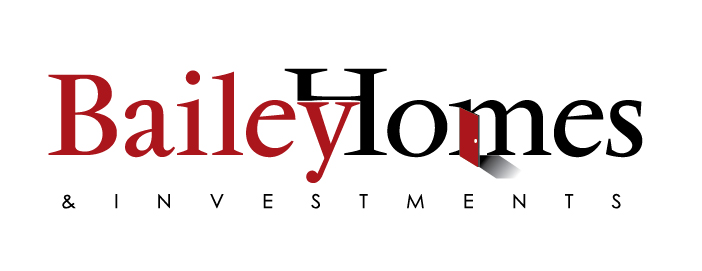
I don’t mind this logo at all ncreative. I’m not head over heels for it, but overall it’s simple and visually pleasing. It will be inexpensive to produce/print to boot.
I wouldn’t mind seeing another typeface or two (to replace the existing one, not in addition to).
Ugh, it’s really just that “R” that bothers me. Eh, maybe keep it as it.
Overall welldone. Professional looking. Clean. Nice work.
Personally I don’t like it much. It is too complex. A better logo should be very simple and easy to remember. I think you can do better.
This is probably not going to be any help whatsoever, but here goes.
I want to like this logo more than I actually like it. At first glance, it appears nicely design and modern. But if I saw this logo outside of any context, I wouldn’t come up with luxury home builder. I might have thought architect or commercial builders, but it doesn’t feel residential to me. This might not be a problem if your client enjoys massive name recognition in the marketplace. I’d put together a mood board with other luxury brands for inspiration.