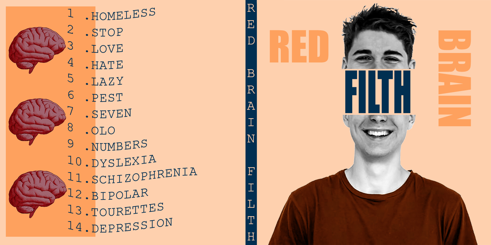
this is an album cover I am working on, this is one of five basic concepts, my fellow band-mates seemed to like this one the most, I think it looks nice but It seems like something is missing and the work is somewhat bare however everytime I attempt to add another element the entirety of the piece seems too “loud” and somewhat childish. any constructive feedback would be amazing, thank you
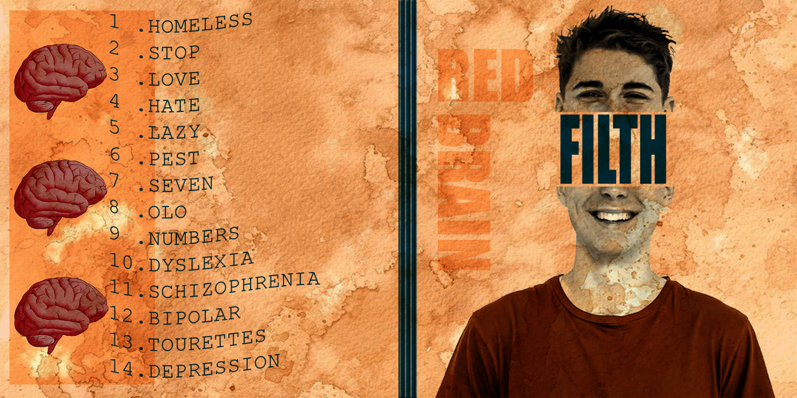
You’re intentionally running counter to normal conventions here, so really, you can do most anything with it and call it good. I suppose you could add some subordinate and subtle filth (dirt, grime, etc.) to areas in the background.
The only thing that really throws me as being off, though, is the name. On the spine (I guess it’s a spine), the name of the band is Red Brain Filth, yet the cover seems to read Red Filth Brain. I’m guessing the name is either one or the other, but on something like this, I’m not even sure of that.
thank you so much for your feedback, I agree I kind of struggled with the spine, the band name is Red Brain, and the album name is “filth”, but I can totally see how the wording can be confusing.
Album art should reflect the album. Not having heard the album it’s hard for me to say definitively. With that caveat out of the way, I’ll say this. I don’t really car for this too much. Given the titles of some of the songs, I think you could do a lot more with the art.
I think maybe you’ve overdone the grimy background. You might want to tone it back and/or make it more selectively placed in just two or three spots on the layout, like something has been accidentally spilled and dirtied it up a bit. In addition, red colors tend to advance, which makes it appear even more dominant. The model probably needs to knock out the background rather than having it overprinted on him.
Although the distinction between the name of the band and the album are clearer now, the band’s name, I think, really ought to stand out more than it does.
first of all thank you for your feedback. I agree than an album should reflect its content however I am confused with the point being I “could do a lot more with the art”, I feel that the art reflects the song titles at least, are you saying that they do not, or I should simply expand on such art.
The album name, I’m assuming, is Filth. You have song titles that include Love, Hate, Dyslexia, Schizophrenia, Bipolar, Tourettes, and Depression. There’s a lot of static, tension, and anxiety in those titles. But the cover is a clean cut, well groomed, nice looking, happy young person. And the overall design is pretty clean. Maybe if the top photo showed some emotion other than happiness you’d have some visual conflict between the top of the head and the bottom. Or maybe you’re trying to say that happy, normal-looking people can suffer with mental issues. If that’s the case, I think you need some graphic device to show behind the facade. Had I been working on this, I probably would have tried to graphically show tension or isolation in a way that would appeal to your target market. All that said, you said you feel the art reflects the song titles. If that’s the case, then go for it just like it is.
1 Like
I don’t like the curves of the song titles ( suggest no curve) nor the way the song titles straddle the darker and lighter coloured zones ( suggest keep to lighter zone). I also feel that the font type is a bit bland and if a mood of chaos or unrest is desired then this could be achieved with a different font type. A different font type for “Filth” May also help in separating the name of the band from the album title - sorry - I see it is different
1 Like
Nice. I like the texture of the second draft.
You have fixed the Red Filth Brain issue on your second draft. So well done on that. Was there a reason why you removed the text on the spine?
The text on the back seems a bit large to me. Normally there is also a copyright notice, various logos and a barcode to fit on the back which would naturally make the track listing smaller to fit.
I think the second version is looking good as well. I’d probably fade back the background a little so it doesn’t overpower the rest. It’s pretty strong at the moment. I thought the spine text was really good and would bring that back. And I think the band name does need to punch a bit harder / be a bit darker. It’s interesting you’ve chosen orange - any particular reason for that?
1 Like
I like the updated version but I agree with Teve. Ditch the curved lines. Also I feel that the brains are competing with text to create a focal point on the back. Maybe just doing one brain washed out in the background would do it!
1 Like
Yep, all that^ and it’s too big. That song list would be weirder and more interesting if it was smaller—a lot smaller—and in a (seemingly) random location on the back cover. There’s no need to fill the space. Let the (empty) space be part of the filthy (im)balance.
1 Like
Of course it’s interesting. It’s orange. Everyone should choose orange. And that’s the reason for choosing it. Orange, all by itself, might get me to buy this album. ![]()
1 Like
For something called filth, and for song titles that scream emotion and discord for the majority of them, there’s a lot of structure to your layout. The guy (as mentioned earlier) is clean-cut, centered, his head is chopped in half pretty much down the center. The 3 brains are all evenly spaced and center aligned, there’s a nice starlight edge to the orange on the back, the band name is at right angles. The song list is aligned.
I’m not sure what the music is like, but the design says pretty mellow adult alternative. To me. Despite the name and song titles.
1 Like
I removed the text from the spine because honestly it just looked disorienting (not in the sense I was trying to attain)
I picked a beige tone randomly then with that color I added a couple of adjustments as well as changing the layers mode to a color burn, the orange is derived from a beige color origianally