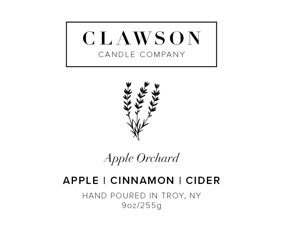
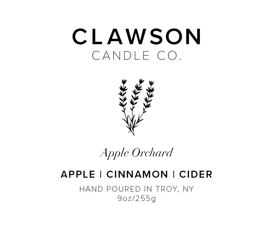
I need a second opinion on the overall layout and type treatment. Can someone please input? The illustration is just a placeholder for where the real one would go. Open to new suggestions too. Thanks!
Why you’re just down the road a piece ![]()
I think it looks good. Easy to read … that’s always a plus ![]()
Is the illustration going to represent the scent or is it going to be more of a company emblem type thing?
I prefer the second version as it’s nice and clean .. but the box around the company doesn’t totally bother me either ![]()
3 Likes
They both appear effective with what they are going to be doing. I almost would say make the “Hand poured in Troy, NY” smaller or maybe tighten up some of the leading.
Those are my thoughts as it stands this is well done.
1 Like
I agree, just a little distinction of hierarchy between the scent and that and I think it’s there.
1 Like

