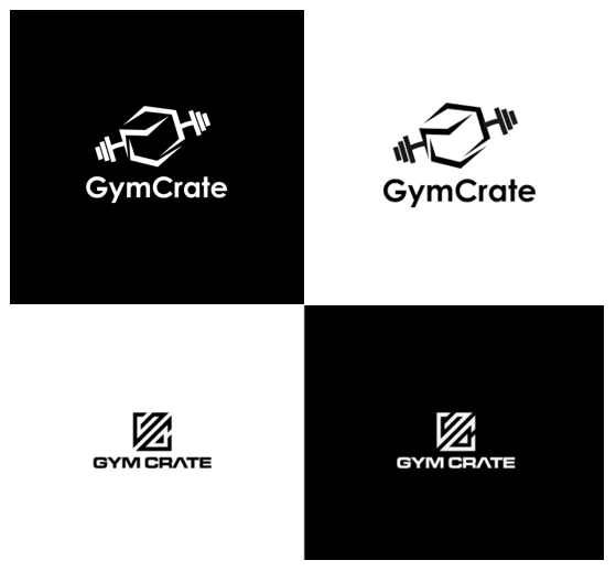
These logos are for a crate service that supplies gym supplements to its subscribers
Welcome to the forum.
As far as the mark goes, I like that you’re combing a barbell and a box, but I can’t help but feel the barbell needs to be coming out of (or perpendicular to) one of the flat sides of the box rather than coming out of the corners.
The mark on the second option is nice, and I prefer the type on the second option to the type on the first option. That said, I’m not sure the type on the second option totally meshes with the mark on the second option. The mark has sharp, pointy corners, and the type is flat and squared-off.
Bottom line, I like the work and think you’re headed in a good direction, but I feel like both could use some more work and refinement.
Thanks for your feedback, much appreciated.
My honest initial reaction was “ohh I like that” you are definitely on to something with both of these options. I definitely find myself liking the 1st option better, however, the text does feel a bit weaker. That being said if you could find a way to find a sharper typeface while not taking away from the mark I think you would be golden.