In case if you are wondering, this is my second post depicting my new designs for the donor card, as well as the promotional poster and the FAQ webpage designs.
For context, the designs for the donor card, promotional poster, and the FAQ webpage are made from a design brief that requests a donor card to be made with a distinctive and meaningful logo, which is to function not only on the card but also on both ‘promotional and informational material’ (Glaser 2014, p. 84).
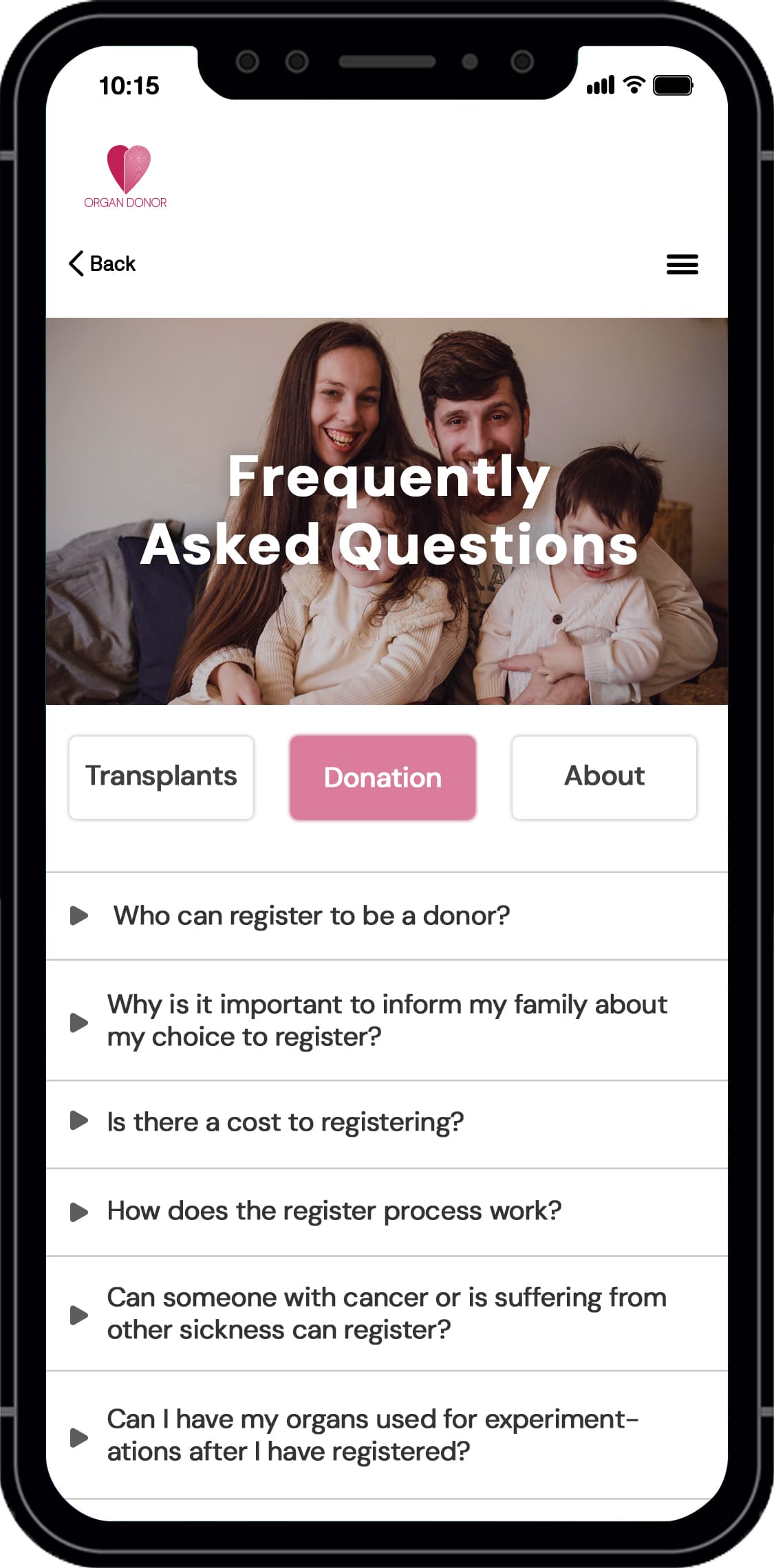
This is the reason why I chose the promotional poster and FAQ webpage designs to depict the logo. However, this is not the only reason why I chose to depict my logo on the FAQ webpage; my other reason is that so young people will be able to learn more about how organ donations and transplantation works, including the organisation that conducts them, since young people look more into the organisation from their ads before trusting them.
Overall, the main aim for the campaign for the donor card is to make young people feel good about their choice to donate their organs.
In my previous post, my original design for the donor card didn’t suit well with people that I received feedback from. But,I hope these new designs will.
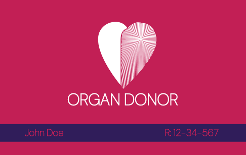
The thin lines will be very difficult to print - pointless and adds nothing to the design, there are more organs than a heart.
The name and reg number are hard to read.
Don’t have hyphenation on for left ragged alignment, and even if justified text it’s not patient friendly, so it’s best to turn it off all together.
Signature, nobody can write on that - it needs to be white so they can sign it.
Why ‘Father Signature’???
Why their numbers on it?
Most organ donors will list a next of kin through the Donor Program.
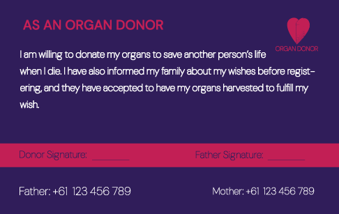
Mobile phone - second last point is written incorrectly.
Last one has hyphenation
Logo - needs improvement
Logo text - needs improvement
White out text on dark background needs to be bold, and increase the tracking/kerning.
Pink on blue is not very contrasting hard to read
Signature area needs to be white
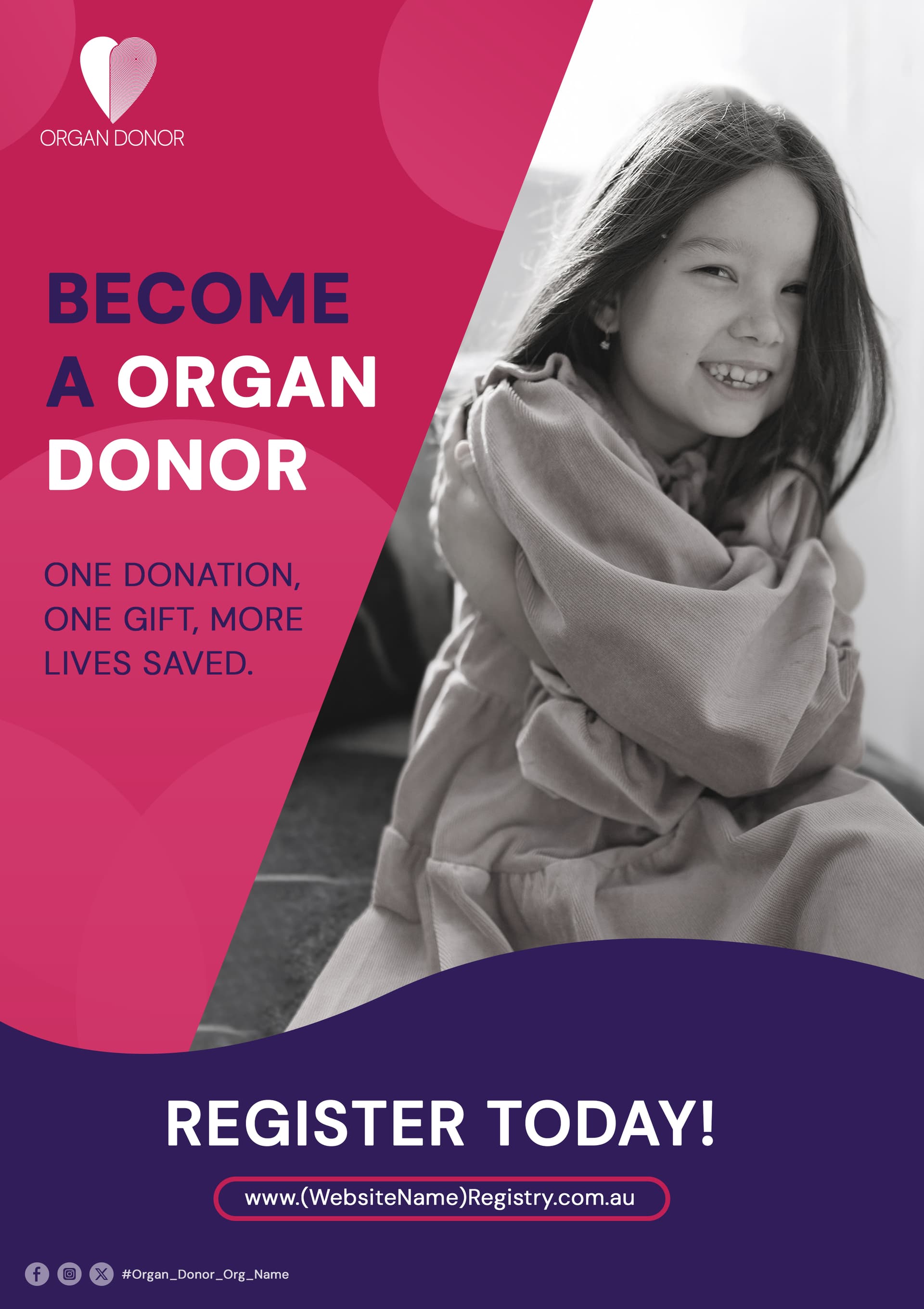
Promotional poster - good, looks very well.
However, no need for exclamation mark “REGISTER TODAY!” seems to imply celebratory. A better tagline ‘BECOME AN ORGAN DONOR TODAY’
A QR code maybe to make it easy to get to website (ain’t nobody remembering a lengthy website at a glance).
App is fine, not much critique except content update and remove hyphenation.
The numbers are there so first responders can know who to call when the donor dies in case of an accident, especially their parents.
Also, if that’s okay. Mind if you detail why the FAQ webpage needs some updates even some suggestions since you said it looks fine except for the hyphenation?
I know what the numbers are for, but why are they on it? First responders don’t normally contact anyone. Persumably they’d have a wallet with their info. As I said, you normally nominate a next of kin, when signing up. So putting peoples personal numbers on a card that could potentially be lost is strange - unless that’s a done thing in Australia, I’m not familiar with how it works there.
And for the FAQ page, I already detailed the 2nd last one needs tightening up - read it again.