We are a new online watch company and playing around with some ideas for a basic text logo that will go on the actual watch dial only. We are focusing on simplicity and minimalistic design so not going for anything fancy with images. Just a pure text logo.
Just wanted some feedback on if the 1st logo with the underline and overline actually looks attractive, or best to leave it without?
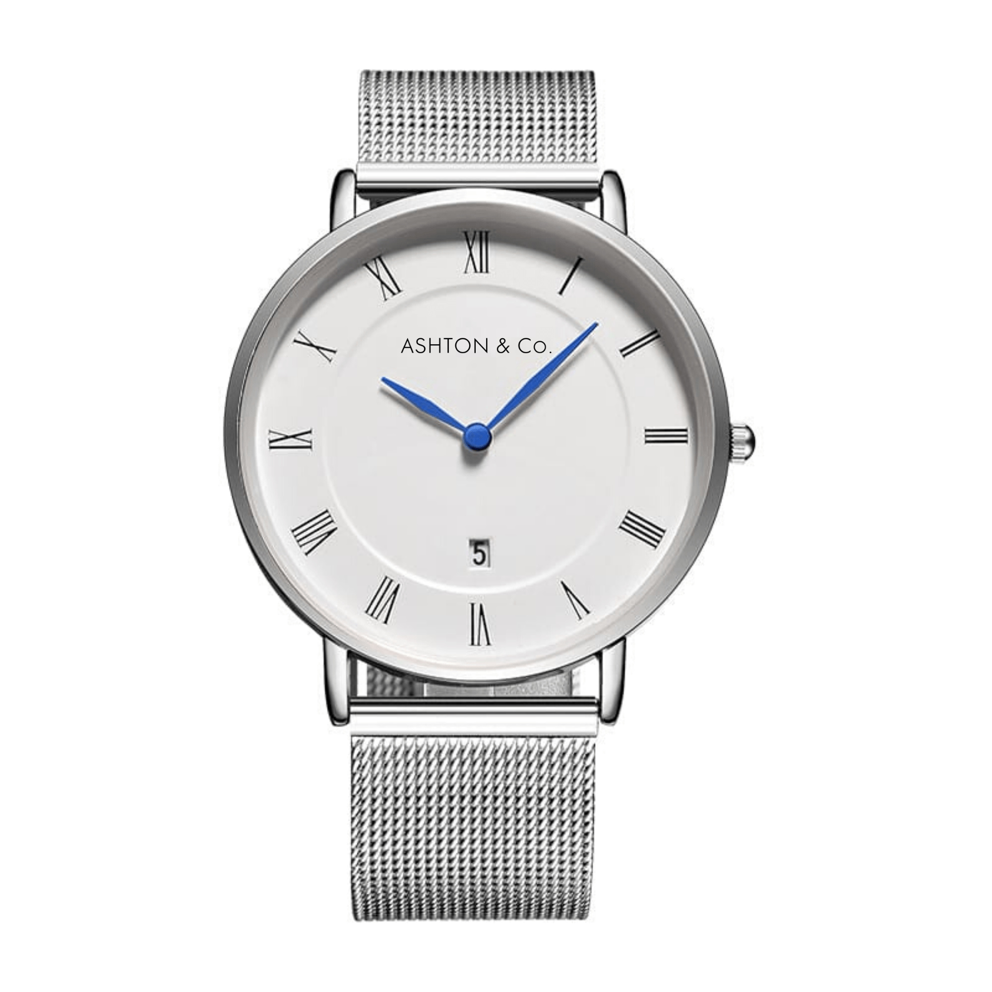
The company is Ashton & Co. and aimed at the age mark between 16-25 year olds (both men and women watches).
Yes, but style isnt just in the text on the dial. Style is the dial itself, the hands, the strap the colour, the casing.
That is kinda my point. Your brand and your product should be cohesive. Just from the picture I can’t tell what your watch would look like in 3-dimensions but the moment I looked at it I thought: “This is a basic watch for old people.” Your logo says that, the use of roman numerals says that, the texture on the wrist bands says that, hell I’d say the shape of the hands say that too. But not here to comment on the watch design.
Your logo looks fine. Your a simplistic and minimalistic company, and you used a simplistic and minimalistic approach to your logo design. It completely matches your brand. The “O” are circular which matches a watch. I’d say the ones with the lines give it a bit more character and makes it stand out. Just saying it doesn’t match the age group your targeting.
Can you share with us the research you’ve done in choosing these fonts? Why are these best suited for your demographic? Is there some examples of these working really well with that demo?
Well, if that’s the question, I’d answer:
Surely the lines are superfluous and add nothing of value. In fact, everything else aside, the over-line on Co. pretty much ruins the whole thing.
I’d definitely not go with the version with the lines.
Futura is a great typeface and it works quite nicely here, but I’d still tend to avoid it for the simple reason that it’s the obvious choice for something like this.
In other words, I’d likely choose a typeface with the same simple, clean, minimal, elegant look but with a little more character that set it apart from run-of-the-mill Futura.
Appreciate the brutal honest feedback. The search goes on for new typeface.
That was just a random sample watch. It isn’t included in the final selections. All watches are free of Roman numerals and for the handful that offer a day reading all are double width.
I like both versions almost equally. I like the font choice (Futura)? the overall image you have created with your choices will certainly work for your younger demographic. Many young people embrace watches that look much more “old” looking than this. Image 1380X1380 looks like the Bank Gothic Font and is a nice alternative to Futura. This is a clean and quite timeless design buddy. Nice job!