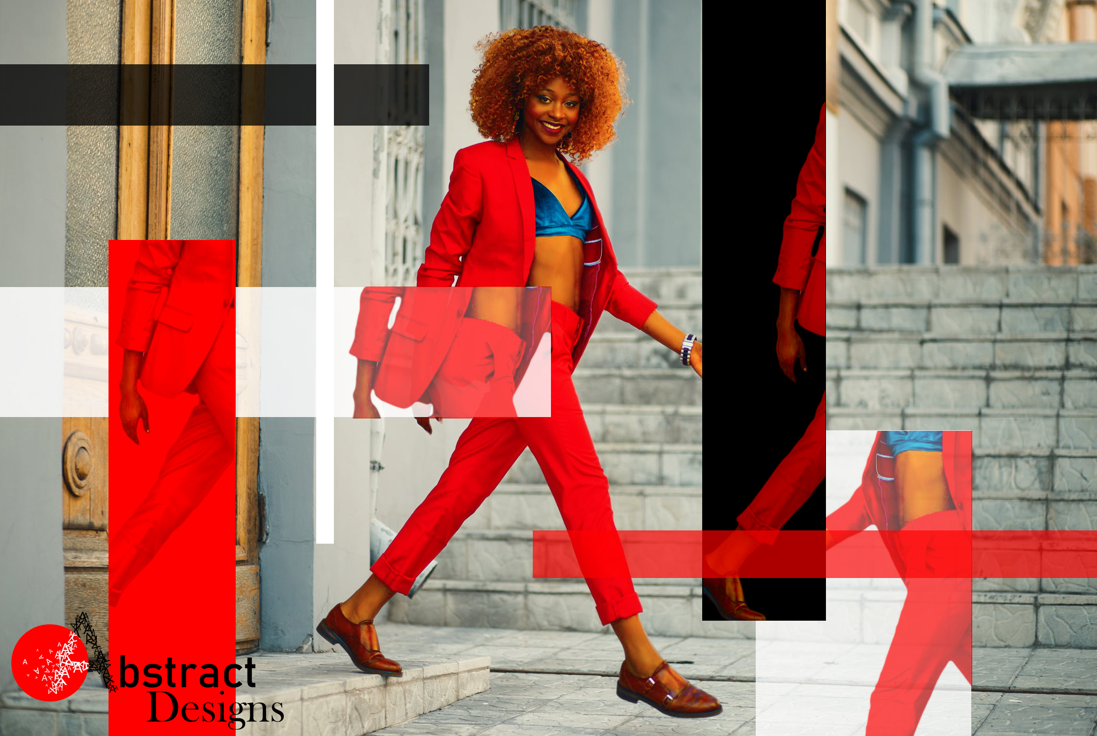
I am not set on the logo on the bottom left, but overall, I want to know what your opinions are of this design. Is the balance alright? Does it look decently professional? What should I have done differently?
What is the purpose of the piece?
Who is the target demographic.
Without knowing that, there’s no telling if it’s working. Something “looking professional” depends on if it conveys the intended message.
Explain why you have all of your elements moving left to right except for the one crashing into all the others.
If you have vertical elements they all should be vertical. The door is causing issues. Looks sloppy.
I didn’t see the A in Abstract at all. The logo is also invading the safety if this is to be a printed piece. That descender is likely to get trimmed off.
Nope.
I like what you’re going for with the deconstructed layout, but I think it’s overdone. Too much happening.
As for the logo, it is hard to see the ‘A’. Also it’s too much to have a decorative, a sans serif, and a serif font all in one logo. Simplify. Also, have an idea in the logo. You can do a typographic logo, but it’s not easy to do a great one, because it requires very deep knowledge of typography to be able to communicate a brand through just letters. Some of the best designers are able to do it though, so it’s not impossible.
Paul Smith is able to convey that the brand is artistic, clean, freethinking, and whimsical:
Boss can convey that it is commanding respect, traditional:
Ray-Ban is cool and easy going:
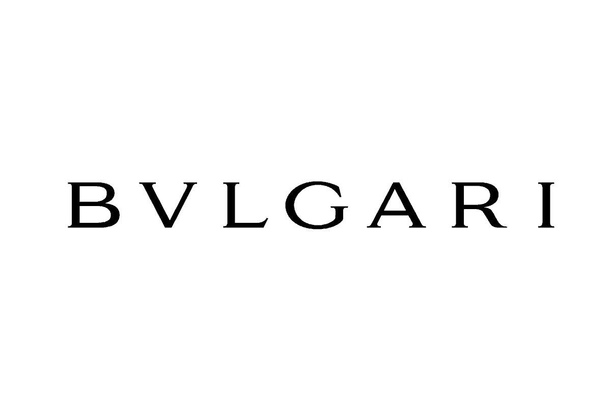
Bulgari tells you it’s rooted in antiquity and carries class with it (i love this one):
If you do a typographic design, ask yourself if your design communicates the core values and if it’s unique enough to stand at the same time, like the logos above.
You gave some great advice in another thread. How best to apply your own advice to your own work might be something to consider. ![]()
1 Like
Agreed, I need to look at my own designs in a similar matter. Sometimes it takes a second set of eyes that aren’t looking through rose tinted glasses. I really had fun making it, so I have been set on trying to incorporate it in a brand, but unless it is for a magazine clothing brand, I can’t see it being particularly compelling for what I’m going for. Thanks! I have just been having fun playing around with design concepts and techniques, but it doesn’t mean I can force it into a brand.