Critique on Document Theme

Hi Everyone,

I’m not quite sure where to post this, but after a bit of scouring the web, this looks like my best bet. I use LaTeX for a lot of the documents I create. I do a lot of maths etc. and as such, I feel it makes a lot of sense to me. I also like my documents to look good, and so I’ve recently spent a fair bit of my time designing a theme for my general use. Since my friends have become quite bored of my trying to talk to them about typography and design I thought I’d try going elsewhere (perhaps where other people share a similar interest in the aesthetic design of documents). Please let me know if there’s a better place for me to be posting this, or if this isn’t quite the sort of stuff this forum is for; assuming I’m in the right place I’d love to hear your thoughts and feedback on my work in progress.

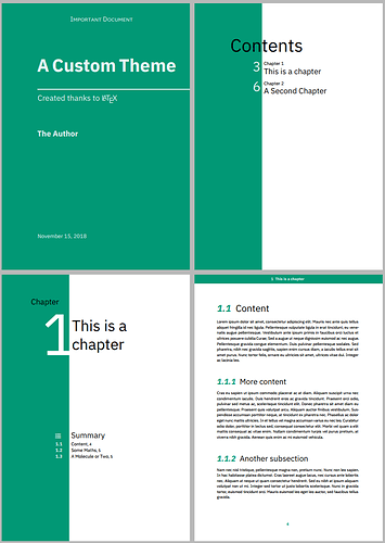
Here’s a screenshot of the demo document.

Take a look

If anyone’s interested in taking a look there are a few variants:

  • Sans-serif (pdf)
  • Serif (pdf)
  • ‘print’/inverted Sans-serif (see NB)
  • ‘print’/inverted Serif (see NB)

Particular interests

While I’m generally interested in hearing peoples thoughts and feedback, there are a few things I’ve been mulling over which I’d be particularly interested in hearing.

  • Thoughts on how to use a colour scheme as opposed to a single (all be it nice) colour
  • Thoughts on the page header solid bar
  • As said before, your general thoughts — other things I might want to consider, features or alternative design, small tweaks, large tweaks etc.

Thanks,

tecosaur

NB

Apparently, new users can only have to links in their posts. As such here are the links to the other two versions.

‘print’/inverted Sans-serif

http://s000.tinyupload.com/index.php?file_id=39888225151081059270

‘print’/inverted Serif

http://s000.tinyupload.com/index.php?file_id=60529655709811054477
In general, graphic design is about developing visual solutions to problems. I’m not quite sure what the problem is in this case other than you wanting to make your documents look good. What are your documents? What is their purpose? Who is the target audience? Are you involved with some kind of publishing?

There are design problems that cry out for different kinds of solutions. Some need a fun, playful solution, Some need a more somber look. Others need to evoke a sense of excitement from the target audience. Still others benefit from an orderly, simple and clean appearance, like yours.

Appropriate design solutions take into consideration dozens of different aspects of the problem being solved with aesthetics being only one of several different considerations and objectives. What is it about the problem you’re attempting to solve that calls out for a highly structured, orderly Swiss approach?

Thank you for that comment. I see that I was far too general, and that it would be hard to give meaningful advice without some key details. Hopefully, this should help clear up the purpose behind this.

I am currently a student, within the fields of mathematics and biology. As such, I frequently produce documents pertaining to these areas. For this, in addition to general use throughout my life, I use LaTeX. I started creating this because I was unsatisfied with the default appearance of such documents. To me, they lacked any form of visual flair, seeming fairly bland stylistically.

I wish to produce a theme that I would be able to use generally throughout my life – ‘me’ documents if you will; which would be clean, visually engaging, and versatile. The effect I wish to produce is a sense of being analytical, but with personality.

OK. That clarifies things. It is, however, a little unusual for someone to have a personal, lifelong style for this kind of thing, but that’s fine.

Quite often I work with biologists and technology companies on various kinds of technical documentation, like reports and submissions to scientific journals. Once you graduate and begin working professionally, the formatting of your work, of course, will likely need to conform to the style guidelines of the organization in which you work.

As you’ve already noticed, not many of your peers are especially concerned with this kind of thing, which means that final formatting in a professional setting is usually handled by others — people like me, I suppose. Normally, these kinds of papers arrive lightly formatted in MS Word, which is how I prefer to get them since it helps to not be encumbered by other people’s formatting that needs to be undone and redone to match the formatting of whatever I might be working on.

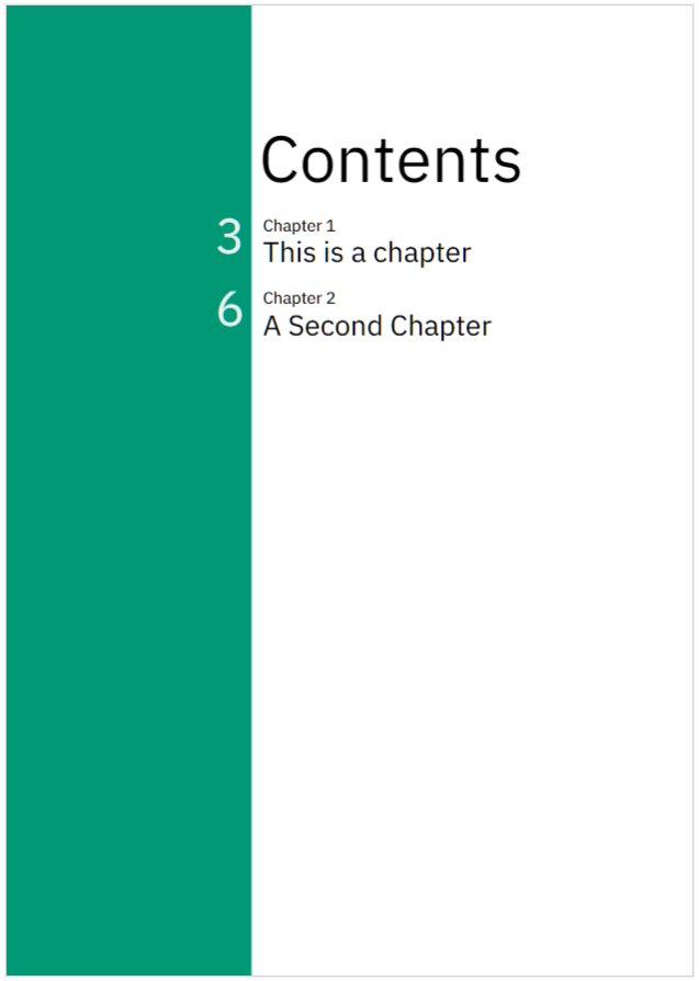
As for your personal style examples, I would be inclined not to run words or lines of type across color boundaries (I’m referring to the word “Contents.”). Black type on a rather dark green background does not provide especially good contrast. I’d be inclined to generally avoid mixing centered elements with flush left-aligned elements. On those pages where type abuts both sides of the green-white color boundary, I’d be inclined to leave a bit more space between the color boundary and the type (words need space to breathe).

As a technical document, of sorts, with a technical documentation look, I generally like what you’ve done. It’s simple, clean, concise, well-organized and largely aligned to an underlying and consistent grid. I especially like the clarity of the content page.

i’m impressed that you care enough about design to do what you’ve done. I wish I could work with more people who shared your concerns.

Thanks for that reply. I really appreciate the advice.

Word Boundaries

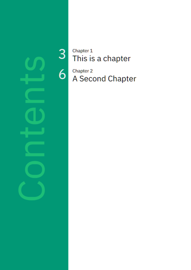
I took what you said to heart about spacing around a boundary, and have re-examined the spacing. I also looked at “Contents” running across the type boundary, and so tried moving it over over the boundary — however, now I admit I feel like there’s too much negative space of the left side of the page (but it definitely seems like an improvement overall).

image

I also tested what effect removing the boundary (by making the whole page emerald) had, and I felt like it changed the feel of the contents page in a way that made it less consistent with the overall style.

Colour Scheme

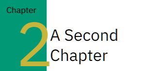
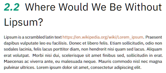
I’d also be interested in your thoughts regarding incorporating a colour scheme, as opposed to a single colour. I have managed to pick out what I think to be a decent-looking palette; however, I am struggling to think of ways to work it in.

At the moment the best I can come up with is using one of the other colours for stuff such as hyperlinks and diagrams in the text. The only other idea I’ve had is changing the large chapter numbering style — however to me it feels as though doing that sacrifices a bit of the ‘clean’ look.

image

Please let me know if you have any thoughts on this.

NB: I’m not naïve enough to think that I’ll be using this style my whole life :stuck_out_tongue:

I’m seeing the same imbalance as you, but I don’t think the problem is negative space. Instead, I think it’s more related to hierarchy. The green area dominates the page, but its doing so is incongruent with its usefulness. In other words, an area of the page that commands such visual attention seems to warrant something equally important actually being in that area.

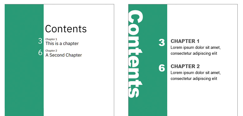
Sometimes explaining these kinds of ideas is more easily done with images than words. What I’m showing below is not my idea for a solution to the problem. Instead, it’s meant to show you that there are more tools in your design toolbox than you’re using. There are many formal elements of design that include things like contrast, balance, rhythm, color, etc. You’ve used some of those elements, but you’re neglecting some of them and being a bit timid about using the others.

You can really shift the visual hierarchy around and increase the visual interest by experimenting with the size of elements, using more contrasting type weights, adding a bit of visual tension, doing unexpected things and making better use of those compositional tools in the toolbox.

Like I said, my example above isn’t a proposed solution. Instead, it’s just an example of how compositional character, balance and hierarchies can be significantly influenced by things you might not have considered.

I like the color palette you’ve come up with in your post, but it’s how you use those colors that matter. In your example, you used an ochre color for the numeral 2 on the green background. Similar to what I mentioned in my first response, there’s a lack of contrast between the colors that might be problematic. If you squint your eyes or convert the example to grayscale, you’ll more clearly see the problem — the color differences don’t adequately counter the lack of contrast in light-dark value.

In addition, the area where the 2 barely crosses over the color boundary between green and white causes a little visual knot that draws attention to itself in a way that isn’t congruent with the rest of the design. If it were mine, I’d probably make that boundary crossing a little more deliberate-looking.

I think I’ve improved on the contents page,

image

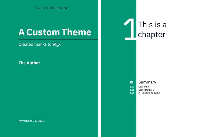
I’ve also started using a dark blue as an alternative colour for bits such as the title and chapter pages

Then the orange for links. Not sure what I’ll do with the other colours but I think it’s beginning to look good :slight_smile:

image

Thanks for your previous feedback — you’ve been quite handy :slight_smile: