My job is mainly focused around a lot of technical stuff and for a while I haven’t had an opportunity to be creative so I feel like I’m a bit rusty and a good critique is always a nice way to get myself back into gear.
This came from a design prompt I used from designercise. It’s a fun way to get the creative juices flowing. It gives you 15 minutes to create a design from a random generated prompt.
The prompt generated:
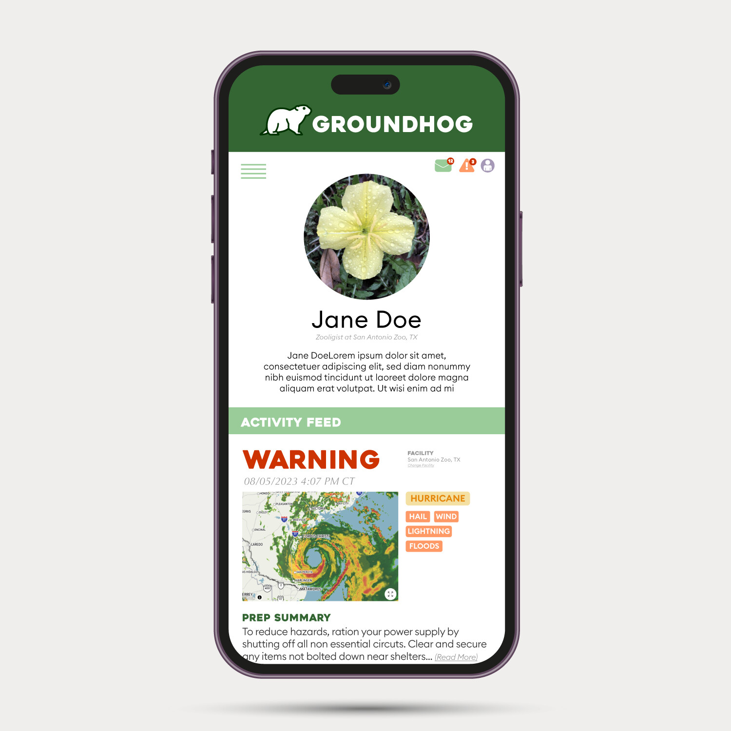
Create a USER PROFILE
For a WEATHER APP
Used by ZOO KEEPERS
With that there was a lot of room for me to interpret. So I decided…
1 - It’s going to be a mobile app
2- If it’s a weather app for zookeepers, it needs to be displaying weather activity in relationship to the responsibilities of their occupation.
3 - Since it is a user profile, it needs to include an option for a profile picture and some “about me” information. But since its main function is not social media, it does not need to be a whole lot of information.
Since it is a mobile app, there also has to be navigation options that are easy to recognize, be able to have visible alert notifications, and be scrollable.
So I decided that the “newsfeed” would consist of weather activity. Based on the type of activity being anticipated, the activity itself would come with tags of what type of weather is on the way, and what potential hazards may come with it.
From there, to make it a functional app for more than weather viewing catered to zoo keepers, I thought precautions or “Prep Summary” (to prepare for the coming storm) would be a cool idea to offer (though I would hope a zoo would already have their own emergency action plans in place).
I also had to come up with a name - so I chose “Groundhog.” It’s an animal associated with predicting the weather so I thought it would make a good mascott/name for a weather app made for zoo keepers.
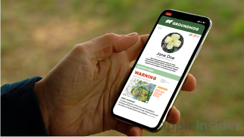
I used a mobile phone mockup from free pic made by svstudioart, and an image I found on google from apple insider, just so it can be seen where it would be used and not just as a simple rectangular shape.