Went to school a long time ago for graphic design. Never could get my foot in the door and seeking whatever job I could get where ever I could get it. Now just trying to get the occasional work on the side and wanting to create a decent portfolio. On some sites (mostly Freelancer and ** contest site removed **). Haven’t won any of the designs yet but at the least it’s good practice.
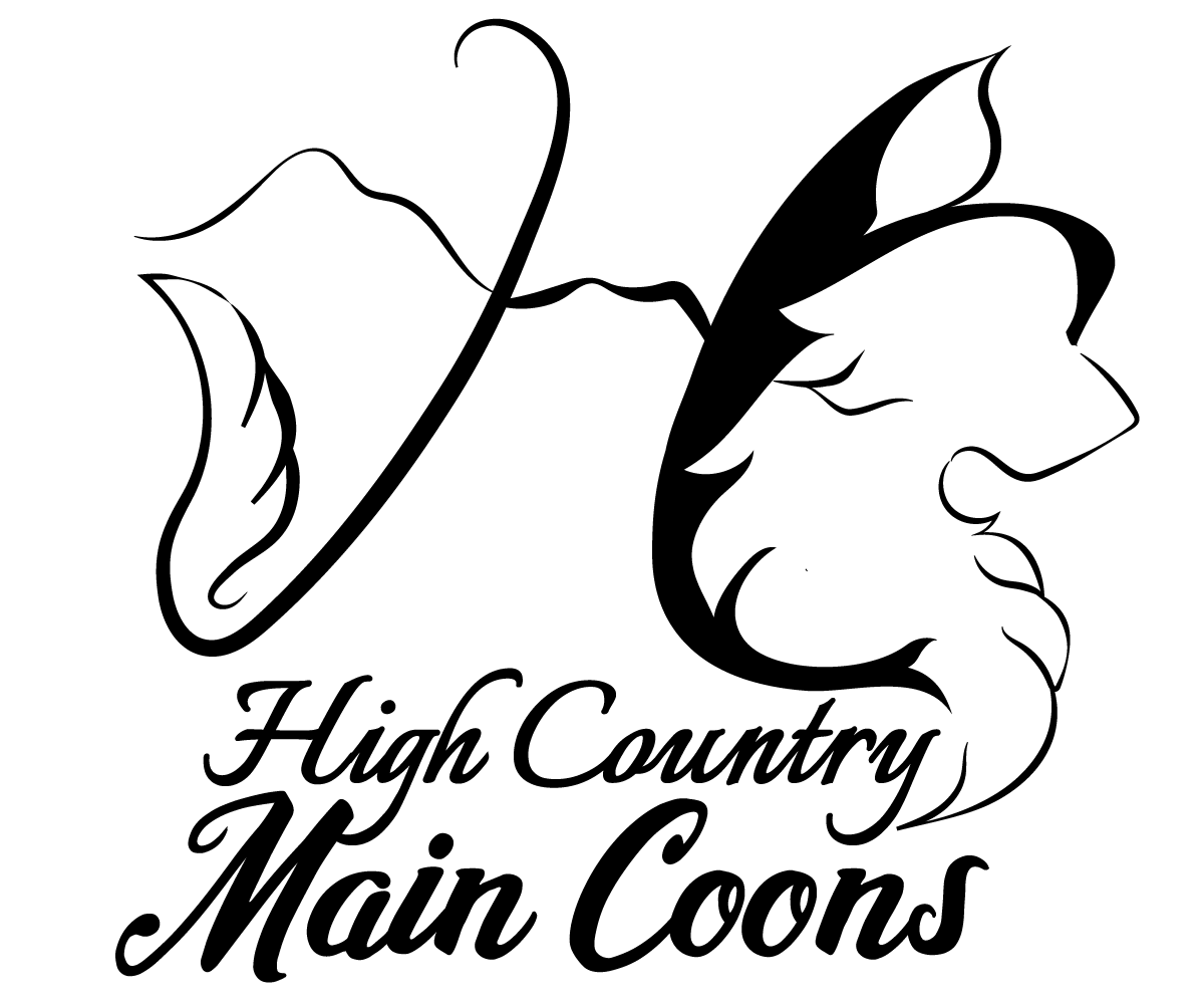
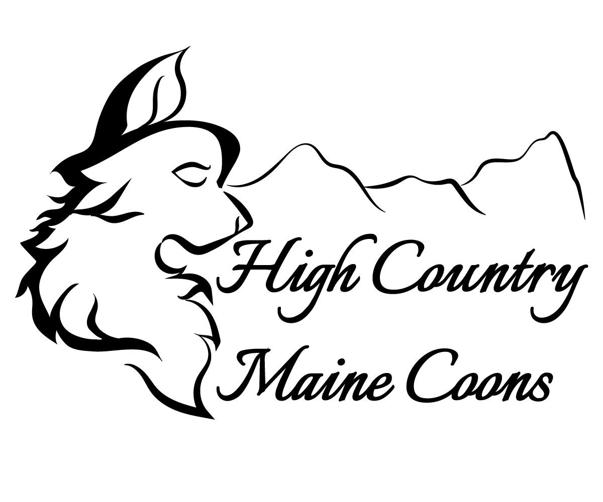
This particular logo was for a cat breeder that specializes in main coons. Person wanted an elegant image of a main coon somehow incorporated into the design and mountains. The logo needed to be able to work on multiple platforms. The target market are people looking for a respectable breeder for main coons. The client gave me a lot of hope, but they chose someone else’s design.
I would still like to use this design in a portfolio, but is there any way I can improve it? where did I go wrong? Or scrap it altogether and rework my ideas from scratch?
Just on first impression:
The cat shapes aren’t accurate enough, and none of the shapes are distinct enough to be instantly recognizable, especially from a distance. Having all the lines given similar calligraphic treatment, including the type, results in a visual mash of curves and flourishes that takes the eye and brain too long to sort out. It would be better if the type styling contrasted the illustrative style to impose some visual separation.
The top version looks incomplete, and the bottom one looks a bit too tightly locked up.
“Winning” designs is useless - crowdsourcing sites undervalue the value of design.
You’re basically giving someone a pick of the logos - from a crowd of 100s for a paltry fee.
What a waste of time.
Anyway - is it “main” or “maine”?
Neither are reminiscant of cats or mountains and the typography needs a lot of work.
Highly recommend taking on the Linkedin course for Logo designing and good practices. You’ll learn a lot.
Very true, won’t deny that fact about crowdsourcing, but at this point its the only sources of design briefs that I can find and the closest I can come to practice whether I submit a design or just work on a design for practice/fun. Every other source has either gone offline or is out of date (but then again so am I) Will take a look at your link and thank you very much for the critique.
Just to chime in again on the recognition of a cat. I saw the words Maine Coon but in the first .. I didn’t see anything resembling a cat. I also have no idea what the “J” is for in the middle. In the second, I see a Golden Retriever. After looking for a bit did I realize the stray leaf was an ear I do like your calligraphy style of illustration however. It has a nice flow to it.
I’m sorry to say that this is you’re best option. Disregard the brief as it’s stated and design the logo the client needs, not the logo the client wants – there can be a big difference.
You won’t find many good design briefs on a crowdsourcing site. The people looking for talent on those sites don’t understand what a good brief entails, so they just sort of write whatever they think is important to them. A good creative briefs comes from a discussion with a client in which questions can be asked and clarifications made.
I do understand the problem you’re facing, though. Real jobs are an important means to getting better at the craft. But crowdsourcing jobs aren’t typical practicing environments because there’s no one, like an art director or senior designer, giving you feedback — it’s just you and a client who simply picks what he or she likes from a buffet of choices.
As for your logo, sorry, but I don’t see a cat at all — just lots of flowing, fur-like lines. I see something resembling a dog’s head in the second one, but that’s it.
Kinda off topic - but I do agree - crowdsourcing sites are not great for briefs.
If someone only values their business at a ** contest site removed ** then they don’t value their business.
My approach when learning was to take junk mail that came through the post, then redesign it, better than what came in.
Approach the company with a proposal of the new design and see if you can get that work from them.
If you can imagine, direct mail would be printed in it’s 100,000’s quantity - so you could sell them the design and print and distribution.
You would just broker the work as such, outsorucing print and distribution and marking up for profit.
You might get lucky - but it’s better than trying to ‘win’ a contest where people don’t value you, your work, or the industry.
Welcome to the forum @jessicaj - I totally empathize with your position, my story is very similar too, so can relate . I think it’s awesome that you’re getting back into design!
To get to the logo critique:
I’m liking the different line weights and cursive lines, that’s really cool. I think I prefer the second one the best.
However it feels like there’s a lot going on, it’s very busy.
I think you need to simplify - I would consider dropping the mountains or the cat, you don’t have to show everything in the one mark, so I would pick one to be the hero. I too thought the cat was a dog when I initially glanced at it, if you wanted to stick with a cat mark, would opt to go for for something more recogniziable as a cat. Would recomend looking at existing cat marks for inspiration.
Legitibility needs to be your top priority - I think the type and mountains get mixed up together. Would recomend changing the typeface to something different, I think there are too many words for it to be able to work in a caligraphy font.
Hope this is helpful!
Just want to say too: @Smurf2 - that’s such an engenious way to generate leads, will have to try it out!
The brief for the project said if possible take the H and C and make them stand out a bit more than the rest of the wording. The J is actually part of the H, looking at it now, the idea I trying for was rather poorly done. Should have went much simpler. Maybe can keep the style for the cat, but change everything else. Thank you for your comments and advice.
Thank you and I wish you luck as well getting back into things. I tried to incorporate everything that the client wanted and ended up with a bit of a mess. Find another way to maybe to incorporate the cat and keep the cursive line style, but will simplify everything else and go with a different type face altogether. Thank you for your help.
This is one of the problems with crowdsourcing work. There’s typically not a good opportunity to interact with the client, so the client just ends up picking what they like without the benefit of consultations with the designer.
With this being the case, the most effective way to land the client is to give them what they initially asked for instead of what they really need. It’s sort of a no-win situation for both the client and the designer.
Hi,
It is really a cool try! appreciate your efforts and intuitive. However, there is always a room for improvements. Don’t get demotivated even after a single rejection! Gird up your loin and give more chance to yourself and try your luck in graphic designing… You can add complimentary elements in your logo designing capabilities and voila… get surprised with the “best results”.
Make it compact while considering the modern industrial trends.
Make some changes with colors to give it a unique look.
Keep it simple, reconsider the nature of their business and give it a one more try before putting it into your portfolio.
I look at the work from the winners and the other people that submit designs, and that is a pretty common thing. They ask for one thing, reject what’s offered, and go with a design that doesn’t fit the brief. It makes it difficult to learn from these things what works in a design and what doesn’t. Thank you for the advice.
Its important to recognize that while the client knows their business. They know next to nothing about graphic design. They know what they like, and when they…“see it they will know” are not solutions to their problem. What pleases the client doesn’t necessarily work in their industry or graphic design.
However, its important to please clients. Sometimes you just have to bite it and take their money knowing what they want isnt going to work for what they want.