Hey guys! I’m a design student in a print publishing class (no professional or anything) and need some critique on this magazine spread assignment. Feel free to give me all the honest feedback! I’ll happily take any advice that will help to improve the design.
Here’s the design brief.
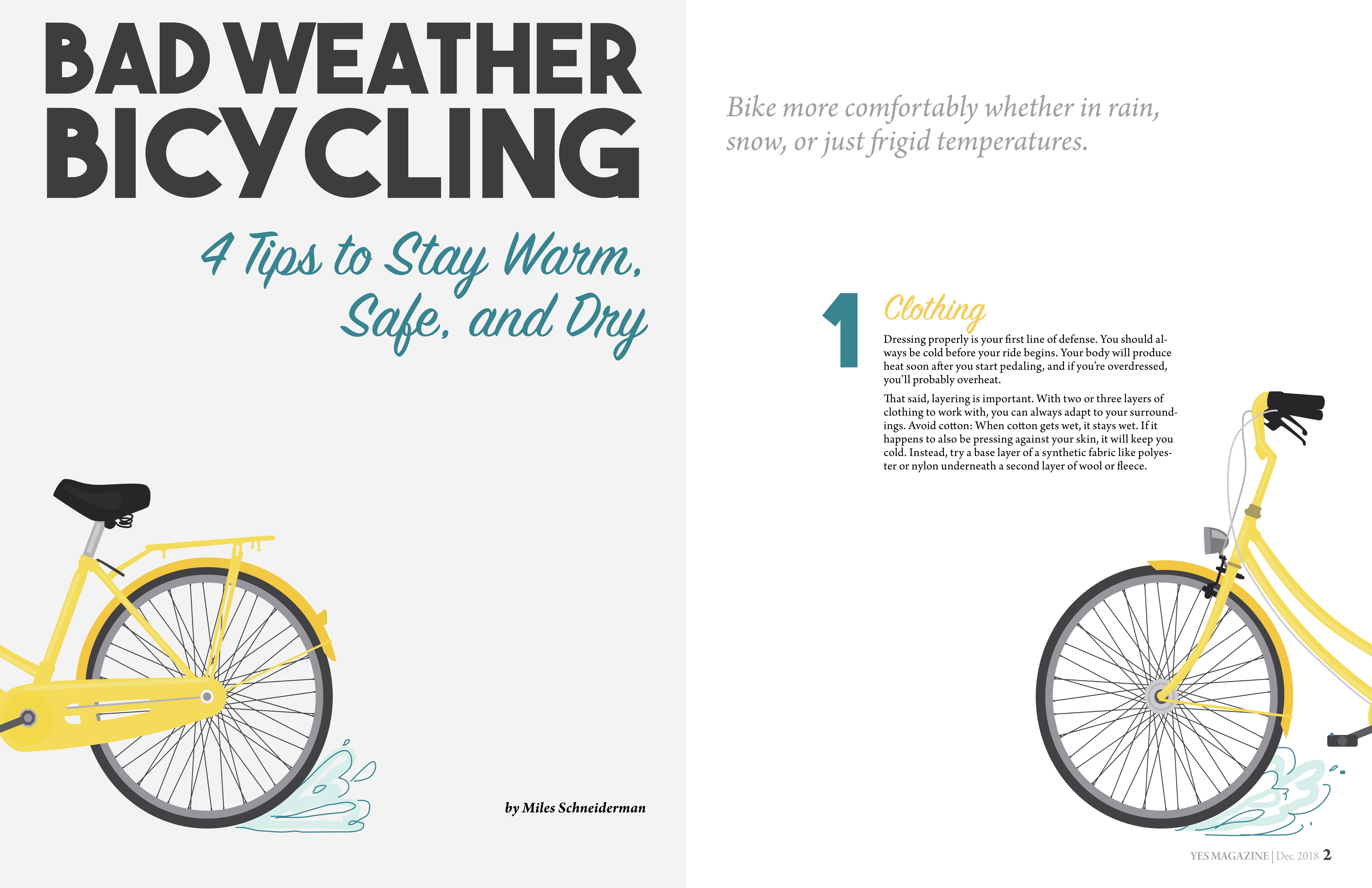
Message: One can still have a positive experience while riding a bike during bad weather.
Audience: College students located in an area where there is seasonal rain and snow. They live close enough to school/work that they don’t need a car, but too far to walk, so their bike is their main method of transportation.
Emphasize the bad weather a lot more, visually. The current effect is pretty cheerful and sunny, which may or may not be your intention. Storm clouds, more obvious rain, snowflakes, maybe feature a raincoat, or waterproof panniers, etc.
Edit the verbiage for the college student market. More bullets, briefer, easier and faster to read.
The yellow headers are almost invisible, and they’re crucial. I’d suggest a dark color, and a non-script font.
I recommend making the opening spread more cohesive, not so “left page” and “right page.” It could be something as simple as carrying the background across both pages, perhaps even “gradating” from bad to better weather.
The bike going off the lefthand page and then off the righthand page feels like it should be the opposite: going “into” the spread." But the page numbers are throwing me off. You’ve presented them as spreads, but even numbers fall on lefthand pages and odd on the right. Did you intend to have the article start on a righthand page, then have numbered pages 2 and 3 as the inside spread, or did you maybe just misnumber the pages?
I agree with what DocPixel said. My suggestion would be to try the headings in green and the large numbers yellow. The numbers being large but in a lighter color will make them a guide and design element secondary to the headings. Right now, the numbers—not the headings—are most prominent.
I think the cohesive style with the illustrations, colors (especially the yellow for the “positive experience”) and typefaces works really well. Great job!
There’s an awful lot of empty space in these spreads. There’s nothing wrong with empty or negative space, of course, as long as it’s part of the composition. In this case, though, with everything spread out and evenly distributed, it comes across more to me as just left-over space that you didn’t have enough material to fill.
There’s lots you could do with a big infographic like this, but I think you finished it without doing those things.
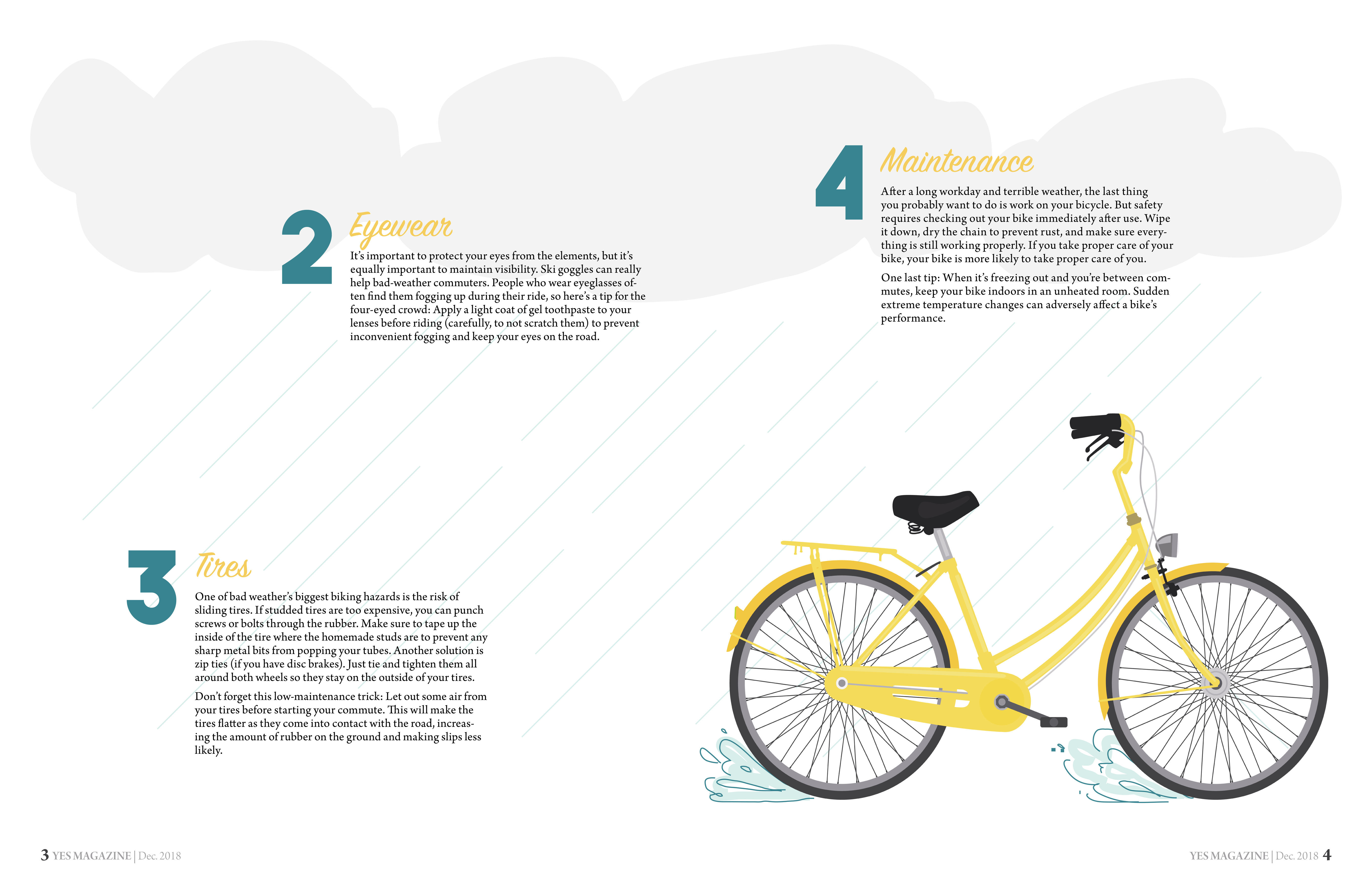
I like the bicycle illustration.
The kerning in your headline needs a bit of work. It sort of reads as BICY CLING.
I have been designing for the sheet fed print industry for the last 13 years.
It’s my lifeblood.
Tell me if i’m wrong, but your cover is on the wrong side of the pagination, if, this spread contains the cover. Otherwise that’s quite an impactful interior page you have there.
I’d like to accept otherwise, that this proof is that of a pagination spread from InDesign. I want to ask you, without me implementing anything, is this a print ready pagination? If you feel or know it’s not, how would the pages be paginated for print?
Initially I like the antique style cover (that is the cover, there on the left?) but continuing this style throughout is not effective. It appears almost as a children’s book, or comic book/graphic novel, only with inferior visuals. The typography has no visual bounds, nor utilizes columns or similar type-flow method. The imagery is repetative and doesn’t grab attention. Two types of people, or, people are draw to an article for two reasons - One has a sincere interest in the title or subject matter, the other is drawn to the imagery or visuals. It’s quite possible to get both parties, or all of one, and a partial of the other. You’re only grasping the subject matter.
Now, my criticism aside, I like this piece in a lot of ways. I love your choice of typefaces. I like the cover - it’s simple with a minimalist approach that works well. Page 2 has a nice ‘lead in’ typography element. I would love to see this floating, free-spirited, text element incorporated more frequently, but complemented by a more structured, columned type, or type within the confines of a shape or graphic element. The two would compliment and contrast each other nicely. Fill the page with either a header or footer - this will draw the reader to critical content in the center of the page, while allowing you incorporate marketing material for the magazine, as well as volume and issue information.
I love the oversized numbering, I love the sub-headers for each paragraph. I love the soft pastel colors.
It’s a piece that has excellent potential, and for a designer at a student level, I think you did an amazing job.