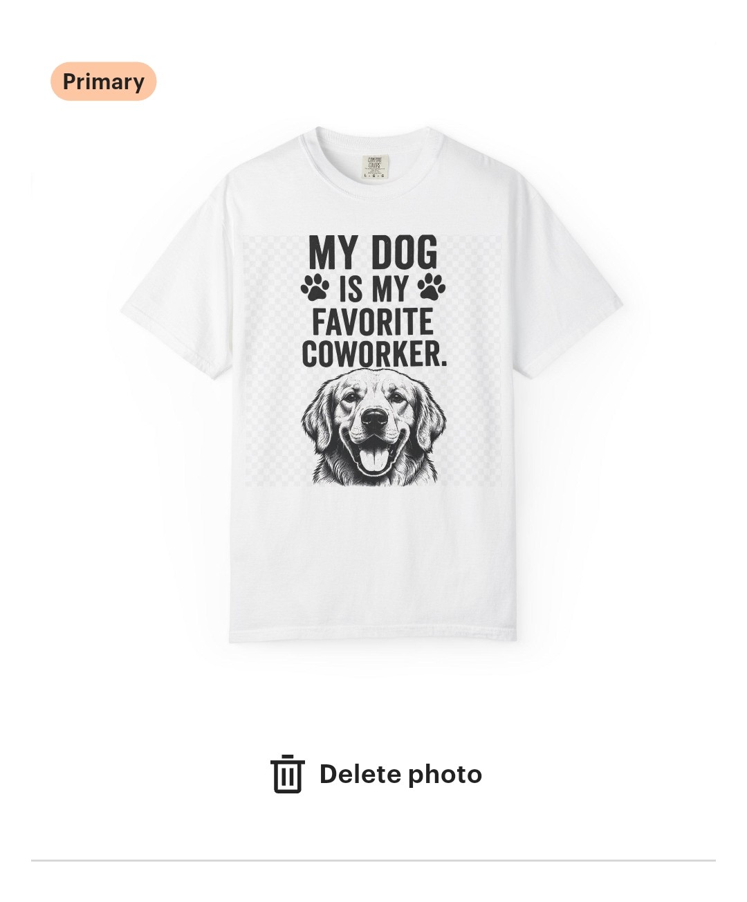
Hey everyone, I need some honest feedback on an older shirt design of mine. It’s getting decent traffic and views, but zero sales, so I know something is wrong with the visual layout or font choices.
It is meant to be printed on a white t-shirt for pet lovers and remote workers. Please look at the layout, typography, and contrast and tell me what is stopping people from wanting to buy or wear this. Don’t hold back
I like the design; it seems balanced. Maybe adding some colour would make it more interesting? Since the focus of the shirt is the dog—which catches people’s attention—I suggest placing the dog after the title ‘My Dog, then my favourite co-worker.’ This would really help the design grab attention
Posted this in your duplicate thread (only one thread per topic please for those of us easily confused.)
I don’t own a Lab. Also don’t want a dog looking like it’s coming outta my pants (the illustration is way down to the beltline. And why the checked background? Or is that a photoshop artifact? Get rid of it.
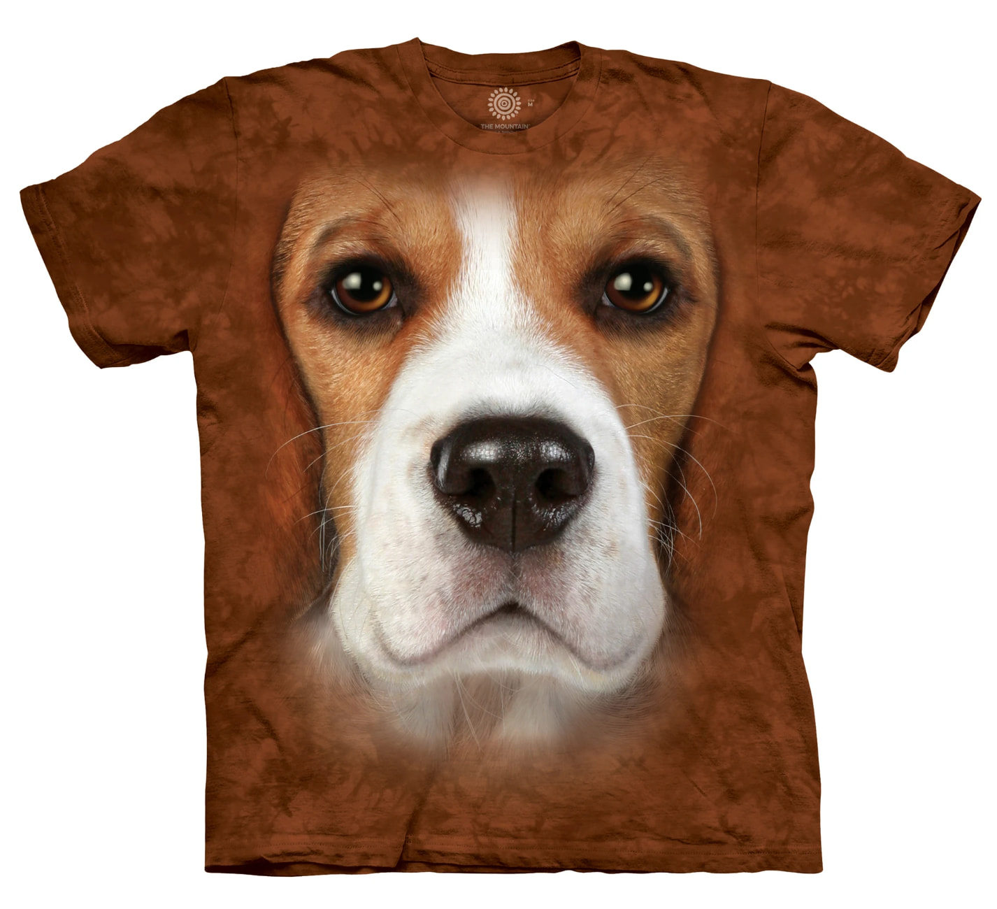
 That would definitely be a statement piece of clothing.