Hello guys,
i’m starting to keep a daily ritual of designing one poster/artwork. It’s going to be mostly things that inspire me, and here goes the first one. Would love to get your constructive criticism. ![]()
I can offer some comments about the aesthetics and type, but, being a personal project without a clearly defined brief, it’s tough to comment on the effectiveness of the piece.
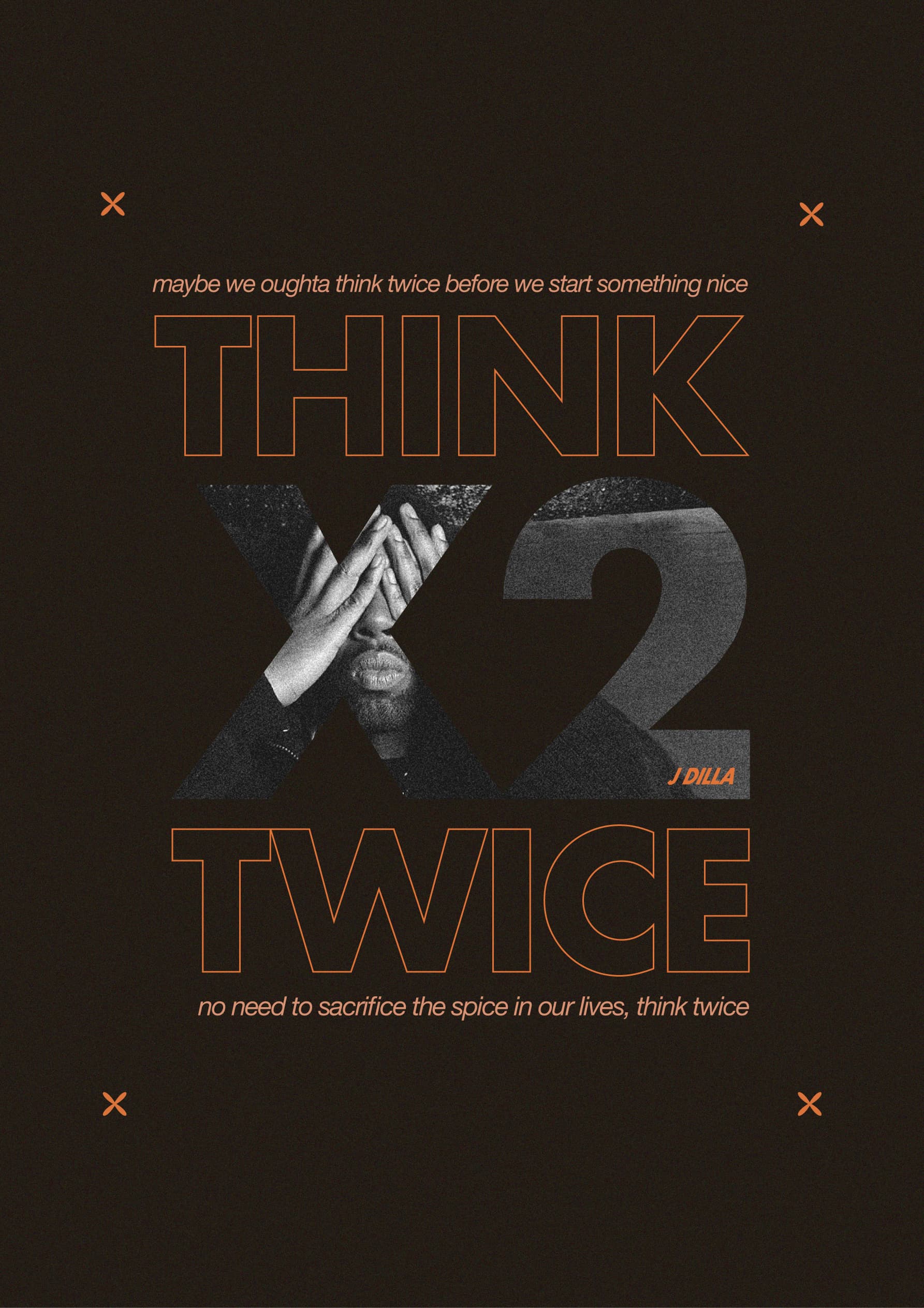
Overall, I think this is a decent start. I am okay with the color scheme, minimal design elements, and the direction you’re going. There is some nice contrast between thick and thine and between large and small.
It looks like you’re using Futura for the THINK TWICE and then switch over to another sans font for the lower case type. Mixing two sans fonts is pretty tough to pull off, and this combination isn’t working. I’m not crazy about going all lowercase for the top and bottom lines. The four Xs draw a lot of visual weight, but I don’t think they add to the story.
1 Like
I was just going to say there is too much small text for a poster.
1 Like
I like the overall looks but have concerns about some of the details.
As Steve said, the Xs draw unwarranted attention to themselves. They almost look like printer registration marks.
The X in X2 is challenging to see — much more so than the 2, which has a more even gray coloration.
I don’t understand the text either. Why should anyone think twice about starting something nice?
Italic type has its place, but I’m not sure this poster is one of those times. I’m not a fan of beginning a sentence with a lowercase letter. The comma in the last line is off too. Perhaps, breaking the line into two sentences with two periods would be more appropriate.
2 Likes
Thanks a lot for your feedback, it’s very helpful. Will keep it in mind on the next one. Appreciate it ![]()
Thanks a lot for taking the time to comment. Very helpful. And to answer your question about the text these are the lyrics to a song called Think Twice by JDilla. Will make sure to clarify what the poster is about next time ![]()
If you have to clarify what it’s about then you have not created a poster.
Except … we ALWAYS ask members what the posted piece is about and to clarify in the Crit Pit
![]()
2 Likes
@Smurf2 I disagree. I know nothing about J Dilla, but the first time I saw the poster I saw the name, I read the words and due to the rhyming surmised it was a singer/rapper. That and like every designed piece there is a target audience in mind. I’d imagine people that are familiar with J Dilla would immediately recognize the message.
I saw jdilla and thought it was signature of the poster designer.
I think the OP did a good job overall, as I said the text is too small to read from a distance and there’s too much text to read.
Sure, you might recognise the artist, but the treatment for the lyrics is not very good.
The rest is ok - just those 2 lines of text look disjointed from the rest of the design piece.