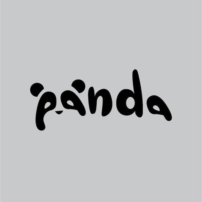
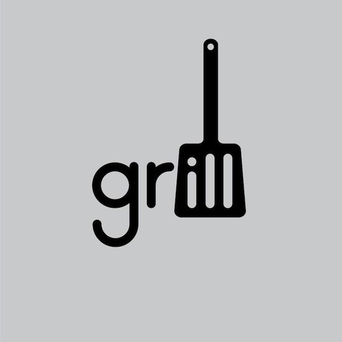
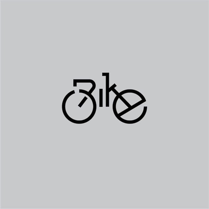
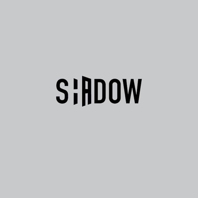
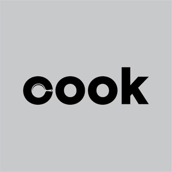
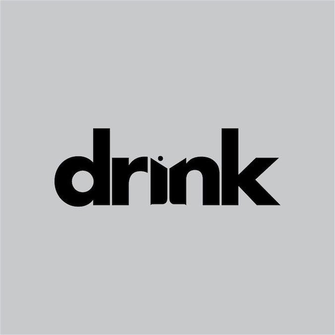
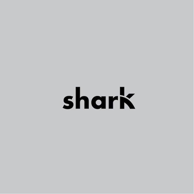
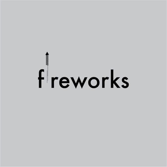
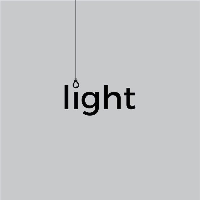
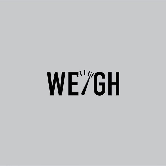
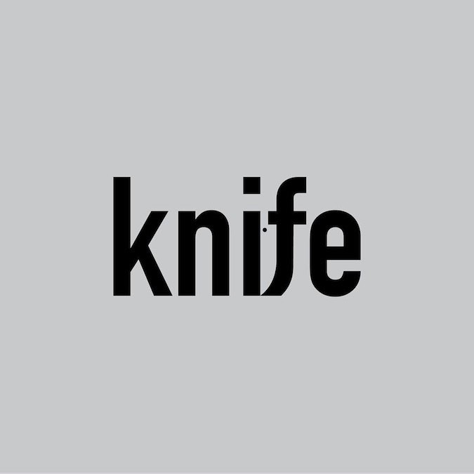
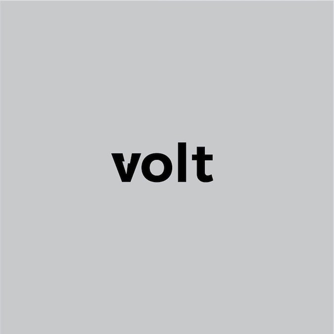
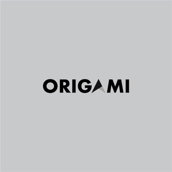
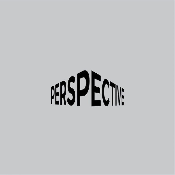
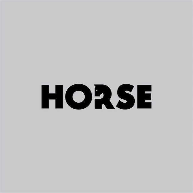
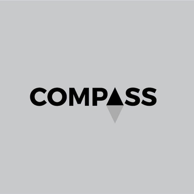
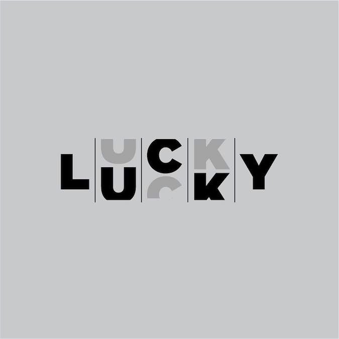
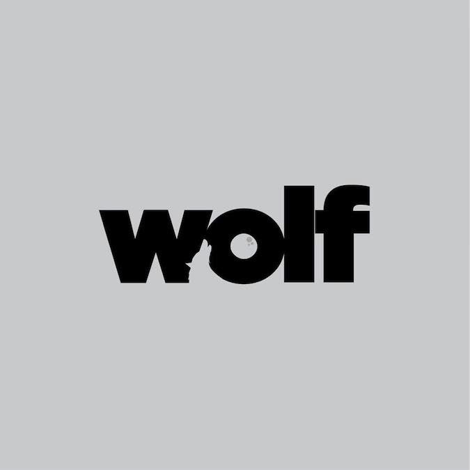
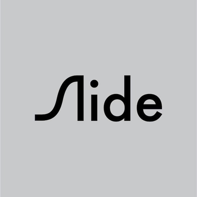
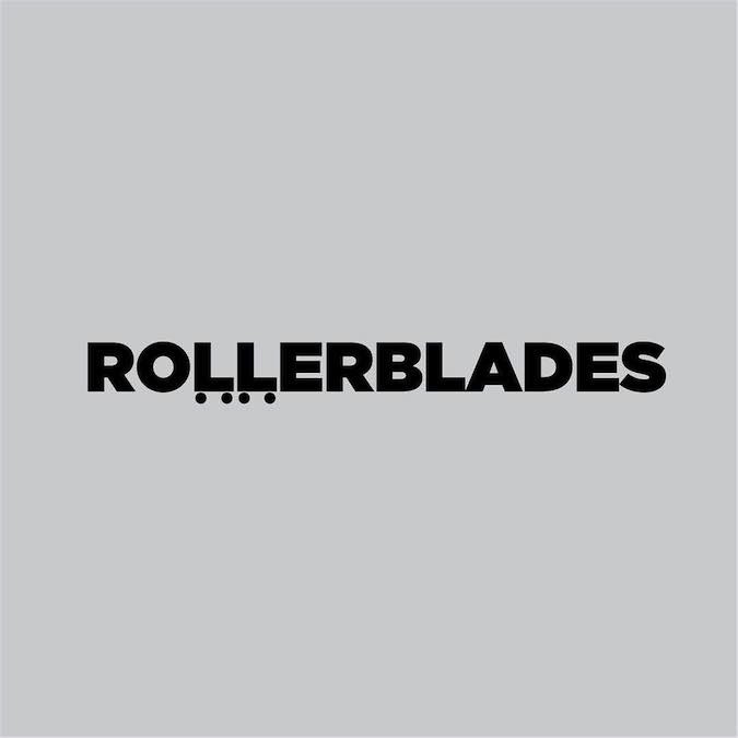
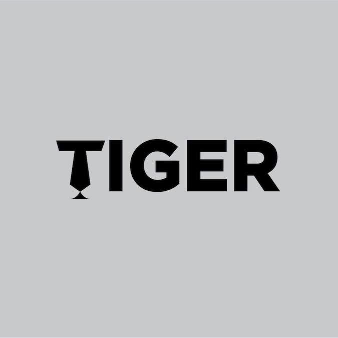
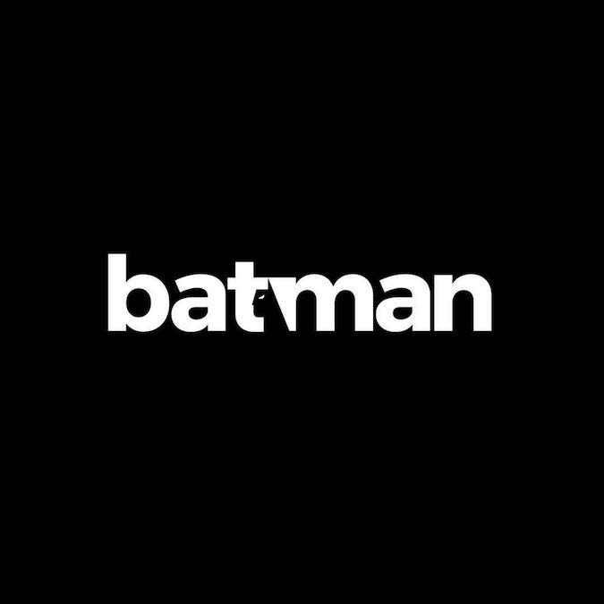
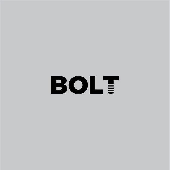
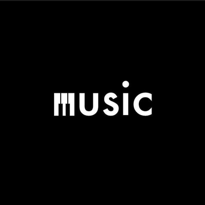
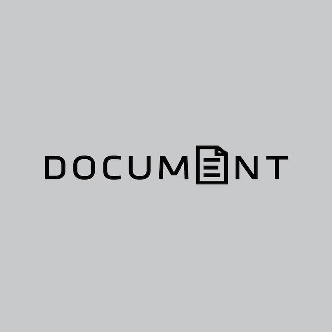
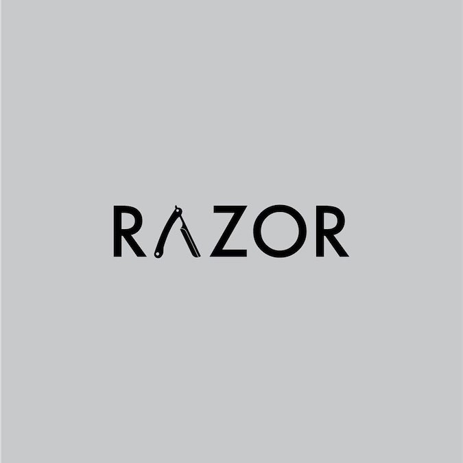
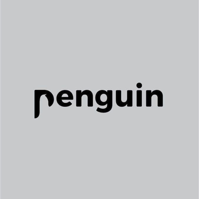
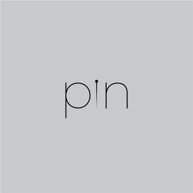
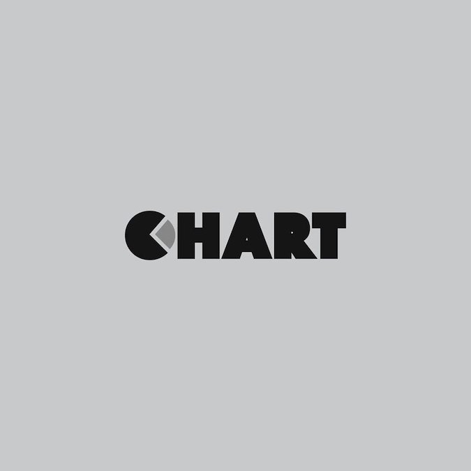
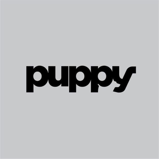
Swedish designer Daniel Carlmatz challenged himself to design a typographic logo every single day for a year. He completed the challenge. Here are some of the better ideas. What do you think?
Swedish designer Daniel Carlmatz challenged himself to design a typographic logo every single day for a year. He completed the challenge. Here are some of the better ideas. What do you think?


3 Likes
Three thoughts . . .
Great work.
How in the world did he have time to do this?
I can’t figure out the meaning of Drink. What’s there that I’m missing?
1 Like
I needed to study it for a minute too. At first I thought it might be a drinking fountain, but nope, the negative space forms a martini glass with an onion or olive or whatever it is that people put in them.
2 Likes
I love them all ![]()
and I’m with Steve … how on earth did he accomplish this every single day???
I loveeee “Cook” ![]()
1 Like
They’re all well done, but I wouldn’t consider any of them “logos”. They are more typographic illustrations of words, not logos. I know that’s nit-picky but designing a logo that is inline with a company and their brand is considerably different.
Once again, I enjoy them and some are very clever and well executed. But they’re not logos.
2 Likes
Yes, I agree. They’re not typical logos. They’re clever, well-done and interesting, but the problem each of them solves is not the typical problem needing to be tackled when designing a logo.
The designer here, Daniel Carlmatz, had the liberty of choosing any word he wanted and doing whatever he felt like with it. I could be wrong, but I’m guessing that if a word didn’t work out, he just picked another word. When designing an actual logo, the problem isn’t nearly that flexible.
Even so, these examples are really clever and impressive for what they are.
2 Likes
About halfway through I had to stop looking at them as logos. Too many production issues.
But as word illustrations, they are very clever.
2 Likes
Daniel’s work is simple and concise, proving that design can be inspired even by little things like a letter or a familiar shape. His successful year-long project inspires all graphic designers to simplify their work and find inspiration in the smallest details surrounding us.