Is there anyway I can improve this? I’m a begginer in logo designs
If you don’t tell us what it’s for, who it’s for, who the demographic is, what the client market is, among other things, we can’t help you.
Otherwise, if you like it, it’s just fine.
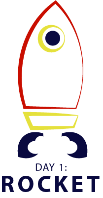
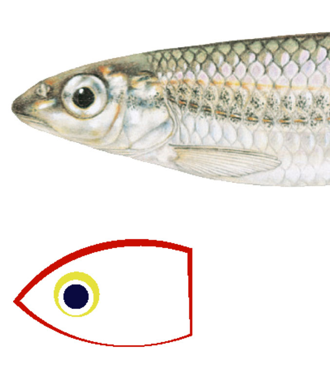
You’re rocket illustration needs some work. When I saw it, the first thing that came to my mind was a fish.
EDIT: After posting this, I realize it might come across like a smart aleck comment. That’s not the intention. Rockets or space ships provide a wonderful opportunity for nice, graphic illustration. This isn’t it. Spend more time working on the rocket illustration.
2 Likes
If you scale the logo down, the thin lines on the right side of the rocket will most likely be lost. Try testing it out to make sure everything is still clear when size is reduced.
@Steve_O that made me literally laugh out loud haha.
2 Likes
Thank you for the feedback![]()
Noted!
I honestly saw a fish first too, so I thought it was a double meaning somehow, but I guess it’s hard if you don’t know the company for the logo. I am not sure how that would work for this logo though. Definitely try tweaking it to look less fish-like. I think the bottom look like fins too, so it took me longer to see the rocket’s air coming out.